| Image |
Comment |
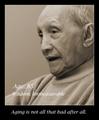
| 01/03/2004 02:11:38 PM |
Wisdom Grows With Ageby HRoxasComment: Great portrait work. I love the message, too. I think that having the embedded text in black might improve the entry. |
 Photographer found comment helpful. Photographer found comment helpful. |
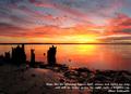
| 01/03/2004 12:32:07 PM |
Inspirationby mbardeenComment: Very striking photograph. I love the color; like the placement of the text, etc. This photo would benefit for this challenge with a nice border, and, since this challenge permits some spot editing, I think darkening the forground ( land portion )might improve the look. |
| Photographer found comment helpful. |
| 01/03/2004 12:28:12 PM |
|
| Photographer found comment helpful. |
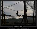
| 01/03/2004 12:23:44 PM |
Hang In Thereby browntComment: I like this compostion overall - framing, border, text, etc., but the photo doesn't support the message . For monkys, hanging in there is the fun part - getting to the other side is really not all that important. |
| Photographer found comment helpful. |
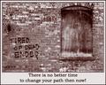
| 01/03/2004 12:19:09 PM |
Tired of Dead Ends?by TooCoolComment: Excellent choice of monotone to emphasise the message. Cropping is just right. I think that I'd try the text in a smaller font to direct the eye to the image, then let it naturally move to the message below. |
| Photographer found comment helpful. |
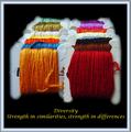
| 01/03/2004 12:14:55 PM |
Diversity - Strength in similarities, strength in differencesby wetlandComment: Excellent entry for this challenge. Love the colors, especially agains the black background. I also like the mat-style border - almost as if the print were already framed. I'd like to see what kind of difference it would make if the lower text line were split into two lines with a . . . connector. |
| Photographer found comment helpful. |
| 01/03/2004 12:11:00 PM |
|
| Photographer found comment helpful. |
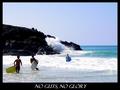
| 01/03/2004 12:12:16 AM |
No guts, No gloryby HavokComment: Terrific photo; great colors; nicely cropped and framed. I think that this particular entry could weather a bolder font just because of it's theme. |
| Photographer found comment helpful. |
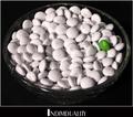
| 01/03/2004 12:10:21 AM |
Individualityby rickhd13Comment: Nice interpretation; great expression of the catchword. I don't care much for the font that was selected, as it takes focus off the candy, and I think that the overall effect might be improved if the thin white frame was left out - just let the black have control to give even more accent to the white M&M's. |
| Photographer found comment helpful. |
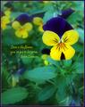
| 01/03/2004 12:05:38 AM |
Love is the flower...by sherComment: Very nice composition; perfect depth of field to accent one flower, yet give the sense of the others. I like the overlayed text: font, color, placement. I somehow don't like the blue border, but can't say specifically why - I don't know what I would have chosen for this print. |
| Photographer found comment helpful. |
Home -
Challenges -
Community -
League -
Photos -
Cameras -
Lenses -
Learn -
Help -
Terms of Use -
Privacy -
Top ^
DPChallenge, and website content and design, Copyright © 2001-2025 Challenging Technologies, LLC.
All digital photo copyrights belong to the photographers and may not be used without permission.
Current Server Time: 04/25/2025 06:39:18 AM EDT.