| Image |
Comment |
| 11/04/2004 09:07:18 AM |
Subjectiveby TranquilComment: the lighting is brilliant, and the picture as a whole is great. the one thing that doesn't look right is the guys handless sleeve (i'm hoping h's not an amputee - apologies if this is the case). I can't see the point and it's a bit of a distraction. however, the darkness, the windows, every other aspect of it is great and is very artistic. 9. |
 Photographer found comment helpful. Photographer found comment helpful. |
| 11/04/2004 09:05:00 AM |
illusionsby vasilkovayaComment: this is quite deceptively dull. initially i thought, fer godsake, this has been done COUNTless times before - 1!. but you've added another dimension to this by what you've done with the middle glass. to be hoenst, the glasses on each side are a little superfluous, and do not add anything to the shot. the sharp focus of the middle glass draws ones eyes automatically to it, and as a result the other ones are barely registering. i think that the boldness of the colours are a bit too aggressive. but i also think that the slosh is a great touch... 7. |
| Photographer found comment helpful. |
| 11/04/2004 07:38:34 AM |
Hello!by ScantyNebulaComment: so cute! awww! i love everything about this - the simplicity of the cup, the marvellous background, the little chap in the cup. the depth of field appears a little too precise, with the little nosey wosey (sorry, can't help it) being a tad out of focus. but that aside, this is a great image - very poster friendly and one of my favourites so far encountered. 9. |
| Photographer found comment helpful. |
| 11/04/2004 07:28:48 AM |
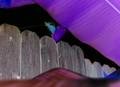
Fenceby matispistaComment: this one is just toooo weird. it's totally insane, and I must admit, not that visually appealing. i'm truly stumped for words on this one, excpet to ask when you collect your drugs could you get some for me? ;) scores a 5, just for strangeness, i think. |
| 11/04/2004 07:22:54 AM |
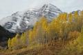
Maroon Bells Changing Seasonsby StookesberryComment: i'm sure 90% of comments refer in some way to the size of the picture, and yes, it is a serious issue. the picture shows an awful lot of promise - tall trees, rolling cloud and mountains always look good. but not when squinting at the screen. if the reason for the size was a 150kb issue, try a lower quality setting (most have microsoft photo editor - when save as click the more button and you can adjust quality there). 7 (because i can see this would have been a stormer). |
| Photographer found comment helpful. |
| 11/04/2004 07:16:28 AM |
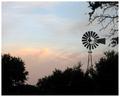
Morning Lightby brett2004Comment: it's a good silhouette type picture, but for me, isn't too exciting. i think the quantity of bushes etc is a little overpowering, and i think that maybe the sky could do with a bit of emphasising enhancing the dark and light areas (if you have Photoshop, try using curves, failing that play with brightness and contrast of the sky in whatever software you have got). 4. |
| Photographer found comment helpful. |
| 11/04/2004 07:10:17 AM |
Shifting Sands by photomComment: FANTISSIMO!! colours are so exotically gorgeous. the landscape is so so dramatically dramatic. i can't decide if i would have cropped just below the light blue sky though... no i like the mountains being defined. this is a great shot - only slight criticism is that it looks almost too perfect (the rich blue behind the golden sand looks too superb). this is a great landscape picture. 10. |
| Photographer found comment helpful. |
| 11/04/2004 06:56:41 AM |
Wedding Dayby C-FoxComment: the posing of this shot and the capturing of the couple is very natural in feel and happy in spirit. The only thing that slightly diminishes the overall shot is the low levels of light. the dull coloured buildings behind the trees are partly to blame, but this might have been rectified with a bit of post editting and brightness adjustment. this is still a great wedding photo - so much better than most of the stilted shots you normally see. the girls facial expression is priceless! 7. |
| Photographer found comment helpful. |
| 11/04/2004 06:45:18 AM |
Papa et moiby LouisonComment: this is a great picture, full of humour and life. the pose feels very genuine and natural. the brightness of the image also works strikingly well. i can't comment too much on this because it's great, and i can't think of a single way to improve it. a lovely, sweet, family shot. hopefully will finish in the top 10. gets an easy 10 from me, anyway. |
| Photographer found comment helpful. |
| 11/04/2004 06:42:35 AM |
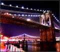
World in Motionby terjeComment: conceptually, this is a wonderful image. the colours are striking, quite surreal and very dramatic. the guy doesn't detract from the overall effect, though i think it would help if he was a little better defined. the glow of the lights and the angle of the shot are also excellent. it feels a little bit strange though - for example, the brickwork on the brdge doesn't look quite right (perhaps it's the result of over processing / editting?) this is still incredibly likeable. 9. |
| Photographer found comment helpful. |
Home -
Challenges -
Community -
League -
Photos -
Cameras -
Lenses -
Learn -
Help -
Terms of Use -
Privacy -
Top ^
DPChallenge, and website content and design, Copyright © 2001-2025 Challenging Technologies, LLC.
All digital photo copyrights belong to the photographers and may not be used without permission.
Current Server Time: 04/22/2025 07:22:26 PM EDT.