| Image |
Comment |
| 10/25/2004 10:14:58 AM |
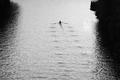
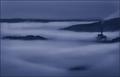
Different Stokesby cabaComment: what an obscure choice of subject - very clever! this is such a case of getting the challenge nailed down - bravo! it's alos quite stylish - the graininess works for me (though it's probably not grainy, just the ripples on the water), and the B&W a good move... the feeling of loneliness, solitude, but a happy peace is oozing from my screen right now. very emotional shot - 9. |
 Photographer found comment helpful. Photographer found comment helpful. |
| 10/25/2004 10:11:12 AM |
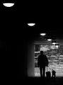
Walking the Dogsby Keith ManiacComment: Composition is the stand-out quality for me here. The mood is also very good - with greyscale suiting your subject and atmosphere very well. the background beyond the tunnel is a little dissapointing, but i s'pose there's nothing that can be done about that. all in all, a great shot - 8. |
| Photographer found comment helpful. |
| 10/25/2004 09:16:42 AM |
Starting LIneby pumaComment: it fits the challenge, no question, though the middle guy is ruining your endeavours a little bit (and he's trying to jump the start!). i can imagine difficult choices were made with regards to cropping - i think for the most part you've got it right, but i might have been tempted to either a) crop level with the top of the concrete wall (thereby losing the distracting biker the other side) or b) cropping higher including more of the bikes, such as handle bars... very tough decision. overall i like it - it's original and quite gripping. 7. |
| Photographer found comment helpful. |
| 10/25/2004 08:56:42 AM |
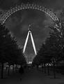
Tree Linedby PixelstateComment: ha - looks familar (i went there at night the other week for the last challange). in terms of perspective and angle, this is really very good. i like how the Eye looks coming up beyond the trees. i also like how the pinching of the tree line is continued up through the Eyes support structure. what lets you down a little bit is the dark and over-grey of the tree and paving area - it's just too dark and ill-defined, and hard to make out. increasing brightness and contrast might have helped. 5. |
| Photographer found comment helpful. |
| 10/25/2004 08:33:19 AM |
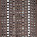
Window Linesby kevrobertsonComment: this would make a great album sleeve - actually, it has strong reminisces of a led zeppelin cover. anyway, i do like the symmetry and repitition in this A lot. regards to fitting the challenge, i can't decide if the lines are implied or not... i think the white ones are, but the beige ones are not. so, yes, it fits. i do wsh it were a little bit sharper though. 7. |
| Photographer found comment helpful. |
| 10/25/2004 04:32:45 AM |
Dream Works by FalcComment: i have absolutely nothing to add to my previous comment, only to say that bloody well done on a totally completely deserved ribbon. this is completely gorgeous and beautiful and totally inspired. |
| Photographer found comment helpful. |
| 10/22/2004 02:56:39 AM |
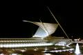
Milwaukee Arts Museumby jab119Comment: cool building that's been well captured here. i especially love the sail-type structure, and how it's been lit up. the white and creams against the pitch black sky is very effective, as is the rest of the structure with the row of lights and windows... I think the inclusion of the landscaping and footpaths lessens the drama and impact of the architecture a bit, i might have tried to see what it looked like by cropping horzintally along the bottom edge of the entrance doors. and crop out some of the bridge. it would look convincingly like a space station then! wonderful building. is it as similarly stylish inside too? 8. |
| Photographer found comment helpful. |
| 10/21/2004 01:02:43 PM |
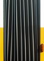
accordion with indicatorby visaksenComment: i didn't vote in this challenge, but i acknowledge your grief for it is a wonderful shot. i love the angularity of it, and visually it's very pleasing. only slight criticism is that the focus seems ever-so just a little bit too soft. . but that's the ONLY quibble, and even that might be down to my eye sight as no one else has mentioned that. this would not look out of place being framed and hanging on the wall of a diner. hand on heart, i'd have given this a 8 or 9. |
| Photographer found comment helpful. |
| 10/21/2004 12:49:01 PM |
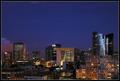
Paris after darkby GabrielComment: ah, la defense! isn't it one of the most fantastic buildings ever. and where, pray, is this wonderful view from? went there in march - and it was actually one of the best things of the trip - very lovely fnac and the missus loved sephora. anyway, i digress. gorgeous picture, very fitting of the challenge, probably the better of the skyline shots this week (clarity and detail is brilliant - i want to buy your camera and lens combo). tres bien! neuf! |
| Photographer found comment helpful. |
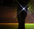
| 10/21/2004 12:20:42 PM |
Silenceby rileyComment: this is a very neat and tidy photo, the composition of which is very effective. i can't decide if the light shining through the tree is a good or bad thing - it looks good, but i'm not sure if it's strictly required. i would say that the sky looks very grainy - unless intentional, this can be minimised with some of the freeware that's freely available (neatimage is the favourite). still, very nice. 7. |
| Photographer found comment helpful. |
Home -
Challenges -
Community -
League -
Photos -
Cameras -
Lenses -
Learn -
Help -
Terms of Use -
Privacy -
Top ^
DPChallenge, and website content and design, Copyright © 2001-2025 Challenging Technologies, LLC.
All digital photo copyrights belong to the photographers and may not be used without permission.
Current Server Time: 04/22/2025 03:13:41 PM EDT.