| Image |
Comment |
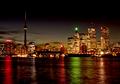
| 10/21/2004 08:49:06 AM |
Cityscapeby HRoxasComment: this is a really good skyline - and the splashes of colour in the water makes for a very attractive shot. having so many lights on in the buildings gives the shot a lot of vibrancy which really appeals to me. some of the lights do look a little whited out, which might be due to a ever-so slightly too long exposure time, but that's the only real criticism. good stuff - 7. |
 Photographer found comment helpful. Photographer found comment helpful. |
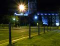
| 10/21/2004 08:13:36 AM |
Abbey By Nightby kevrobertsonComment: i would recommend that when faced with such a shot / location, you rest your camera on something - such as one of those bollards in the street. this will minimise camera movement. the shot also needs a bit more focus. i love the way the abbey is lit - the blue lighting is very effective. moving along the street closer to the building, and perhaps focusing on one part of the abbey might have given a more dramatic shot. 3. |
| Photographer found comment helpful. |
| 10/21/2004 08:10:30 AM |
Bozo Wants His Nose Backby JPRComment: very scary! was the "B" on the right intentional? if so, very nice touch. as is the rake (gives the mad bloke in the barn look an air of authenticity). with possibly only one or two exceptions, this is certainly a favourite for weirdest of the week. 6. |
| Photographer found comment helpful. |
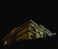
| 10/21/2004 07:55:38 AM |
Ascendingby ArtysteComment: i like the (isometric?) view of the building - looks like a Sims house! the big area of black at the bottom of the shot is a major distraction and unbalances the picture a bit though. lovely stars on an evidentally good clear night. the colours of the house seem a little muted, perhaps a bit of brightness / contrast twiddling might be good? 5. |
| Photographer found comment helpful. |
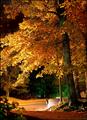
| 10/21/2004 07:52:26 AM |
Night falls.by parrotheadComment: nice autumnal colours here. i think there's too much stuff though - the (broken) brick wall and road detract from the overall appeal - indeed, cropping directly above aforementioned wall might work well. it would given the green light in the background some strength too. very nice, but i think less would be more here (if you'll excuse the tired cliche). 6. |
| Photographer found comment helpful. |
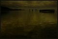
| 10/21/2004 07:47:06 AM |
The end of the dayby JeanComment: so dark! the green sheen of this makes it more interesting, and i love the little things such as the peoples. this is a great idea, expertly carried out. it feels so sombre. but gorgeous. nice one. 9. |
| Photographer found comment helpful. |
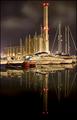
| 10/21/2004 07:40:54 AM |
Power-Boatsby marboComment: that water is unbelievably smooth and gorgeous! there are aspect of this i like a lot, such as the architecture of the building in the background (is it a power station?), the water and the sky. i'm not all that keen on the final cropping - personally i would feel that fitting in ALL of the stacks reflection is slightly overkill - i think maybe cropping just below the red lights closest to the boats reflections would feel more natural (adhering to the much referred to rule of thirds). doing that would also have brought the boats and details closer (squarer image) which would also be an enhancement of sorts. other minor quibble is that the boat resolutely facing the wrong way is a bit of a distraction, but then there was probably sod all you could do about that. this is a shot that become more appealing the more you look at it, and is pretty serene. 8. |
| Photographer found comment helpful. |
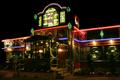
| 10/21/2004 07:30:10 AM |
Cool spot in the dead of night.by graphicfunkComment: I totally adore the stained glass, signage and jukebox style roof! it's only a pity you didn't take a step ladder with you so you can get to the same height and just take a picture of that, as personally, i think the elements below the blue / purply neon light lets the overall image down somewhat. seriously, the top third of the picture is amongst the best stuff this week. it's just overall, with the people outside, the cheap handrails and the ugly doors, it feels a little messy. top bit ten, bottom bit three, average 6.5 (or seven) |
| Photographer found comment helpful. |
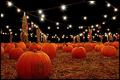
| 10/21/2004 06:56:10 AM |
Pumpkin Patchby markmyshotsComment: this IS lovely! i adore how the pumpkins are laid out (having a lone pumpkin in the immediate foreground proves you have an excellent eye for composition) and the glare of the lights overhead really enhances the mystical / fairy tale feel of the picture. some minor elements look a little over editted (unsharp mask?) and i think a slight tinkle with neatimage et al would have finished it off. also, i might have cropped or cloned out the people - they're a bit redundant really. this is, however, a very great picture and is especially pleasant on the eyes. great great subject and location. 8. |
| Photographer found comment helpful. |
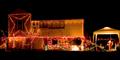
| 10/21/2004 06:52:37 AM |
Christmas Lightsby HeavyComment: has this been validated? this is october, right? are these people insane? technically (leaving aside the obvoius psycho tendencies of the family in question) this shot is suffering a little because of the 640 pixel limit. because of the shape of the house, it doesn't really fill the image and all the details are a bit too small to focus on - i think focusing on certain parts (the lights on the steps, or santa even) might have proved worth playing with. it's a good find and fits the challenge, though. 4. |
| Photographer found comment helpful. |
Home -
Challenges -
Community -
League -
Photos -
Cameras -
Lenses -
Learn -
Help -
Terms of Use -
Privacy -
Top ^
DPChallenge, and website content and design, Copyright © 2001-2025 Challenging Technologies, LLC.
All digital photo copyrights belong to the photographers and may not be used without permission.
Current Server Time: 04/22/2025 03:01:47 PM EDT.