|
|
|
Showing 631 - 640 of ~979 |
| Image |
Comment |
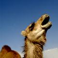
| 10/08/2004 06:20:36 AM | I was fired by that cigarette company!by photomComment: Bit of a silly title, really, but forgetting that, this is a terrific picture. the camels face has heaps (well, humps) of personality which I find is quite a rare thing in wildlife shots. Lighting and composition is top notch as well. detail such as fur and eyelashes is nice and sharp, and in terms of hanging on a wallability, i would say this does a superb job. one of my favourites of the week. 10. |  Photographer found comment helpful. Photographer found comment helpful. |
| 10/05/2004 03:52:33 PM | Enchanted BCby zeuszenComment: conceptually, this is a very intriguing, powerful and striking image. it is also beautifully composed. i still think the only think that lets it down is the flash of green bank across the centre. if this was perhaps greyscaled, or cloned with the flat grey of the footpath, then i think it would appear slightly more balanced, with the people (and their bright splashes of colour) a bit more prominent.
since reading your description as to how it was done, i've tried the same with (even if i say so myself) pretty successful results - turning seemingly dull and lifeless shots into something substantially more gratifying. so thank you for that.
again, this is a spectacular and original and gorgeous shot. 160th out of 189 is truly an injustice, and evidence of the number of deranged twonks that plague the voting here... 13 ones. i mean, honestly. i gave this a ten; and if someone told me i could only have five favourites from the whole site, this would easily be one of them. it's inspiring stuff like this that makes the 25 bucks a year such a bargain.
so keep it up! | | Photographer found comment helpful. |
| 09/13/2004 09:32:17 AM | Alien Menaceby anirenoComment: this has some very lovely lighting, the composition is splendid, and the subject matter, though strange and unusual, works well. only thing is, it looks remarkably like a drawing - you know, one of those pieces of artwork set designers do. i don't know how you created this effect, but i must say it's very clever. but as a result, it doesn't look like a photo, or even a photo that's been subject to lots of editting. maybe there's too much noise-reduction software implemented? dunno. i like it, it just has a strange appearance. 7. | | Photographer found comment helpful. |
| 09/13/2004 08:27:49 AM | All my Babiesby DarkRiderComment: though two of you thought of it, i still think this is a very clever and original idea. the brickwork up the top is a little bit distracting though, and it's was momentarily a bit tricky to see what was being reflected (i thought you were being especially proud of a collection of vases). still, i like very much the thought behind this one - 6. | | Photographer found comment helpful. |
| 09/13/2004 07:27:21 AM | pensiveby brunasComment: nice one! i do like how the mirror is not in focus, but you / your model is. i'm guessing it's an editting trick, because obviously the reflection is the same distance away as the mirror. possibly. don't know. only thing that might warrant a slight rethink is posture - the hands / arms are hiding part of the face, and where emotive feelings are concerned i feel there should be more face than arms and chair. still, i like the way the shot is taken, kind of voyeustic almost. B&W also fits the mood. erm - 8. | | Photographer found comment helpful. |
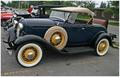
| 09/13/2004 07:22:40 AM | Classic mirrorsby Dim7Comment: i think this is stretching the fitting of the challenge a little bit. if one of the chrome hub caps (or even one of the side mirrors) became the principal subject in the shot, then i don't think there would be any issue. but it just seems little more than coincidental to have mirrorred surfaces in the frame. composition appears a bit cluttered too, with stuff, people and boxy buildings in the background... it's a lovely looking motor though. 4. |
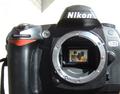
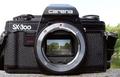
| 09/13/2004 07:10:45 AM | SLR-the world insideby redpandaComment: wow - that's weirdly coincidental - came straight after the Nikon version. great minds, eh? unfair to compare the two, i know, but i think this is the more preferable - principally for your choice of reflection. it's actually a very interesting and captivating shot and it certainly fit's the challenge. only suggestion would be to crop closer to the camera on the right hand side - i actually like the fact that there is largely a white (blown-out sky) background and the only greenery was on the mirror - the bits of lake and trees on the right kind of lessen the illusion. that minor thing aside - it's excellent. 9. | | Photographer found comment helpful. |
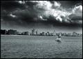
| 09/13/2004 06:46:34 AM | smog over the cityby whiteroomComment: it was a terrible film, but this strongly reminds me of independence day (big spaceships etc). in terms of the quality of the shot, this is fantastic. the sky - obviously the focus of the shot, is both dramatic and beautiful. the little boat is a nice touch, that definitely adds to the overall feel. choice of black and white (well, greys and white, really) is also very nice. problem with the 21st century is that, unlike the wonderful days of where the burning coal and oil in the middle of cities was rife, the burning of clean fuels, even diesel, produces a very clear kind of smog. consequently, title aside, it's hard to see why this fits this particular challenge. it's still a wonderful shot, very poster-esque. can't give you more than a 7 though. sorry. | | Photographer found comment helpful. |
| 09/13/2004 05:59:20 AM | Longing for yesterdayby JinjitComment: this is very lovely. the composition is very nice and the sharpness and detail of the smoke is excellent. colours are also a strong point - deceptively monotone, but isn't. i might have tried pulling the candle away from the wall a little bit (to reduce the proximity of the shadow), brought the candle a tiny bit more in focus, and to be honest, the border doesn't really improve the overall appearance. on the whole though it's a lovely shot, and the smoke is especially well done. it's also a very stylish submission. 7. | | Photographer found comment helpful. |
| 09/13/2004 05:14:24 AM | Exhaustionby guitar_mannComment: it's an interesting composition, and i like what you've done with the colours and lighting (don't know what the technical term / filter is, but it looks good!)
Thing is, the smokiness isn't really that apprarent, or indeed noticeable (i can't tell is the area left of the chrome is bodywork or not...). it's too abstract and visually difficult to decipher. it's certainly original, but i'm not sure that it fits the challenge. 5. |
|
Showing 631 - 640 of ~979 |
Home -
Challenges -
Community -
League -
Photos -
Cameras -
Lenses -
Learn -
Help -
Terms of Use -
Privacy -
Top ^
DPChallenge, and website content and design, Copyright © 2001-2025 Challenging Technologies, LLC.
All digital photo copyrights belong to the photographers and may not be used without permission.
Current Server Time: 04/22/2025 12:18:18 PM EDT.
|