|
|
|
Showing 751 - 760 of ~979 |
| Image |
Comment |
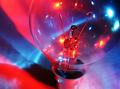
| 06/04/2004 11:01:34 AM | Illuminationby redmoonComment: Thank you all for the lovely AND helpful comments and of course the overly generous votes.
This was a completely straight forward image to compose. It was done thusly.
Got a sheet of card.
Placed upon the card one used light bulb (I was brought up with pearlescent bulbs, never realised how beautiful clear bulbs can be).
Got one camera, a little tiny tripod (free with a magazine), the Star Wars special edition video box set and an old walkman. Positioned everything in such a manner that the lens was pointing in a downward angle.
Used as my light sources: 1) one flashlight shining through a blue bottle of water (as per my abstract shot �Ty Nant�, 2) one infrared mouse lying on its back. I had to wave my hand in front of the mouse a bit to get the red light to shine, but that aside, it worked rather well.
Post editing included crop, curves (wonderful thing that, you can really improve the colours of an image, methinks), resize, and I think that was it. Oh, and neatimage, of course.
La fini.
If i did it again i would crop better, tone down the pink, and use something that wasn't a light bulb. possibly.
|
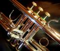
| 06/01/2004 04:55:03 PM | Jazz by L1Comment: this is a very high quality image - and is also a very cherished trumpet. this is a good subject for reflecting various sources of light, and you've certainly done it justice. only slight reservation is the green felt - a bit too bright and a distraction. if the instrument were turned a bit it might not be so apparent. but seriously, that's the only thing: the background is perfectly subtle, the 45° angle is perfectly, erm, angled... the left seems marginally out of focus compared to the rest though, but that's being unnecessarily picky. excellent. 8. |  Photographer found comment helpful. Photographer found comment helpful. |
| 06/01/2004 04:50:09 PM | Multi-simplicityby LouisonComment: hmmm. by rights, a curled up bit of white paper (looks like one side of bouble sided sticky tape) on a white background shouldn't be interesting. but it is! striking even! the different shades of greys are quite a draw, and i find myself staring at this... all the little nuances rock! i like a bit of minimalism, and by jove, i think this is it! the off centre position is totally right, and there's no way i'd alter this. good job matey! 9. | | Photographer found comment helpful. |
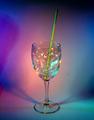
| 06/01/2004 04:46:09 PM | Blowin' Bubblesby KaDiComment: this is very nice - wine glasses are hardly original, i admit, but the addition of bubbles is sheer brilliance. i can clearly see that the piece has been illuminated from different sources, as per the requirements. i'm in two minds about the inclusion of the straw, because even though it affects the overall simplicity of the image, i do think it really ought to be there. the lighting and greens are very good... it's a shame that spot editting isn't allowed, because there's a slightly distracting splodge on the right... and did you consider using neatimage et al? the colours are striking, and overall this is a definite top 10 favourite of the week. 8. | | Photographer found comment helpful. |
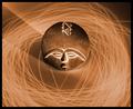
| 06/01/2004 04:40:26 PM | voodoo: getting out of the spellby KiraComment: this is a lovely piece of illuminatory art. the sepia tones, the whooshy whooshy light, and the way the edges of the raised bits glow (thereby conveying a three-dimensional appearance and gives a strong impression of feel) really appeals to me. the shadow makes it a tiny bit unbalanced in terms of symmetry, but that aside i think that this is very well composed and taken photograph. excellent - 9. |
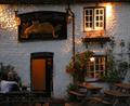
| 06/01/2004 04:36:50 PM | Indoor lamps, outdoor lamps & the last dab of daylightby legalstevenComment: it's a nice looking pub, but the shot is quite a bit of focus, which might affect your overall score - sharp images do usually tend to do better here. to get round this, when you're out and about it might be worth keepin an eye out for a flat surface you can balance your camera on - taking a shot at night / dusk invariably leads to a longer exposure time, and hand shake is impossible to avoid. using a timer (if it has one) and a flat surface so you don't have to hold the camera can result in some really sharp photos. |
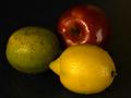
| 06/01/2004 02:34:03 PM | Still Lifeby nevillecComment: too dark, really. it might have been worth trying a coloured background in lieu of the black... also the lemon is noticeably out of focus, and it being the brightest object plus being in the foreground, it kind of detracts from the overall image. having the fruits wet IS a nice touch. it's a good example of fitting the challenge as well. 4. | | Photographer found comment helpful. |
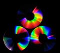
| 06/01/2004 02:30:26 PM | Light Reflectionsby s4nd3r99Comment: it's hard to tell if more than just one light source was employed here, but one should assume that it was. it's certainly very pretty... did you consider cropping through the discs so that there was less black filling the screen? it's the wonderful colours that sell this image, so i think i would like to have seen more focus on that... 6. |
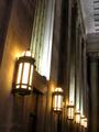
| 06/01/2004 02:27:12 PM | East Entranceby banmornComment: it's an attractive shot, no question there, i just feel it's somehow, erm, a bit incomplete. i'm not overly keen on the unusual angle, and i think i might have cropped the image a bit more square like - specifically i would have taken out everything above the shadow on the ceiling. This would have the lanterns filling the lower thrid, rather than the lower quarter which i think is a bit unablanced. with regards to the challenge it's definitely a fit, and i think a very good choice location. 6. | | Photographer found comment helpful. |
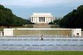
| 06/01/2004 09:48:04 AM | Price of Freedomby blemtComment: i think i'm being thick - i can't see the threes. well, 3 people, and three shadows in the monument thing in the background, but i would have thought those are incidental. i'm afraid i don't know my american history enough to think of something that might be more specific. technically, it's a very nice picture - symmetry is pleasing and the guy in the fountain is a good point of interest. | | Photographer found comment helpful. |
|
Showing 751 - 760 of ~979 |
Home -
Challenges -
Community -
League -
Photos -
Cameras -
Lenses -
Learn -
Help -
Terms of Use -
Privacy -
Top ^
DPChallenge, and website content and design, Copyright © 2001-2025 Challenging Technologies, LLC.
All digital photo copyrights belong to the photographers and may not be used without permission.
Current Server Time: 04/15/2025 01:16:07 AM EDT.
|