| Image |
Comment |
| 06/01/2004 09:39:57 AM |
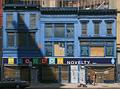
Three Blue Buildingsby BikeRacerComment: this is a good image, but the shadow (cast by signage?) is a major distraction. using the kerb and the top railing as your top and bottom crop is pretty smart, gives it a kind of natural border. the people are a nice touch too. honda doesn't fit though, and overall the areas not in shadow feel, to me, a little too bright (though it might be the contrasting shadow that gives the impression of over-brightness). also, on an initial look it looks like it is one building (wth the shared shopfront) but only on closer inspection, you can see that they are indeed three. this shot does have a great deal of charm, and i hoe to see it do well. 7. |
 Photographer found comment helpful. Photographer found comment helpful. |
| 06/01/2004 09:31:17 AM |
Nell'ombraby MarkComment: this could have done with a very slight Clockwise rotation - the wonkiness is a little bit distracting. the position of the lights works effectively though, and i like how one light is yellower than the other. but i might add that by coming in closer you would ahve picked up on the grooves on the vase more obviously. i only mention that because the vase seems to have an interesting texture. 5. |
| Photographer found comment helpful. |
| 06/01/2004 08:10:50 AM |
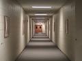
Light and shadowby ckalliesComment: initially, this is to me a very striking image. the pattern of light and shadow is interesting and works well. on closer study, it seems a pity that the doors at the far end weren't cemtred; they kind of knock your symmetry a bit off-kilter. also, some sort of support for your camera (a tripot, video box set, something like that) might have produced a less fuzzy image. in all though; it's a good subject, fits the challenge and very likeable. 7. |
| 06/01/2004 04:48:40 AM |
Hard Drive in Technicolorby lbWhaplesComment: this is a definite favourtie of this challenge - the lighting (in it's multipleness) is beautiful, as are the colours and the angle of the shot is pitch perfect. your choice of subject is different and original, and for making something seemingly ugly and boring into the visoinary wonder i see before me is inspiring. my only reservation is that i wish it was a little bit sharper in the foreground, but that aside, i am well impressed. 9. |
| Photographer found comment helpful. |
| 06/01/2004 04:12:12 AM |
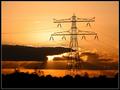
'electric lighting' vs. solar lightingby boogieComment: this is unquestionable a beautiful image. in my opinion, the meeting the challenge aspect is a bit stretched (even with your title taken into account). but in terms of photographic merits, this is a very lovely picture. it's sharp, in focus, colours are terrific - as is your timing with the sun behind the clouds and it's rays being clearly evident. could've been a winner in the silhouette challenge we had recently. |
| Photographer found comment helpful. |
| 05/29/2004 10:26:29 AM |
CMY by EddyGComment: this is a wonderful photograph, and i'm at a total loss as how you did it! the quality of this image is leagues ahead of many of the ones on offer this week - it's seemingly simple but oh so well set up and executed. my only slight thought is that there is a little too much empty space at the top... but that aside, it's perfect. 10. |
| Photographer found comment helpful. |
| 05/29/2004 06:05:17 AM |
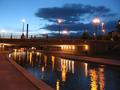
Reflectionsby anatomComment: it's a bit on the small side, which unfortunately detracts a little from what is a really attractive shot. however, by moving my head closer to the screen, it looks bigger and one can appreciate it more. really, small sizing does detract from the image, and getting close to you 640 pixels max is important. however, the sky, the lights and the reflections are all beautiful and well captured. it might be my head (i'm a bit hungover) but it looks a smidgeon on the wonky side to me. overall, gorgeous colours, fits the challenge, a bit out of focus (slightly hampered by the size) but very nice. 5. |
| Photographer found comment helpful. |
| 05/29/2004 06:00:55 AM |
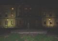
Province Houseby zeke123caComment: This looks like a nice old house; and choosing the location for your submission is a good idea... the light in the foreground is somehow looking not right. did you use a flash, or was it some other source? if it was the result of a flash - might i suggest you rest your camera on a solid surface and use a long exposure and the timer? also post editting it could do with a drop in brightness or an increase in contrast for the dark areas aren't really dark or bold enough - a bit to greyey if you will. it's a good idea for the shot that does meet the challenge. |
| Photographer found comment helpful. |
| 05/28/2004 02:47:52 PM |
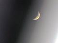
Moon and street lightby BrooklynsbridgeComment: oh, lot's of noise. download the freeware version of neatimage, it'll minimise the grainy pixellated effects you've got. it's a pity because the spread of light in the lower corner is quite dramatic. |
| Photographer found comment helpful. |
| 05/28/2004 02:42:00 PM |
Watermelonisiousby mirdonamyComment: this is a lovely shot. i'm not enTIRELY sure about the choice of lurid green, but it's all been captured very wall. it's a pity you're not allowed to clone out the dust spots though - i bet you were itching to get rid of them! i like the off-centre setting, makes it more interesting. 6. |
| Photographer found comment helpful. |
Home -
Challenges -
Community -
League -
Photos -
Cameras -
Lenses -
Learn -
Help -
Terms of Use -
Privacy -
Top ^
DPChallenge, and website content and design, Copyright © 2001-2025 Challenging Technologies, LLC.
All digital photo copyrights belong to the photographers and may not be used without permission.
Current Server Time: 04/15/2025 01:20:48 AM EDT.