|
|
|
Showing 831 - 840 of ~979 |
| Image |
Comment |
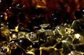
| 05/03/2004 02:08:59 PM | Composition 1by elsapoComment: Is it jam and marmalade on a light box? not entirely sure, so well done! The lower half is considerably more beautiful than the top (the light effect (refraction?) is more prominent at the bottom) so to me, it seems a trifle unbalanced (it could actually be trifle, could it not?). I would have cropped out some of the red i think as you have a remarkable effect in the lighter areas. still, very good and quite intriguing. 8. |  Photographer found comment helpful. Photographer found comment helpful. |
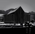
| 05/03/2004 02:06:07 PM | U F Oby heidaComment: to be honest, i've not been ALL that impressed with this weeks submissions. But this is the first that has grabbed my attention in a "what ho, what is this" kind of way. It's very beautiful. In terms of meeting the challenge - well i would say it does. I would guess that it was a bulding, but i can't be entirely sure which is basically what the viewer should think, IMHO. The lighting gets 10, the composition and cropping gets 10, the little blue bit of neon is fantastic... This is a really cool picture that cannot be improved. well done, full marks, 10. | | Photographer found comment helpful. |
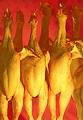
| 04/30/2004 12:32:39 PM | ain't nobody here but us chickensby rananculusComment: Well, obviously this will (probably) end up in last place (colours are not great, and the detail in the top portion is far too ill-defined), so being all ironic and everything, i thought you should be denied the ultimate pleasure, and award you 10 instead. | | Photographer found comment helpful. |
| 04/30/2004 12:19:43 PM | i live behind the babyby sunnee17dmzComment: Hopefully i'm not alone in saying this, but this doesn't really scream of a "where i live" picture to me. In fact, it would only really fit the challenge if you happened to be greenfly or something living in the flower, then that i could understand. It's not a bad photo; the colours of the flower are bold and details of the flower are very sharp. Did the blurry background come out like that in the camera, only it looks a little too fake and a bit too contrasting to me. Also, it looks like the kid has a box of matches and is about to torch the poor innocent flower - so you should get marked down a bit for wanton cruelty to horticulture ;) (in case you're wondering - you didn't!) |
| 04/30/2004 11:11:37 AM | Xby zeuszenComment: What a stylistically drab monstrosity this is! Going duotone definitely appears to be a good move. Personally, i might have been tempted to have chopped out the extreme bottom portion of the shot (the large area of black is quite overbearing). However, that aside, i think this is a fine picture, and from the scenery in the background, it looks like you live in a great place. 8. | | Photographer found comment helpful. |
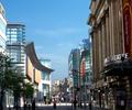
| 04/30/2004 07:54:12 AM | King Cottonby PaulkComment: Very strange effect going on here. Looks almost like an architects proposal drawing superimposed on a photo of the reral existing environment, like the type you see in building magazines. I am NOT suggesting that this be the case, but the type of building and the light upon them just, to me, gives that impression. it's quite strange. there's a little evidence of over use of unsharp mask at the top of the stone building in the foreground, which is what gives you your halo effect. What i do like is the view you've chosen - the little mock (or real) tudor place in the far background is in direct contrast with it's surroundings, and somehow this visually appeals to me greatly. |
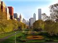
| 04/30/2004 06:23:41 AM | Chicago (My Second Home)by GolferDDSComment: Bit too much of the unsharp mask tool going on here. The trees look fantastic though, almost like a painting - i think i might have been tempted to crop out some of the sky just to draw more attention to the (gorgeous) landscaping. I also love the fact that the image is so devoid of people. And, sigh, those trees. Plus, those buildings on the left - great old architecture. Lighting is very good. Perhaps half a dozen steps to your right might have given a more symmtrically pleasing result but in all, very good. I'm probably docking you a point for the excessive unsharpening, but i don't think i'm being unfair giving an 8. | | Photographer found comment helpful. |
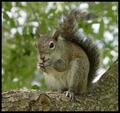
| 04/30/2004 05:33:33 AM | Coral Springs, Florida: Too many squirrelsby hstegComment: NEVER! There never can be enough squirrels with their cute little twitchy noses and little bushy tails, being frisky and chewing on their nuts. This is a great picture, nicely composed and detailed. Doesn't exactly convey where you live, though (of course, your title helps). | | Photographer found comment helpful. |
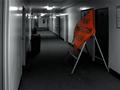
| 04/30/2004 04:46:28 AM | in the dormsby AFChrisComment: Ah, this takes me back. Any sort of building site furniture is easily placed within the dormitory halls (i used to especially like the little yellow flashing lights). Though, to me it doesn't REALLY fit the challenge (the corridor outside a room hardly constitutes village, town or city) it's done with such humour and dare i say it, style, that i'm willing to let that go. Changing to B&W is a clever and effective way of drawing ones attention to the road sign, so that decision definitely works. Overall, i think this is a bit silly, but pretty good. 7. | | Photographer found comment helpful. |
| 04/29/2004 04:35:26 PM | Kittenby RgarciaComment: SO CUTE!
The detail of the eyes, and the fur is brilliant. his gormless expression is priceless, and his wittle feetsies! (sorry, can't help myself). couldn't you have taken another for the proportion challenge? | | Photographer found comment helpful. |
|
Showing 831 - 840 of ~979 |
Home -
Challenges -
Community -
League -
Photos -
Cameras -
Lenses -
Learn -
Help -
Terms of Use -
Privacy -
Top ^
DPChallenge, and website content and design, Copyright © 2001-2025 Challenging Technologies, LLC.
All digital photo copyrights belong to the photographers and may not be used without permission.
Current Server Time: 04/12/2025 01:15:18 PM EDT.
|