| Image |
Comment |
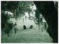
| 09/05/2004 12:52:58 AM |
Drifting Apartby sherComment: Stunning. One of my favourites in this challenge - everything is so crisp and clear, and the scenery is absolutely gorgeous. The subject matter and the title tie together to make it moving as well. The green toning is interesting - I wouldn't have thought of it myself, but it seems to suit the photo. Fabulous job - 10 |
 Photographer found comment helpful. Photographer found comment helpful. |
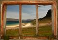
| 09/05/2004 12:47:25 AM |
The farmers viewby Mad-DComment: Beautiful! I love the warm tones in this; it really gives the photograph a nice, comfortable feeling while still remaining exotic. |
| Photographer found comment helpful. |
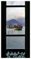
| 09/05/2004 12:46:29 AM |
Isola dei Pescatoriby KazzeComment: Beautiful framing - no detail is lost, and it's a stunning view. Focus is flawless. 10 |
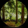
| 09/04/2004 08:59:03 PM |
Framed Forestby MonaComment: I think this would have looked nicer without the heavy green tones - maybe even in black and white or toned to a sepia. It feels a tad neon with the green highlights overpowering the sunshine that's breaking through the trees; some curves and a touch of sharpening would also improve the appeal. With those minor changes, though, this would be a fantastic photo. The scenery is well framed and it has a very balanced feel about it. |
| Photographer found comment helpful. |
| 09/04/2004 08:54:46 PM |
OK! OK!by ggbudgeComment: The idea is very clever, but there are a couple of things that stop this from being an interesting image for me: the textured white item behind the red box, the blue foreground, and the position of the hand. I closer crop on the upper half would probably have balanced it out more in the absence of more hand to the left side; as it is, it feels like too much hand is missing and too much finger is visible. A white foreground and background (or any colour, but it would look nice if the foreground and background matched) would also have made this feel less like a snapshot - it might also look nice in black and white, or maybe a selective desat with only red showing. Overall, while I think this one could be improved, the idea is very clever, and it does meet the challenge well. |
| Photographer found comment helpful. |
| 09/04/2004 08:46:37 PM |
Guardian Angelby JPRComment: Flawless. Black and white works fantastically, composition is excellent, contrast and brightness are right on; the detail level is excellent. 10 |
| 09/04/2004 08:45:05 PM |
†by aznymComment: This is one of my favourites in the challenge. The vivid colours contrasting with the neutral tones surrounding the glass, the clarity, the textures and symmetry - all of it is fantastic. Beautifull framed. Wonderful job! 10 |
| Photographer found comment helpful. |
| 09/04/2004 08:43:19 PM |
Framed Mountain Gloryby SandyPComment: Absolutely gorgeous... really makes me miss the mountains! Stunning clarity in this, the details are so crisp without contributing any excess noise. Lovely. 10 |
| Photographer found comment helpful. |
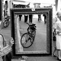
| 09/04/2004 08:42:17 PM |
|
| Photographer found comment helpful. |
| 09/04/2004 08:41:04 PM |
picture this...by coldaComment: This has a great deal of appeal. The clarity is all around excellent; many interesting textures are visible throughout the image. The contrast is just right. Lovely! |
| Photographer found comment helpful. |
Home -
Challenges -
Community -
League -
Photos -
Cameras -
Lenses -
Learn -
Help -
Terms of Use -
Privacy -
Top ^
DPChallenge, and website content and design, Copyright © 2001-2025 Challenging Technologies, LLC.
All digital photo copyrights belong to the photographers and may not be used without permission.
Current Server Time: 04/21/2025 10:05:47 PM EDT.