| Image |
Comment |
| 05/09/2006 06:37:31 PM |
Desperate Phone Callby talikfComment: This would totally work as a movie poster. I think as has been said before the lighting is great and emotion in the model's face is excellent and doesn't even appear to be acting in the shot. If I had to add any critique to the image it would be that by the wrist it is abit too sharp and has a bit of a halo and on the cheek above the right eye the skin appears to have a alittle bright spots that attract the eye. In most cases it wouldn't matter but movie posters always seem to have the skins tones way over processed. If I was voting I would have voted it an 8 or 9 then sulked on to the next entry thinking about how much better this then my photo for the challenge. |
 Photographer found comment helpful. Photographer found comment helpful. |
| 05/09/2006 06:01:37 AM |
2.75 Bubblesby aimeethetooComment: ------------ ****Greetings from the critique club****------------
I think this was a really creative idea for the negative image challenge and you executed your idea very well. As with many images in this challenge with very strong colors after inversion they could be hard to look at and your image is very easy on the eyes and the bubbles make me want to see closer into the them to see the details.
As far as composition goes I think it is really well done. I may have cropped slightly differently by having the bubbles abit higher up and the wand slightly to the right to make use of the rule of thirds. This woud have placed the wand in one of the places the eye is most drawn to and from there it would follow the bubbles. Also I can faintly see some blueish tint in the background underneath the bubbles which can be a small distraction. (Although I didn't notice them at first.)
I think the post processing would have helped your score abit, although I know it is difficult when working with a negative image. I noticed that you used invert to make you image negative. I would suggest using curves instead as it allows you to have more tonal control over the image, you simply change the curves low point to the high point and vice versa or from this / to this \. I hope that makes sense. Your bubbles seems abit overblown and it is hard to distinguish where the bubble ends and the background begins in some parts. Although I am not sure if this was intentional or not I could see voters taking a point away for that. The other thing that really strikes mee is that you are very blue and there is no change in the blue from your hair, shirt and skin tone and I am not sure how that is and perhaps voters who didn't comment may have thought this also and took a point down also. So maybe where shirt that was different than your skin or even some with lots of different colors to see how that would have looked.
Overall I think this image was really well done and as I critiqued it I liked it more. The border I think worked for your image too. The inside of the bubbles are great and it was a creative and well thought out idea. I hope this is helpful to you. If you have any more questions feel free to send me a PM. |
| Photographer found comment helpful. |
| 05/08/2006 09:04:18 PM |
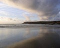
Fort Bragg, CAby judywattComment: I wonder if we are running in parrallel lines. I would also go to Fort Bragg every Labor Day weekend. I know right where this is also. You have a nice gallery and this is a good beach shot. |
| 05/08/2006 09:01:27 PM |
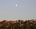
Full Moon Over San Miguelby judywattComment: Wow I have been here too! The church there is amazing, it appears to be dropped there from Europe. I like this photo as it reminds me of my trip. |
| 05/08/2006 08:59:04 PM |
Kids on Crissy Field Beachby judywattComment: I love San Francisco, I am from the east bay(concord) myself. If you want to sell this as a print I may try and clone out the birds or dust spots near the top right of the photo in the sky. The picture of the kids with the backdrop of the golden gate is excellent. |
| 05/08/2006 08:55:04 PM |
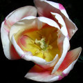
Inside the Tulipby judywattComment: I like the lighting on this photo and the depth of field. I would like to see the entire photo in frame and maybe burn the backgraound to a dark black so that the photo may pop alittle bit more. The drpos of water are also nice too. |
| 05/07/2006 09:10:22 PM |
|
| 05/07/2006 04:04:38 PM |
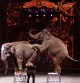
The Circus in townby DigiFotoBuddyComment: I wish this shot was just abit wider so that we could have the feet of the trainer and the top of the ringling brothers sign was completely in frame |
| Photographer found comment helpful. |
| 05/07/2006 03:59:56 PM |
Gay Marriage: Adam and Steveby Sunshine86Comment: I think showing the two men's faces would have had more of an impact because it shows they aren't trying to hide from the public, but a great a idea and just a suggestion |
| Photographer found comment helpful. |
| 05/07/2006 03:56:27 PM |
|
| Photographer found comment helpful. |
Home -
Challenges -
Community -
League -
Photos -
Cameras -
Lenses -
Learn -
Help -
Terms of Use -
Privacy -
Top ^
DPChallenge, and website content and design, Copyright © 2001-2025 Challenging Technologies, LLC.
All digital photo copyrights belong to the photographers and may not be used without permission.
Current Server Time: 04/11/2025 06:12:04 PM EDT.