|
|
| Image |
Comment |
| 11/01/2004 10:53:30 AM | |
| 11/01/2004 10:35:36 AM | |
| 11/01/2004 10:33:59 AM | Red House of Baselby _wu_Comment: I think the angle strips a bit of detail from the windows - the window sills are very deep. This makes it seem like a very tall building, despite the fact that no wide-angle distortion is used, and the frame is horizontal. It's like one of those pictures of new york sky scrapers, making a face at the sun.
I really like the sharpness of the edges, and the textures, and the colors are simply brilliant.
Good show! |  Photographer found comment helpful. Photographer found comment helpful. |
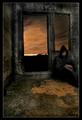
| 11/01/2004 10:31:05 AM | Oneby Mad-DComment: What's in the background? Just a city? And if so, is it the only light source, reflecting off the clouds? If that is the case, how long an exposure did it take to get that without losing depth of field?
It's a gorgeous image! | | Photographer found comment helpful. |
| 11/01/2004 10:28:04 AM | Eternaly Happyby BoltiComment: Her left shoulder is distracting... Too bad it didn't make it.
I also think this photograph could really benefit from a more cinematic aspect ratio - if you crop a lot of the sky, and a tiny bit off the bottom, the eye would jump to the beautifuldetails, like the way the pole, then the small building and then the house reflect, the gradients in the water, the light on the frontmost rock, the folds of the shirt, and so forth. | | Photographer found comment helpful. |
| 11/01/2004 05:16:08 AM | Evening Shadesby charmayneComment: The textures are really amazing! I've never been able to get water to look this good when not in real life.... ;-)
My eye keeps looking for the bigger clouds though. It's deceiving that the clouds we see on the top are really only the second, smaller reflection. I also think it's a bit of a shame that the trees, which are quite plain, take up so much of the frame. With more sky, the trees would seem more like silouhettes, (especially on the right), than a barrier. Maybe with a slightly wider lens, and a vertical orientation, the detail of the water could have been captured, but more of the sky would have been preserved too. | | Photographer found comment helpful. |
| 11/01/2004 05:12:36 AM | autumnal poolby carlosmfernandesComment: The colors that reflect are stunning, and the subjects are interesting, but I think there are too many of them. The leaf and crud on the bottom right, for example, could be a picture of it's own right, especially with the way the mucky stuff sort of cuts chunks off the bars. It's a nice interaction between the earthy brown and rocky white versus the more accurate blue sky and metal fence.
The sunlit reflection and the needles could be also a separate image, without the rest of the subjects. If that were the case, a slightly higher exposure should be in order, to make the needles more appearant, but this might have washed out the yellows. Dunno. | | Photographer found comment helpful. |
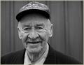
| 11/01/2004 05:08:16 AM | O.G.by undieyatchComment: I think either a little bit more or a little bit less depth of field would have helped here. The ears are just out of focus, but most of the face isn't. This creates a sort schizm, where the nose, mouth and eyes are in focus, but some of the hair, the rim of the hat, the cheek fuzz are. Those parts are more like the neck, suite and ears, not a part of the face, in my humble opinion. Thus the lack of focus on the ears seems like an error. If the ears were in focus, or only the core of the face was, then i think it would be more consistent.
Aside from that, I wonder if you used some sort of light reflection, or whether this is just plain sunlight. |
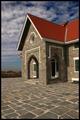
| 11/01/2004 05:02:51 AM | Robert Moses State Parkby TLL061Comment: I think the photo is a little off balance. Showing less of the floor on the bottom could have helped that, you know, with the law of thirds and all that. Furthermore I think that the floor is an interesting texture, but that the sky, especially on the top is more so, and would have liked to see more of it.
I think a yellow/blue polarizer could have helped make a bit more contrast between the sky and the roof, but perhaps that would have ruined the color of the stone. Could have been interesting to see what it would have done. | | Photographer found comment helpful. |
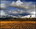
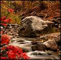
| 11/01/2004 04:57:45 AM | Autumn in the Rockiesby dwterryComment: The contrasts of colors and textures is very nice in this image. The composition is very clever in capturing all of them appropriately, except, perhaps for the little blotch of soil on the bottom right, which sort of bothers the water. Perhaps if the camera was a few inches higher, a better compromise could be reached.
The lighting is really nice. It looks a bit sharp for an overcast day, falling very directionally. Maybe I just don't see enough of these in real life, but I think it really makes the picture stand out. | | Photographer found comment helpful. |
Home -
Challenges -
Community -
League -
Photos -
Cameras -
Lenses -
Learn -
Help -
Terms of Use -
Privacy -
Top ^
DPChallenge, and website content and design, Copyright © 2001-2025 Challenging Technologies, LLC.
All digital photo copyrights belong to the photographers and may not be used without permission.
Current Server Time: 03/12/2025 07:35:27 PM EDT.
|