| Image |
Comment |
| 06/12/2007 08:14:20 AM |
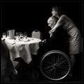
A Brief Moment of Silenceby jjbeguinComment: Originally posted by Bosborne:
I have made this one of my favorites despite what the SC deems as a ''failure''. |
[sarcasm]Oh geez, did we put 'failure' in the DQ description again? Stupid us.[/sarcasm]
JJ...amazing job. Not a failure at all. I certainly hope that you don't believe the words that are put into our mouths by people who do not understand. Editing or no editing, this captures a beautiful moment in time, one that touches many hearts and one that these people will remember forever as well.
Your edits are also amazing, drawing out this touching scene from the background, and really are what make this photo even more amazing. It may be too much for the challenge...but DEFINATLY not too much to make the photo great.
Congrats either way. |
 Photographer found comment helpful. Photographer found comment helpful. |
| 06/09/2007 05:37:20 PM |
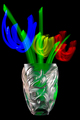
Posies for Picassoby De SousaComment: Excellent. I was beginning to think that people were not understanding the whole painting with light idea. very nicely executed. love the color and the overall placement of the subject is very good. nothing to complain about here. |
| Photographer found comment helpful. |
| 06/09/2007 05:21:50 PM |
Fade Outby GeneralEComment: nothing really impressive here photographically. Could have just as easily been a screen shot off a computer or something. Not really sure where the painting with light was used to make this creative or interesting. I think in order to appreciate this image, one would probably have to have seen the set up and execution. It's just not capturing my interest. |
| Photographer found comment helpful. |
| 06/09/2007 05:15:06 PM |
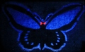
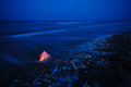
The Mothman Propheciesby DarkzedComment: not sure what this is, and it's hard to tell that it was painted with light. I think maybe there could be a more interesting crop or way of displaying this. upper left corner is dark, causing a distraction. nothing to really hold my interest for long. crop is too tight around the subject and subject is too centered. overall lacking in the 'wow' department. |
| 06/09/2007 05:11:51 PM |
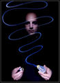
Set the light free by PanoComment: Love the point of this. The lack of focus in the hands really draws my attention downward away from the most interesting part of the image. Since the hands are brighter than the face, that's where my eyes go, and the face area is a more interesting section. Very neat concept for the photo, and well executed. |
| Photographer found comment helpful. |
| 06/09/2007 05:08:07 PM |
Steaming Hot !by karinnComment: Not really sure what I'm looking at here. There is nothing that catches my eye as interesting. my eyes wander around looking for the point of the image. the color is ok, but the photo in general is lacking something to hold my interest. sorry if i'm missing something. |
| Photographer found comment helpful. |
| 06/09/2007 05:04:42 PM |
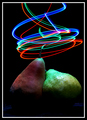
Forbidden Pear Loveby cryanComment: :) I like it. I like the lighting on the pears as well as the painted lighting above. You did an excellent job with the lighting on this one. Focus and clarity are also perfect. Nothing to complain about here. Very nice. |
| Photographer found comment helpful. |
| 06/09/2007 05:00:32 PM |
Painted Nudeby shankswareComment: This seems too dark for me. Hard to tell that the light has been 'painted' on or if it's just a stationary light source. i like the pose, and it's very tastefully done, only wish that the subject were a bit brighter. would love to see this in more detail. |
| Photographer found comment helpful. |
| 06/09/2007 04:54:35 PM |
Lily Lanternby WeatherGurlComment: Very pretty, I love how the flower stands out with the lighting. The background compliments the subject very well. Focus and clarity are great. I love how it's dark but for the flower. Makes it stand out wonderfully. There is nothing about this photo that I don't like. Excellent job. |
| Photographer found comment helpful. |
| 06/09/2007 04:49:22 PM |
Washing Ashoreby senor_kasperComment: That shell is huge compared to the other ones, looks almost unreal. I like how it stands out on the blue background. Colors are very nice. Rule of thirds plays nicely here and focus is good. Nice visually appealing image. |
| Photographer found comment helpful. |
Home -
Challenges -
Community -
League -
Photos -
Cameras -
Lenses -
Learn -
Help -
Terms of Use -
Privacy -
Top ^
DPChallenge, and website content and design, Copyright © 2001-2026 Challenging Technologies, LLC.
All digital photo copyrights belong to the photographers and may not be used without permission.
Current Server Time: 07/22/2026 05:28:50 PM EDT.