| Image |
Comment |
| 07/20/2005 12:32:31 AM |
|
 Photographer found comment helpful. Photographer found comment helpful. |
| 06/13/2005 12:52:09 AM |
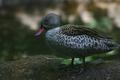
Petit Oiseau, Pourquoi Je T'Amour?by shabbychicComment: Hahaha the duck! That ducky has an adorable expression. I really like this. The only thing I would've suggested would've been to make it a bit brighter. Otherwise, you did wonderfully with the use of limited depth of field.
Hope you do well on this one :)
Hey, it won't let me make a vote! It's only letting me comment...Maybe it'll let me later. I'll come back to check soon.
Later: I'm not allowed to vote...I'm not a subscribed member. I'm sorry. |
| 04/10/2005 09:22:28 PM |
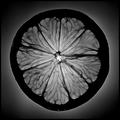
"O"by elsapoComment: Haha I like this. Very interesting, would have been funny if the background was yellow since it's a lemon. But that probably wouldn't have looked as cool. Neat idea, froggy. :p |
| Photographer found comment helpful. |
| 04/02/2005 12:33:42 PM |
|
| Photographer found comment helpful. |
| 04/02/2005 12:29:54 PM |
|
| Photographer found comment helpful. |
| 04/02/2005 12:26:12 PM |
Let Them Eat Cakeby TuckersmomComment: I love the colors and the composition on this. It's a really good concept. The only thing I would suggest is to be careful without the contrast around the butter and flour, it seems like that whites are being blown out a bit in that spot. Otherwise, nice work! |
| Photographer found comment helpful. |
| 04/02/2005 12:08:35 PM |
|
| Photographer found comment helpful. |
| 04/02/2005 12:08:08 PM |
|
| Photographer found comment helpful. |
| 02/19/2005 01:23:07 AM |
Kid at Heartby YellowpeepComment: Probably one of the best self-portraits I've seen so far. Nice composition, tones are perfect, and I love how the limited depth of field puts all but the bubble and left side of your face out of focus. It's a very cute concept, as well. Your eyes and expression convey the message very nicely, making the title believable.
Wonderful work. |
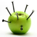
| 02/14/2005 07:13:09 PM |
Nailedby timluComment: Nice piece - love the color in both the apple and the nails.
Perhaps a different lighting direction could have added a stronger tone to the shot though, and by looking at it, it feels like you spent too much time thinking about the placing of the nails (I do that all the time when it comes to positioning in images). Also, to convey more pain, breaking the apple up a tiny bit would have added an interesting touch.
All in all though, it's a good image. Very nice focus on detailed areas and the white contrast is very flattering to the subject.
Good work :) |
| Photographer found comment helpful. |
Home -
Challenges -
Community -
League -
Photos -
Cameras -
Lenses -
Learn -
Help -
Terms of Use -
Privacy -
Top ^
DPChallenge, and website content and design, Copyright © 2001-2025 Challenging Technologies, LLC.
All digital photo copyrights belong to the photographers and may not be used without permission.
Current Server Time: 03/12/2025 09:34:46 AM EDT.