|
|
| Image |
Comment |
| 11/18/2009 02:58:24 AM | |  Photographer found comment helpful. Photographer found comment helpful. |
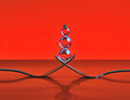
| 11/09/2009 08:06:37 PM | Best Friends by timfythetooComment: \
ETA: Not sure what that original \ was all about there. Apparently I was hitting backspace to maneuver around the challenge entries. Anyway, I love the emotion you captured here. They both seem very happy with the current situation. Congrats on the blue! Message edited by author 2009-11-12 13:35:48. | | Photographer found comment helpful. |
| 10/27/2009 06:31:27 AM | Good night.by MartyComment: Hey there from the Critique Club
Well first of all, WELCOME TO DPC. Its one of those places that you will love and hate all at the same time. Welcome and congrats on getting that first entry in!
My thoughts on the image: This is a nice start. While not scored over the midpoint yet, this is still a nice way to begin. I love the warmth you captured on the face of your subject. The subject is also nicely focused and crisp.
My ideas for improvement: I'd like to see a little better composition. While I am no stickler for the 'rules of photography' this one is a little too centered for my tastes. I think that I'd even like a square crop best on this particular capture, thus cropping off some of the emptiness on the left hand side of the frame.
Where I would have/did score this entry: In this particular instance, I agreed with the voters. I voted this one at 5, but it truly wasn't far from pulling a 6 or better. Nice work and again, WELCOME!
Thank you for the opportunity to provide a critique on your entry,
Eric
|
| 10/27/2009 06:11:46 AM | stoned immaculateby disassociationComment: Hey there from the Critique Club
My thoughts on the image: Very unique. Like you posted, this is your first experiment with light painting. It is a very fun and interesting concept once you get an idea of which light and exposures turn out which images. You now know what you did for this one and which results followed.
My ideas for improvement: Paint more faster and speed up that shutter a bit. Moving the light slowly and randomly produces vast differences in the light and exposure. Start out with an idea of what you want to paint, the experiment until you get a consistent result. The random movement of the light produced some interesting shadows, but it also left you with some very distracting, blow highlights.
Where I would have/did score this entry: I did vote on this particular challenge, and I scored you at 4. With that in mind, I was in agreement with the voters for the most part. However, this is an interesting start to a potentially strong image. You have a strong idea and a great subject. Now go shoot it again. That D100 paired with the 50mm 1.8 can yield you some tremendous images. That is still one of my favorite old cameras to break out here and there.
Thank you for the opportunity to provide a critique on your entry,
Eric
| | Photographer found comment helpful. |
| 10/27/2009 05:44:50 AM | Red-Bellied Black Snake Pops in to Say Helloby lccm_82Comment: Hey there from the Critique Club
My thoughts on the image: My eye immediately notices the relatively bright exposure of the overall image. While I do think that you meet the challenge, I think the there were some technical aspects of the image that could have surely been executed better.
My ideas for improvement: I am guessing that you are running that camera on full-auto mode. Am I wrong? My first suggestion for improvement would be to switch to manual and play with those controls. Looking through your first few entries, they all seem to have very similar mistakes. First and foremost, pay attention to your primary focal plane. With an image such as this, I'd like to see the primary point of focus directly on the eyes of the snake. Here, your focus seems to be on the ground be low the reptile. Practice with toning that flash down. Here, you relied solely on the flash itself to light the entire image. Open up that aperture, slow the shutter, up the ISO and let the flash provide a soft, gentle fill rather than such a harsh blast. I'd much rather see some warm tones of the surrounding, natural light rather than the flat, white light you produced.
On a different note, also take time to let the voters that have taken the time to comment on the image that their comments were helpful. We really like to have our little boxes checked.
Where I would have/did score this entry: I did vote and a gave it a 4. There are many areas for improvement from a technical standpoint that would help this vote grow considerably. Keep shooting and keep posting.
Thank you for the opportunity to provide a critique on your entry,
Eric
|
| 10/27/2009 05:30:56 AM | The Fruit Shop Ownerby ankursomaniComment: Hey there from the Critique Club
My thoughts on the image: Your image is full of vibrancy and interesting colors. My eye is immediately drawn to the various fruits and pulled into the image. The colors are terrific and captivating, which, as other voters have mentioned, is also the primary flaw of the image.
My ideas for improvement: This would have scored much better, in my opinion, with the owner cropped out and the image submitted to artificial lighting. DPC voters lover vibrant colors and seem drawn to them like mosquitoes to those bright, purple bug zappers. As mentioned earlier, the owner himself is difficult to find in the image. However, the fruit is lit with nice, even, artificial lighting.
Where I would have/did score this entry: I did vote on this one and it pulled a 5 from me. I like the flow of the image as well as the bug-zapping colors, but the challenge was missed in my opinion. Looking back at it now, I would have probably have hit it with a 4.
Thank you for the opportunity to provide a critique on your entry,
Eric
| | Photographer found comment helpful. |
| 10/27/2009 05:24:04 AM | Onwards!by BazlordComment: Hey there from the Critique Club
My thoughts on the image: You did a fine job meeting both ends of the challenge. You captured the into and out of very nciely. I also like the subject matter as it has a very different interest from images usually presented here. I also like your depth of field use in an attempt to hold the viewer's eye on the primary subject. There are, however, some technical and compositional flaws that I'd like to see addressed to make this a stronger image.
My ideas for improvement: Again, I like the subject matter, but I'd like to see the presentation just a bit different. The object at the bottom right of the frame is terribly distracting to my eye. I definitely need that cropped a bit better. Also, I would personally like to see a just a slight bit more space between the frame and his nose. Cropped as it is feels very tense. I also believe that the composition would have been a great deal stronger with a slight rotation in your point of view. I'd like to see the soldiers at the rear bleed over and off of the frame on the right side. Your lighting is also reversed from what you need it to be. A fill flash would have greatly helped hp;d my eye onto the primary subject rather than the brighter, busier background.
Where I would have/did score this entry: I did vote in this challenge, and this one hit me right in the middle of the road. I was one of your 71 5s for this one. There was a great deal of interest, and you did a fine job meeting the challenge well. There were just too many execution flaws in my mind's eye to pull a much higher vote from me. I think that the image, as it is, was scored fairly appropriatly by the voters.
Thank you for the opportunity to provide a critique on your entry,
Eric
| | Photographer found comment helpful. |
| 10/27/2009 05:11:21 AM | flight patternsby posthumousComment: Hey there from the Critique Club
Well, you just missed the sexy curve, and thankfully missed the brown as well. You ended up with a fat woman that has large breasts and very small ankles an feet. The image definitely has tension and interest, but the softness and business is somewhat difficult for my eye to linger on. I will say that the flow of the subject matter itself definitely keeps my eye wandering the frame. I always look forward to your entries. While not always 'DPC Friendly' they are never lacking thought and creativity.
Thank you for the opportunity to provide a critique on your entry,
Eric
| | Photographer found comment helpful. |
| 10/27/2009 05:03:57 AM | Ghostly Glowby mark082Comment: Hey there from the Critique Club
My thoughts on the image: I like it, and I see that you are on a pumpkin theme this month. Nice work, but I think that the exposure is just a little too low. I also agree somewhat with Patrick regarding the warmth.
My ideas for improvement: Let the exposure go for another second or two. Not only would this brighten up the pumpkin, it would also nicely light the rest of the image. Then, I'd cool down the white balance just a touch to take away just a little of the warm colors in the scene.
Where I would have/did score this entry: I did vote on this one and I gave it a 6. I like the concept, and I like the subject matter. It was a toss between a 5 and a 6 for me, but I gave the rare benefit of the doubt and tossed out a 6.
Thank you for the opportunity to provide a critique on your entry,
Eric
|
| 10/27/2009 04:57:44 AM | Ghostly Skaterby dustingoodingComment: Hey there from the Critique Club
My thoughts on the image: You had the beginning of a very neat and interesting image here. The concept is terrific, but there are some obvious flaws in execution, in my opinion. I agree with all the comments below except for the perfect composition.
My ideas for improvement: Agreeing with Steve, the background is a bit too busy for my eye to be happy hanging out in the frame. Perhaps rotating your point of view more towards the front of the subject would have remedied this. Of course I can;t be sure as I have no knowledge of the surroundings, but I think a slightly different point of view would have grown the score. Some rotation would also take away the distracting tree and bright light in the top left corner. Also, my eye wants to see the entire skater. Chopping off his head places this more in the realm of an accidental snap shot rather than an intentionally composed work of art.
Where I would have/did score this entry: I did vote in this one and I gave it a harsh 4. However, with some moderately easy compositional changes, this one would have surely pulled a 6 or 7 from me. I love the concept, but your execution needs some adjustment.
Thank you for the opportunity to provide a critique on your entry,
Eric
| | Photographer found comment helpful. |
Home -
Challenges -
Community -
League -
Photos -
Cameras -
Lenses -
Learn -
Help -
Terms of Use -
Privacy -
Top ^
DPChallenge, and website content and design, Copyright © 2001-2025 Challenging Technologies, LLC.
All digital photo copyrights belong to the photographers and may not be used without permission.
Current Server Time: 04/21/2025 06:11:11 PM EDT.
|