| Image |
Comment |
| 05/09/2005 05:07:44 AM |
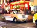
Sorry, busyby mimidComment: The driver and unique shape to the taxi makes this shot. Colours are good, and movement creates interest. Perhaps just a tad to many blown highlights draw too much attention from the subject to different parts of the frame, but hard to control in shots like this. Solid entry... |
 Photographer found comment helpful. Photographer found comment helpful. |
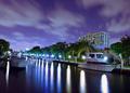
| 05/09/2005 02:28:28 AM |
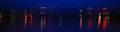
Albion Riverby doeboe616Comment: Nice picture and interesting colours. Controlling the blowout on the house would have ensured a better score I feel. |
| 05/09/2005 02:26:10 AM |
|
| Photographer found comment helpful. |
| 05/08/2005 10:47:18 PM |
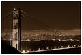
San Francisco by gaurawaComment: Good choice on the sepia. I would have considered cropping slightly more off the top. Some distracting lights in the detract a little from the overall feel. Otherwise an excellent submission - very well done. 9 |
| Photographer found comment helpful. |
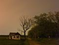
| 05/08/2005 10:07:36 PM |
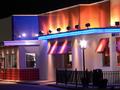
Study in Pastelsby joe_minerComment: Great colours and good exposure. Given there is no sense of pattern I think it could have been enhanced by a clear subject. I know it was probably unavoidable, but I do find the bright light distracting in such a prominant postion in the frame - but nevertheless you have achieved a good result. Well done. |
| Photographer found comment helpful. |
| 05/08/2005 10:04:04 PM |
canal nightsby plongcamComment: Very classy... Well done. I like the colours and the tones - the tilt to the image gives good dynamic feel and I think it works for this image. 9 |
| Photographer found comment helpful. |
| 05/08/2005 09:56:15 PM |
The evil nightby umbroComment: I think that cropping the right hand portion of the frame would have enhanced this shot. A square format would also have helped I think. Overall a nice shot, good tones for the subject, and good exposure. |
| Photographer found comment helpful. |
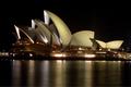
| 05/08/2005 09:37:50 PM |
The show is onby psychephylaxComment: Ahh... My home Sydney! You get my vote on nostelgia alone! Can never see enough of the Opera House... |
| 05/08/2005 09:35:46 PM |
|
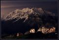
| 05/08/2005 09:32:23 PM |
Mt. Timpanogosby fifieldComment: Nice image. I feel the exposure on the rocks in the foreground is slightly too high in comparison to the background, but the mountains look great in moonlight. Well done. 7 (├āŹ'm a hard marker!) |
| Photographer found comment helpful. |
Home -
Challenges -
Community -
League -
Photos -
Cameras -
Lenses -
Learn -
Help -
Terms of Use -
Privacy -
Top ^
DPChallenge, and website content and design, Copyright © 2001-2025 Challenging Technologies, LLC.
All digital photo copyrights belong to the photographers and may not be used without permission.
Current Server Time: 03/12/2025 09:18:48 AM EDT.