| Image |
Comment |
| 07/20/2005 12:37:24 AM |
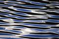
Of A Good Hatby holdingtimeComment: This picture doesn't adress the challenge very well, I think. Colors are also washed out and composition has too many distracting elements. It is an interesting shot, though. |
 Photographer found comment helpful. Photographer found comment helpful. |
| 07/20/2005 12:31:54 AM |
Throwing in the towelby jaxterComment: The execution is good, but the subject, for me, is just too boring. I'm not sure how you could make this look interesting. |
| Photographer found comment helpful. |
| 07/20/2005 12:30:24 AM |
liquidby rhipsterComment: very simple and very good. maybe it's too simple, looks like it could have been a painting. Did you maybe push the contrast too much? I feel like it's missing a bit some connection to reality. But, I like it. |
| Photographer found comment helpful. |
| 07/20/2005 12:25:40 AM |
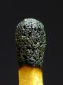
Burnby zumba666Comment: I think the execution of this picture is perfect, but the subject is just not very interesting for me. |
| 07/20/2005 12:24:32 AM |
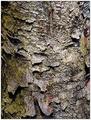
Bark - Ruff Ruff?by james_soComment: I think it's a good choice of subject, but the pic lacks something that would 'draw me in'. Maybe it's the contrast. |
| Photographer found comment helpful. |
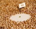
| 07/20/2005 12:21:26 AM |
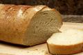
Crunchy on the outside, Chewy in the middleby ruffianComment: The pic doesn't reveal the textures of your subject very well. You should also avoid blown highlights, which in your case predominate the slice of bread, like the plague. They can really kill an otherwise good picture. |
| Photographer found comment helpful. |
| 07/19/2005 01:51:21 PM |
Close To Homeby hockaleesComment: Very nice! I really like the color contrast in this image, the brown skin against the green grass really makes the kangaroo pop out. Did you do a lot of post-processing? II think the tail of the kangaroo on the left distracts the attention too much, but I guess you didn't have many options here. Anysway, this is a very good pic. |
| Photographer found comment helpful. |
| 07/19/2005 01:29:00 PM |
The Last Stanceby CamComment: Kind of funny and good execution. I would have dropped the flag, though, or placed it out of focus. It distracts. |
| Photographer found comment helpful. |
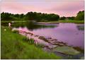
| 07/19/2005 01:26:21 PM |
|
| Photographer found comment helpful. |
| 07/19/2005 01:25:06 PM |
flying freeby ursulaComment: Nice Idea and good execution. The model looks a bit terrified, though. |
| Photographer found comment helpful. |
Home -
Challenges -
Community -
League -
Photos -
Cameras -
Lenses -
Learn -
Help -
Terms of Use -
Privacy -
Top ^
DPChallenge, and website content and design, Copyright © 2001-2025 Challenging Technologies, LLC.
All digital photo copyrights belong to the photographers and may not be used without permission.
Current Server Time: 03/12/2025 03:58:19 PM EDT.