| Image |
Comment |
| 11/10/2011 05:50:22 PM |
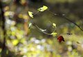
Caught in a Spiderwebby MaryOComment: I like it. While the blown highlights certainly contribute to the 'sunny day' feeling, a bit more detail in the leaves would have been pleasant. If the dark border on the left side would have extended to the bottom, it would have helped mimicking the shape of the golden spiral. I wonder if changing ange would have allowed that. |
 Photographer found comment helpful. Photographer found comment helpful. |
| 11/10/2011 05:43:59 PM |
Red in blueby vtruanComment: Interesting, I like the negative blue space and the red attire certanly gives presence to the axe man. A closer crop, resolution permitting, might have served the golden ratio principle better. Also, but really this is my personal opinion, I kind of prefer this kind of shots to be either more blurred for the movement or tack sharp (possibly with drops of sweat frozen mid air, ok, that's probably asking too much). |
| Photographer found comment helpful. |
| 11/10/2011 05:37:52 PM |
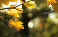
Goldenby colorcarnivalComment: Nice bokeh. As the focal point of the spiral is on the bottom left leaf, and the shot plays on leaves definition versus extreme bokeh, a slightly different angle to exclude the out of focus twig on the left would have worked better for me. |
| Photographer found comment helpful. |
| 11/10/2011 05:33:34 PM |
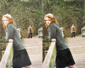
Special Momentsby BenstedComment: Nice autumn colours. Is she wondering at the falling leaves? The colours on jackets and trousers lack of details and look a bit unnatural, maybe a bit of of underexposure to receover in postprocessing could have helped in that and also in preserving detail in the highlights. The white cloth on the wall is a bit distracting. |
| 11/10/2011 05:27:41 PM |
Frozen Spiralby Snowboard3rComment: Nice and a rare find. I wonder if a more angular lighting could have made for a more dramatic image, possibly underexposing a bit to keep more texture in the ice. Also, while I guess that in a large print this would be less of a problem, at this resolution a more out of focus background would have helped a lot defining the spiral further. Very interesting image. |
| Photographer found comment helpful. |
| 11/10/2011 05:19:39 PM |
Motionby MightyPirateComment: Interesting idea. I like the sense of movement and the speckles of ice cream but I think it would have worked better with the bat (cricket? croquet? uhh) more blurred and leaving a trail (slow shutter speed and flash perhaps?). This way, also because the left side of the bat is in focus and the ice cream is on the right side, it gives me the weird feeling that the bat is swinging back towards the left. Independently from the subject of the challenge, cropping so to leave more space on the right (for the ice cream to fly) would have made for a more effective image, in my opinion. Including a two hands grip and a bit of the forearms would have also made the blow look more forceful (poor icecream :) |
| Photographer found comment helpful. |
| 11/10/2011 04:45:44 PM |
Lighthouse windowsby WhebbComment: Interesting texture and composition. A bit more detail in the highlights and definitely more brightness in the sky would have made for a better image, in my opinion. |
| Photographer found comment helpful. |
| 11/10/2011 03:14:11 PM |
Come sit a while...by stphqComment: Repetitive patterns are often interesting, but in this case I find the alignment of the benches and perspective compression work against stressing the pattern. I personally find the misalignment of the benches to be somewhat attractive, like a disconnected path, but I do not find the image particularly strong. I wonder if it might have worked better by including more of the road vanishing in the distance, possibly including an approaching figure suggesting someone will eventually sit. |
| 11/10/2011 02:37:03 PM |
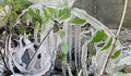
Symphony of Colorby sfaliceComment: Interesting idea, perhaps more of a melody of color than a symphony, given the prevalent hue. I am not necessarily a manic with focus when soften serves a purpose, however in this case I find that the out of focus at the extremities of the flower detracts for the image, particularly because the blur is very digital in look. Perhaps, a bit more depth of field, if achievable, would have improved the image. I am not 100% sure this framing actually works. Possibly, having lines and flower to curve back into the frame would have helped. |
| Photographer found comment helpful. |
| 11/09/2011 09:04:54 AM |
Untitled-1by ScooterMcNuttyComment: I love this, it's a very nice take on the 'two in the portrait' theme, if there is such a thing :) |
| Photographer found comment helpful. |
Home -
Challenges -
Community -
League -
Photos -
Cameras -
Lenses -
Learn -
Help -
Terms of Use -
Privacy -
Top ^
DPChallenge, and website content and design, Copyright © 2001-2025 Challenging Technologies, LLC.
All digital photo copyrights belong to the photographers and may not be used without permission.
Current Server Time: 04/22/2025 02:34:57 PM EDT.