| Image |
Comment |
| 02/17/2006 01:07:59 PM |
|
| 02/17/2006 01:03:40 PM |
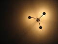
Ceiling lightby riceacigarComment: Ummm...huh? Not really sure what this has to do with. Nice off center placement though... |
 Photographer found comment helpful. Photographer found comment helpful. |
| 02/17/2006 12:58:48 PM |
|
| Photographer found comment helpful. |
| 02/17/2006 11:04:43 AM |
How Muchby cools98Comment: Greetings from the Critique Club
In the future, it's very helpful for the critiquer if you comment on your picture (look in the CC forum). It's hard to give suggestions when we don't know what you were shooting for, etc...
Composition:
I like the angle of the subject since it presents diagonal lines leading the eye into the picture.
Lighting and Technique:
I'm confused by the small aperture, long shutter speed, and small DOF. In any case, the lighting on this is a little strange since the reflections on the corners of the shapes draw my attention to the reflection instead of to the subject.
Post-Processing:
Sharpening looks good, brightness and contrast are good.
Suggestions/Improvements:
The small DOF effectively locks my eye to the center of the picture but there's no real interest there. If you had made the DOF a little larger so the OOF areas gradually going out of focus I think this would've worked better.
It's hard to tell what this was lit with (looks like a ring flash or a ceiling fan), but I think bouncing a flash to get a diffused source would've helped prevent the distracting reflections.
I hope this was useful to you, and please feel free to contact me via PM if you have any questions regarding this critique.
Regards,
Zeke Smith Message edited by author 2006-02-17 11:08:05. |
| Photographer found comment helpful. |
| 02/16/2006 04:19:12 PM |
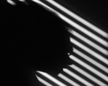
Blindedby banmornComment: Greetings from the Critique Club:
I have to start by saying I'm very surprised this didn't do better in the competition. I think it's a very creative shot with great technical aspects and fits the challenge perfectly. In any case, on with the critique.
Composition:
The positioning of the diagonal lines from the blinds is excellent as they lead the eye to the subject of the shot. The position of the subject at about the golden position is also very good and has a nice balance for the shot. Great job.
Camera Work:
Great work with the multiple exposures to find the one that fits the best...hard to say anything else here since everything is a shadow.
Post-processing:
The level of the shadows is great...it's a little odd that your shadow seems darker than the blinds (must be white blinds that don't totally block the light). Overall brightness is very good except for the slightly hot spots under your chinand above your head. I think bringing down the highlights a little would've helped even that out some.
Looking through the results, it seems that most of the high rated shots involved both the shadows and what cast them. My suggestion for the future would be to put as much interest in the shot as you can...while technically this shot was quite good, I feel it's lacking something to draw the viewer in and keep them interested.
|
| Photographer found comment helpful. |
| 02/16/2006 02:51:20 PM |
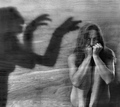
Fear Of Your Own Shadowby JudiComment: Greetings from the Critique Club:
Composition:
The subject's placement in the shot is very good. I would've preferred the body of the shadow to be a little more prominent since it's cut off on the side but it works well. Everything leads my eye into the shot and the shadow's arm leads me to you so that worked out very well.
Camera Work:
The lighting is very even and the choice of the wood grain background works out very well. One thing I'm distracted by is the fact that I can see the grain through your body. It does make it look dreamy but I would've liked to see you more solid. This could've been accomplished with 2 flash pulses instead of a well lit long exposure.
Post-processing:
Contrast and brightness look good and the B&W looks very nice. The burning of the shadow looks a little blotchy though. Some areas are almost completely black while others are dark grey.
Overall I like this shot. The emotion displayed on your face really interests me in the shot so you did what you were trying to do. My main comments for improving the shot (and I could easily be wrong) could've been achieved by strobing a flash so that you weren't so transparent. Congratulations on your top 20 finish. |
| Photographer found comment helpful. |
| 02/16/2006 02:05:35 PM |
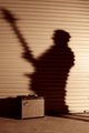
Shadows of Garage Grungeby fotomann_foreverComment: Greetings from the Critique Club:
Composition:
Overall pretty good...only criticism I have is that the angle of the guitar keeps leading my eye out of the shot. Nice position of the amp and main shadow so that works well.
Camera Work:
Exposure looks good. Lighting is uneven on the background (difficult, but in this case I think distractingly so as I keep getting drawn to the bright region at your back). Focus is on and impressive for a self-portrait.
Post-processing:
I like the sepia tone of the shot as I feel it adds some grunge that with color or pure B&W might not have been there. I actually think you could have successfully added some grain to this shot to make it feel a little grungier as well.
Overall I like the concept and the picture is pretty good. It lacks punch though as nothing is jumping out and making me stare for a long time. Main distractions that would help with making it better for me would be getting rid of the hot spot on the background and repositioning so the neck doesn't lead me out. Otherwise, nice job. |
| Photographer found comment helpful. |
| 02/15/2006 12:50:04 PM |
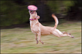
Almost...there...by cresusComment: I wanted to thank everyone for their great comments. As for how many tries it took...I'd say probably about 50. So if it weren't for my obsessive compulsive dog I'd never have been able to get this shot. I'm happily suprised at how well this did. Thanks again. |
| 02/09/2006 12:09:49 PM |
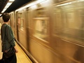
Subway Blurby ARMY_DOCComment: Motion panning is panning the lens not blurring a moving subject. |
| Photographer found comment helpful. |
| 02/09/2006 12:09:08 PM |
againby fouadComment: I don't understand why this would even be entered in motion panning. |
Home -
Challenges -
Community -
League -
Photos -
Cameras -
Lenses -
Learn -
Help -
Terms of Use -
Privacy -
Top ^
DPChallenge, and website content and design, Copyright © 2001-2025 Challenging Technologies, LLC.
All digital photo copyrights belong to the photographers and may not be used without permission.
Current Server Time: 03/11/2025 01:50:29 PM EDT.