|
|
| Image |
Comment |
| 01/18/2004 06:48:53 AM | "Hockey in Motion"by fredrojComment: Greetings from the Critique Club
Initial thoughts/My opinion
Great action in this particular scene. The left player could be sharper and the image somehow comes short in colour and crispness.
Content/Composition
There is no sport with more "Action" than hockey, so you selected an excellent topic. Also how the image is cropped is well done: enough space on the left so that the player in focus can move somewhere and just right at the right side, showing the blurred player rushing into the scene. Top and bottom also well cropped.
Also taking away the referee was a good choice: it reduces the elements the viewer has to look at to the minimum.
So content- and compositional-wise very well done.
Camera work -technically
Panning works just great and focus seems to be good too. You probably did the best that can be done regarding the exposure in this complicated light situation: the left player is a little dark, but a higher EV-setting would lead to a loss in the details on the ice. So also well done here.
Digital Processing - Technical
To me you could have improved the image digitally by selective sharpening of the left player and applying a bit of blur to the rest of the image. In this way you could have lost the graininess of the background too. I tried to apply "smart-sharpening" to the image and also blurred the back: works well, although it does not make a completely different image, just strengthen its intention.
If you are interested, I can show you the result.
Fits the challenge
Yeah, the image does it very well.
Good luck for your further submissions
|
| 01/18/2004 06:24:44 AM | Flash Photographer At Workby GeneralEComment: Greetings from the Critique Club
Initial thoughts/My opinion
While the ceiling was shown when it loaded the first time I thought: that's an interesting place of great leading lines and structure and I looked forward what would be at the end of the ceiling. Was disappointed when I finally looked at the harsh, blue flash and the peoples and chairs.
Content/Composition
Of course there is action in this image due to the flash. However, this action and the place don't fit well in my eyes: the exhibit is a place of silence and contemplation, whereas the flash is an element of disturbance, harshness. Such a contrast might of course be an interesting compositional elements, but to me it did not work well in this case. That is probably due to the fact that the two elements are not well balanced and especially that the exhibition hall isn't too quiet due to the people. It's at that moment already very busy even without the flash photographer.
Something that might have worked better here is to focus on the movement of the people rushing through the hall: that's an often seen action in museums that is simply contradictionary to the intention of places like that.
Camera work -technically
The image looks not sharp were it should be: only the upper portion of the ceiling is fine, the rest is a little too blurred. Was it a handheld shot? Exposure seem OK, maybe a tad too dark.
Digital Processing - Technical
I'm honestly not a big fan of the blue hue of the flash: a flash is by itself already cold enough and the blue colour makes it even colder and also look too unnatural. I would thus have changed the colour digitally. Cropping works well, you might have considered rotating the image a bit clock-wise.
Fits the challenge
Somehow yes, but to me it's more "disturbance" then action itself.
Good luck for your further submissions
|  Photographer found comment helpful. Photographer found comment helpful. |
| 01/18/2004 05:52:14 AM | Learn To Play.........by tolovemoonComment: Greetings from the Critique Club
Initial thoughts/My opinion
Fits the challenge very well, composition too straight and too small.
Content/Composition
You did choose a great subject: the accordion is a very nicely looking instrument and wanting to learn it is of course a good "New Year's Resolution". Also showing some music books is a good idea (from those I would have taken only the three top once: they have a simple, clean structure).
The image comes short in the angle of view to the accordion. The instruments has so many interesting shapes (the keyboard, the buttons etc.) and so interesting textures (the opalescent surface with its colourful reflections) that a close-up, maybe along the keyboard with a well set light and the books making a colourful background, would have done way better.
Camera work -technically
Exposure seems right on the accordion, the books however are somewhat underexposed. It looks to me as if flash has been used, something that has to be avoided under almost all circumstances. Focus is fine, however, that's hard to judge due to the small size of the image.
Digital Processing - Technical
Beside the small size of the image, some more sharpening might have been helpful to overcome the exposure issue: sharpening usually brighten up an image without loosing details in the bright regions.
Fits the challenge
Yes, fits very well: it's a real resolution and you can probably achieve it in contrast to some non-smocking resolutions:)
Good luck for your further submissions
|
| 01/18/2004 05:32:44 AM | Mr. Lebowski's Swim Lessonby SirBiggsALotComment: Greetings from the Critique Club
Initial thoughts/My opinion
Great idea: very different to other water images, has some technical and compositional shortcomings, leading to a lag of WOOW-factor.
Content/Composition
The content is just great: The water surface you show us is full of vibration, texture and live: very dynamic, full of action and life.
In Germany there is a saying "Storm in the water glass" and in means "making a big fuzz about something very unimportant". Your image shows this very well.
The composition comes somehow short at several points. The water glass you choose isn't very attractive: a simpler one with thinner glass and without any structure (by that I do mean the shape at the bottom) would be better. The angle of view and the cropping might be improvable too, however, I can't tell in which direction to go, one simply has to try it. The droplets flying around are also a problem: in the image they are not strong enough to make an important compositional element, so it would be better to either not showing them or increase them much more to give them an importance equivalent to the water surface.
One main point is the colour and light: there is some colour shown and that is important. Without it, i.e. B&W, the image would be very flat. I would have strengthened colour by using light reflected from coloured paper or so and also by a coloured background (the later might not work though). That would have increased the dynamic of the image considerably. Of course the glass rim would show this colouration too, but with a better glass this would have made up just a probably nicely coloured line. Right now the red at the left rim just does not look nice, looks more like dirt.
Camera work -technically
Exposure seems fine, but it's hard to tell here, because the exposure is the main control to get the texture on the busy water right. Focus seems fine too, although not of great importance here.
Digital Processing - Technical
The image looks a little over-sharpened to me, otherwise fine. As mentioned: I would have used a different cropping. Negative space is not of importance here IMO.
Fits the challenge
Yes, for sure.
Good luck for your further submissions
| | Photographer found comment helpful. |
| 01/17/2004 05:31:17 PM | |
| 01/15/2004 03:36:35 PM | | | Photographer found comment helpful. |
| 01/15/2004 11:44:28 AM | Exhuberanceby amsmythComment: Hi Anne;
Congrats to this image: it has a great play of color, shapes and lines. I do like the composition very much, especially the window frame in the background and that it is titled relative to the lines coming from the branch.
Maybe just cropped a little different on the left side though.
Regarding the noise issue I have send you a PM,
Jörg
|
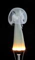
| 01/15/2004 05:08:28 AM | Fingering Ghostby kiwinessComment: Great creativity Gary. hope you didn't cut yourself when taking the bulbs apart. Did you use full voltage, i.e. 220V, or did you use a dimmer? How long does it take between switching on the lamp and before is burned out?.
Jörg | | Photographer found comment helpful. |
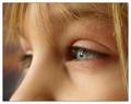
| 01/15/2004 03:15:16 AM | A whole life aheadby Harz_JoergComment: Thanx for all your votes and kind remarks on this image, making it the 12th place in this superb contest.
I'm very, very happy with the outcome.
I'm also happy to see that my G3 is capable to make great, SLR-like shots right out of the camera.
Thanx again.
@Kiwi: that's somehow true and somehow not: to get our little one in front of the camera is often very hard, taking this particular picture not at all. I just asked her if I could take a picture of her eye and I was allowed to take just one. I was amazed by the light and quality myself. A large format copy hangs already on our wall. Message edited by author 2004-01-15 05:53:07. |
| 01/15/2004 02:21:46 AM | Chairman of the Board by crabappl3Comment: Congrats for the blue ribbon!
And as stated below a good example how the new member rules enhance an image and not make it digitally looking at all.
Jörg | | Photographer found comment helpful. |
Home -
Challenges -
Community -
League -
Photos -
Cameras -
Lenses -
Learn -
Help -
Terms of Use -
Privacy -
Top ^
DPChallenge, and website content and design, Copyright © 2001-2025 Challenging Technologies, LLC.
All digital photo copyrights belong to the photographers and may not be used without permission.
Current Server Time: 04/10/2025 10:13:35 PM EDT.
|