| Image |
Comment |
| 08/31/2011 07:55:27 PM |
|
 Photographer found comment helpful. Photographer found comment helpful. |
| 08/31/2011 06:16:04 PM |
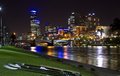
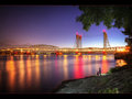
Classic Melbourneby LadComment: That water almost looks like ice! Very nice colors and composition. Love the bridge separating the picture into two very different worlds. A nice foreground to contrast the skyline with. |
| Photographer found comment helpful. |
| 08/30/2011 07:19:09 PM |
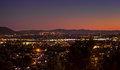
The "Burbs"by dtallaksonComment: The nice and subtle color gradient is lovely and adds interest to the night scene, but I don't see any strong subject or narrative. Also, the half and half division of the pic is not very pleasing. Would've loved the horizon at a third of the pic so that either the city or the sky would've dominated and become a subject to the picture. |
| Photographer found comment helpful. |
| 08/30/2011 07:16:50 PM |
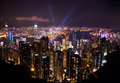
The City of Melbourneby Kel73Comment: What an interesting tower in the left. My eye is immediately drawn to it and am slightly disappointed that its reflection got cutoff at the bottom. Would certainly look better with it I think. The colors are nice and the sky has a bit of added interest to boot. The red on the right is slightly distracting from the rest of the nice skyline. |
| Photographer found comment helpful. |
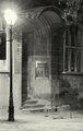
| 08/30/2011 07:10:12 PM |
Too late to Shopby BpzzrComment: Someone was frustrated! :)
The conversion to Black and White is a good idea - it makes us notice the 3 main elements in the picture without getting distracted by the yellow color cast. Makes me look for a story behind the scene.
However, it doesn't quite say City to me - not talking about technicalities, but just the feel of it. Good luck. |
| Photographer found comment helpful. |
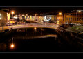
| 08/30/2011 06:53:27 PM |
Night lightingby NiallOTuamaComment: Interesting that the bridge reflection shows an S-curve while the bridge doesn't. Very nice night scene of a quite canal street. The border does it a disservice though - and throws the composition slightly off-kilter. |
| Photographer found comment helpful. |
| 08/30/2011 06:49:30 PM |
San Diego by seethroughmylensComment: The wonderful colors on the buildings make me want to see it in full resolution. I wouldn't have minded a crop of this with more height, just so I can see more details. Right now, it just leaves me thirsty for more without completely wowing me. Still, darned good. |
| Photographer found comment helpful. |
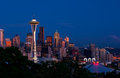
| 08/30/2011 06:40:00 PM |
The Emerald Cityby cabaComment: The classic postcard...
Would've liked some more room on the right to give some breathing space to Mt.Rainier.
Simply love the colors..
Sticklers for "Well after the Sun goes down" might object to the orange sky reflections in the tops of the buildings - Good luck. |
| Photographer found comment helpful. |
| 08/30/2011 06:34:03 PM |
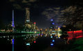
Jewel of the Cityby AllenPComment: I see all the basics of a good picture here though it might need a slightly different composition to stand out as one.
A tighter crop might help make the subject appear more as a jewel of the city. Right now, it's kind of lost, almost a distraction from the skyline. Also, the division of the picture into 2 equal halves - an empty top half and a busy bottom half doesn't make it feel balanced. |
| Photographer found comment helpful. |
| 08/30/2011 06:29:30 PM |
Urban Lifeby william88Comment: Wonderful! Seeking peace and calm in the midst of a bright and busy life... Love it! |
| Photographer found comment helpful. |
Home -
Challenges -
Community -
League -
Photos -
Cameras -
Lenses -
Learn -
Help -
Terms of Use -
Privacy -
Top ^
DPChallenge, and website content and design, Copyright © 2001-2025 Challenging Technologies, LLC.
All digital photo copyrights belong to the photographers and may not be used without permission.
Current Server Time: 04/18/2025 10:28:51 AM EDT.