| Image |
Comment |
| 01/10/2007 02:23:26 PM |
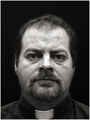
Give Us This Dayby james_soComment: Looks incredible pixelated.. and it doesn't fit with his face (too little wrinkles,..)in my opinion (vote=4) |
 Photographer found comment helpful. Photographer found comment helpful. |
| 01/10/2007 02:19:50 PM |
My Grandaughterby CraftyComment: I like the whole idea. The umbrella works well with the lady. But technically the composition is wrong and i feel it in the end result.. meaning: she looks to the left, you have the umbrella leaning to the left, yet you give no place to either of them. You have so much space to the right, why not move your granddaughter up to the right and as such give more space to the look, as well to the umbrella which is presently cut off.
The lighting is spot on.. very nicely toned.
I get the impression you really searched and found the right person for this challenge. Just that small detail of composition.. vote=6 |
| Photographer found comment helpful. |
| 01/06/2007 05:47:39 AM |
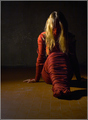
Fence in her rebellious spiritby shoggyComment: I like the shot, but i don't see the fence in it.. her dress but how? I simply don't get it. vote = 4
Edit:
"Maybe it was my mistake on translation (i'm italian, ..and sorry for my bad english in this few rows.. :P ), but i meant as fences anything that wrap or frame something. this is why i've searched something different that cage a cow or that is around a house."
Thanks for this reply, because it helps me to understand where you come from. Words can mean different things in different languages and i for one think we should take that into account. So as you understand fences as something to wrap or frame something, i'll look at your shot in that way.
Your title indicates that she is rebellious, so i expect her to fight the wrapping, to fight against her limits. I don't see that. I see her sitting passively and that actually destroys the impact of the wrapping.
As to the light: you have something strange going on, you have blueish tints in her dress, hair and even on the ground (at least on my screen) and there doesn't seem to be an explanation for it. I think a bit of postprocessing would have helped you there.
I do like the idea very much, but i would have liked to have seen you go all the way (fighting against her bounds). Vote=6 |
| Photographer found comment helpful. |
| 01/06/2007 03:30:07 AM |
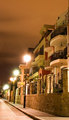
East Perthby MrDarcyComment: The fence is not among the first couple of things i notice when looking at this shot. I do like the idea of a night shot, but here you took the whole of the building and street effectively hiding the fence.
vote=4 |
| 01/06/2007 03:28:46 AM |
division...by HairlessmanComment: I feel that there is too much white-isch sky in your image. Also you have a high contrast throughout your image, which should bring out the dark fencepoles better, but the first one doesn't pop out against it mixed background. I know that this sound like a contrast to my previous statement of too much white. But if you wanted to go for the white sky, go for it all the way, so kneel when taking this shot and get also this first pole against the sky and not the ground. Or don't go for it at all. In the last case, a better dof, here small focused area would help bring out the poles against a very blurry background or maybe color - non color would have been better to bring them out of the buzzy background.
vote=4 |
| Photographer found comment helpful. |
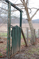
| 01/06/2007 03:19:50 AM |
Green gate in fenceby astonerComment: Too small for me to really judge, but in short:
A burned out sky, which is very noticeable. It attracts the most attention and not the focus, which i think is the green door. If you would have nice sunlight falling on the door, it would attract more attention, because the sky would probably not have been burned out. Also it would have given a warmer feel to the image.
The green door: maybe it has an interesting structure, but i can't see it because your image is too small.
Composition: the door is nicely put, but i can't see the fence sufficiently to get a sense of depth around the door.
vote=3 |
| Photographer found comment helpful. |
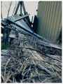
| 01/05/2007 02:19:57 PM |
Washed Away by hurricane katrinaby haydawlinComment: The focus is on the part swinging up, but to fit your title more, i think it would have been better to be in focus on the bottom part. Here are roots, branches,.. cluttering the fence so it gives a more chaotic feel, which would be cleared up by the slightly out of focus part of the fence which is still trying to stand straight. That way the impact would come from the cluttered part, which would be stronger in my opinion.
I very much like your color use.
vote=6 |
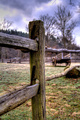
| 01/05/2007 01:55:42 PM |
Holding Back the Pastby JawnyRicoComment: I think i would have tried a horizontal composition, with the fence wood at a third to the left and the wooden car-thing, still out of focus but at another third to the right. Now you have a very nice wood in the center, which leaves too little place for the wooden car to breath.
Love the sky.
(vote=5) |
| Photographer found comment helpful. |
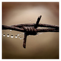
| 01/05/2007 01:49:29 PM |
An Unusual Juxtaposition by mpetersComment: I would like to see a bit more off centered composition, where i can see more of the bigger drops to the left because they give this image its nice contrast nature - human. Still the color and weathered look is very nice. (vote=8) |
| Photographer found comment helpful. |
| 01/05/2007 01:45:13 PM |
fEnCE - [tHe GraSS IsN'T aLWayS GReEneR]by surfinbirdComment: I love the look of the wood, so great timing to get the shot. However i feel it is too low in the image to give it the attention it deserves. It has so much potential for giving a great feeling to the shot and it's only in the lower half and you have so much empty sky above it. Position it a bit higher would fill the photo a bit more, without loosing the foggy, cold feel.
Personally i would also have placed the wood just a tiny bit more to the right so i could get a bit more depth feel by seeing the second post a bit better.
I love the atmosphere you captured, but i also feel you've lost some of its impact by not placing it a bit more prominent in the image. (vote=6) |
| Photographer found comment helpful. |
Home -
Challenges -
Community -
League -
Photos -
Cameras -
Lenses -
Learn -
Help -
Terms of Use -
Privacy -
Top ^
DPChallenge, and website content and design, Copyright © 2001-2025 Challenging Technologies, LLC.
All digital photo copyrights belong to the photographers and may not be used without permission.
Current Server Time: 03/12/2025 07:51:18 PM EDT.


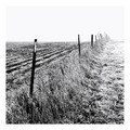
![fEnCE - [tHe GraSS IsN'T aLWayS GReEneR]](https://images.dpchallenge.com/images_challenge/0-999/609/120/Copyrighted_Image_Reuse_Prohibited_445762.jpg)