| Image |
Comment |
| 12/26/2006 08:19:13 AM |
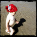
wALkiNG oN sUNshiNEby LOWLANDSComment: Composition-wise, he's standing on a strong line in a photo, at a thirds and you indeed us the other two-thirds good by accommodating his look towards the ground. It's a shame the foot is not on it, because that is kinda painful to watch.
Lightwise.. this is where i personally feel it doesn't all work out for the best. A human tends to look at the whitest parts first and here that is the out of focus shoulder down to the legs. The part that needs to get the attention, the face, is out of the light and as such doesn't attract the attention it should.
The focus on the contrary is dead on. The face is sharp, sadly enough the attraction-getting of this dof, is lost by the white glow on the other parts of the body.
So you have two strong elements, composition and dof, but to my personal feeling a lot is lost because of the light.
|
 Photographer found comment helpful. Photographer found comment helpful. |
| 12/22/2006 06:00:27 PM |
Red2.jpgby w0fcmComment: I'm going to comment here from how i would like the result to be, which might be different from yours.
First of all, the choice of red on black is usually great because they give a great contrast to each other and improve each other. However the red of the dress in my opinion detracts from the red of the hair.
Secondly the light on her is very nicely balanced out so that the skin tone is nicely kept throughout. And here i would have chosen something else. I would have tried to emphasized the look of her, by confining the light more to her face and not a nicely balanced light throughout. A more confined beam from high right would have brought out the face more and thus emphasize the look in my opinion. Also the red of the dress would be less present and thus allow the red hair (which would be in the light also) to shine more.
Lastly i really like your idea of a child looking to something and to get her to do it in a studio is amazing. I hope to see more of this. |
| Photographer found comment helpful. |
| 12/20/2006 11:33:56 AM |
Wahine Sunset.JPGby MelonMusketeerComment: This is exactly taken at the right time. Nice warm colors, which aren't whitened out because of the sun being too bright. The boat makes for a nice silhouette against the colors.
However i think this might have been a bit better if you walked more to the left so you could get the brightest sky-area in the same line (vertically speaking) as the boat. This would eliminate the black area, if you moved your point of view a bit more to the left as well. Also this would mean the boat would be at a third in the bottom (as it is now) but also on a third from the right side and that point (third-third) is one of the four strong points in a composition.
At the same time because of the composition i proposed the river would bend into the image from right to left, while now it bends from middle to left, meaning it's shorter path for the viewer to travel out of the image.
Overall a very good idea and you waited for the perfect time. In my opinion a slightly better composition would improve it a bit more. |
| Photographer found comment helpful. |
Home -
Challenges -
Community -
League -
Photos -
Cameras -
Lenses -
Learn -
Help -
Terms of Use -
Privacy -
Top ^
DPChallenge, and website content and design, Copyright © 2001-2025 Challenging Technologies, LLC.
All digital photo copyrights belong to the photographers and may not be used without permission.
Current Server Time: 03/12/2025 07:50:33 PM EDT.