|
|
|
Showing 161 - 170 of ~1843 |
| Image |
Comment |
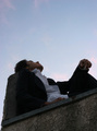
| 05/31/2006 02:34:54 AM | under the sky so blueby noodleboyComment: Greetings from the Critique Club. My critiques are generally geared towards trying to help you improve your score within DPC, and not on any true "artistic" merit of the photograph itself, unless it relates to DPC voters and scoring. Please keep that in mind as you read this.
Initial Thoughts
Pretty good, I see great potential in this.
Composition/Content
First off, I just want to say that in self-portraiture, many people get the wrong idea that you have to be engaged with, or looking into, the camera. You probably got hit a little bit for this, but it's not true, and I like the idea you have presented here, personally. However, I think choosing to shoot from so low an angle has also hurt, (especially with the distortion from the wide angle), and there may just not be enough *you* to really complete the photo.
Background
The sky is a little too light. Especially on DPC, people like strong, darker, deep blue skies. To achieve this end, most people either use a polarizer, or they use a gradient on their skies. This helps give the shot a lot more presence and keeps it from being too flat. A darker sky would also not cause the subject to look darker, and would help with the contrast issue, which could (especially on darker monitors), turn you into a silhouette.
Camera Work/Technical
Using such a small aperature for a photo of this nature isn't needed at all. You could have dropped to an f/5.6 or f/8 and given yourself a higher shutter speed. You'd have dropped the exposure on the sky, and still maintained good detail in yourself. Especially if you'd shot at less of a low angle. If you start to lose detail in the subject, a reflector can help that as well.
Digital Processing
As I said, a deeper sky would have helped bring this shot out. Also, there seems to be a general softness to the shot which doesn't really work here (makes it just seem more out of focus), and some work with USM would have helped a lot.
Fits the Challenge
Unless this isn't you, it fits the challenge. I do think, however, that many voters gave you lower marks for your choice of composition here, which is a little sad. While portraiture generally follows a certain set of "rules", this is a good choice for a departure.
My Opinion of the Photo
A good photo with a lot of potential. I'm not a fan of the low, low angle, but if you'd brought it up some, did the tweaks I mentioned, and gave yourself a *little* more presence, this could have really worked well. As it is, I still think it was under-appreciated, and probably deserving of a higher score. Keep on working on your stuff.. not a bad first submission at all, and good luck with future challenges. |  Photographer found comment helpful. Photographer found comment helpful. |
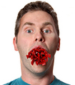
| 05/31/2006 02:18:24 AM | Hiding In The Shadowsby bs-photosComment: Greetings from the Critique Club. My critiques are generally geared towards trying to help you improve your score within DPC, and not on any true "artistic" merit of the photograph itself, unless it relates to DPC voters and scoring. Please keep that in mind as you read this.
Initial Thoughts
Ouch, I bet DPC killed this. *looks*. Yup.
Composition/Content
Not a bad composition at all. Draws the viewer in, and the slight distortion really works. However, DPCers really don't like.. "different", which is what I can plainly see you were going for here. Reading your comments, I guess there's really not much I can say. It really fits your intentions.
Background
The sickly green color fits well, and that distortion I mentioned gives it a nice "madness" feel.
Camera Work/Technical
This is where DPC took you apart, but.. again, you knew it going in, and nothing I would have normally said here to help a photographer that *didn't* know going in would really apply, would it? Good slight view of features that are still hidden in shadow, sharpness on the background instead of on yourself.. to me, you nailed your intent. Too bad voters never look at it that way.
Digital Processing
You don't leave any details, but whatever you've done to achieve that sickly, deathly, neon-ish effect works. At least for me.
Fits the Challenge
Unless it's not you, it fits.
My Opinion of the Photo
A wonderfully done photo in the artistic sense. Normally, I'd have given all kinds of critique to a photo like this, but.. because of what you've written in your photographer's comments, I can see that it wouldn't be worth my time. You knew exactly what you were going for, and you achieved it to your end.
Know, however, that voters on DPC will probably never embrace an image of this kind during a challenge. If you care to score higher in the future, you will need to give *them* what they want, and leave the artistic works for your own time. That, however, is entirely up to you, but I wouldn't feel right leaving this critique without at least saying that.
P.S. Also, in the future, it might be better if you left the "Give me an in-depth critique" button unchecked on photos of this nature, especially if you *know* they aren't high-scorers or if you know what you wanted in the first place. It just helps us to avoid leaving a long critique with a person that probably doesn't really want it anyway. Message edited by author 2006-05-31 02:20:29. | | Photographer found comment helpful. |
| 05/31/2006 02:05:49 AM | decisionsby Len ScapComment: Greetings from the Critique Club. My critiques are generally geared towards trying to help you improve your score within DPC, and not on any true "artistic" merit of the photograph itself, unless it relates to DPC voters and scoring. Please keep that in mind as you read this.
Initial Thoughts
Over-exposed, a bit crowded, and looks more like a portrait than a self-portrait, because of the pose.
Composition/Content
From my experience, a good self-portrait is one that engages the viewer and tells them a little about yourself. While I understand that what you are trying to say here is, "I'm a photographer", what it says to me is, "I shot this other guy that is a photographer". This is because the subject is disengaged from the viewer, and the camera, and is too busy with the camera he is holding, giving the impression that he was caught in a candid moment, and not capturing himself. Also, standing so close to the tree takes *more* emphasis off yourself, and puts it on the environment, making it more a candid snapshot than a concious effort at a portrait, to my mind.
Background
You had a wonderful, wonderful background to really use to your advantage here, but it is mostly overshadowed by the tree you stood into, and the harsher lighting of the day. I know that while out in the wilderness, you can't always choose your lighting, but your exposure is definitely too bright here, and a faster shutter speed would have been recommended.
Camera Work/Technical
Which brings us here. In bright days, you really want to meter for your background first and foremost, espeically if you have a good reflector or flash to fill with. A shutter speed of 1/500 - 1/1500 (and probably more on the higher end), would have eliminated the harsh lighting on the snow and on your features, and you could have worked on the shadows in post, or with the fill flash at that point. As for using the tree to help show your DOF, I don't believe that it was required. You, yourself would have provided that well enough.
Digital Processing
There is still far to much over-exposure here, but not really any blown highlights. (well, except maybe in the snow peaks). A little more work with levels would have helped this dramatically, pulling down the harsh lighting. Using levels on an adjustment layer would have also let you put the shadow detail back in using a low opacity brush. I'd also suggest learning the "Color Balance" adjustment as well, as your skin tones retain a little too much yellow/red, especially in the highlights.
There is also a distinct lack of sharpening, which is easily fixed using USM. I'd start with a 50%, 0.3 radius, 0 threshold, and then tweak from there. (some people like to go 150, 1.0, 3). Just experiment with it so that you lose that general overall softness that I see here.
Fits the Challenge
This is one that is a little iffy. It fits the challenge, of course, since it's you (or so I'll give the benefit of doubt), but the overall *feeling* doesn't say, "this is me". A little more interaction with the camera that took the shot, or a little stronger emphasis on you yourself, would have helped this aspect greatly.
My Opinion of the Photo
As I've said, I don't really get a huge "self-portrait" feeling from this photo. It has or had much potential, but seems just a little too hurried in ways, and just a little too "non-self" in others. I want to really like it, but I think it could have been a lot better.
Good luck on future challenges. | | Photographer found comment helpful. |
| 05/31/2006 01:48:35 AM | Man in a Panama Hatby chaliceComment: Greetings from the Critique Club. My critiques are generally geared towards trying to help you improve your score within DPC, and not on any true "artistic" merit of the photograph itself, unless it relates to DPC voters and scoring. Please keep that in mind as you read this.
Initial Thoughts
This isn't bad. Lighting is a little too hard, and you seem to be on the wrong side of the frame.
Composition/Content
In classic portraiture composition, it's best if you leave negative space to the side of where the subject is a)looking, or b)leaning. This gives the viewer an impression of flow, and it's difficult to pull it off if you decide to break from this. In this photo, you just seem to be going against the flow for no real reason, and as such leave the viewer (me, in this case), feeling crowded out. I end up looking more at the space than at you.
Background
Backround is good, and I like the soft gradiating from dark to not so dark.
Camera Work/Technical
You lack a touch of focus in the key area, which is just around the eyes. Also, your choice of a longer exposure (1.6 seconds) has resulted in a bit of motion blur in the eyes (and other areas) as well, contributing to the focal problem. In portraiture, it is very important that the eyes (if you are using them), are sharp and appealing to the viewer. If they lack focus or sharpness (unless for some express desired intent, which I don't feel here), you tend to lose the viewer. What I would suggest, if you wished your portrait to retain the ambient lighting, is to bump up to ISO 800 (which the 20D can handle very well), and drop the aperature to 3.5 or 4, thus giving you more shutter speed to work with, and probably sharpening your eyes much better. Now granted, the usual voter won't notice something like this *conciously*, but I can guarantee that it'll be a factor to many, even if they can't quite say why.
Digital Processing
Well, I don't know if you wanted the tungsten/ambient lighting this way purposely or not. It does add a little bit of a warmer, saddish aspect, but voters generally don't do well with it, and less yellow and more natural skin tones might have helped your voting. Your contrast is nice though, but it could still use another couple of low-pass USM for sharpening.
Fits the Challenge
Unless this isn't you, it fits the challenge.. obviously.
My Opinion of the Photo
While I liked it on first glance ok, I do think it would have been a stronger photo had you been on the right side of the frame. It would have given the impression of having more space and feeling less cramped. As DanSig pointed out, there are reasons why most portraiture "rules" are in place, and choosing to go outside those rules should have a strong and intensive purpose. I don't feel that your photo really had these, so it showed in the voting.
Good luck in future challenges. | | Photographer found comment helpful. |
| 05/31/2006 01:32:13 AM | Out Ridin' Fencesby eqsiteComment: Greetings from the Critique Club. My critiques are generally geared towards trying to help you improve your score within DPC, and not on any true "artistic" merit of the photograph itself, unless it relates to DPC voters and scoring. Please keep that in mind as you read this.
Initial Thoughts
A distinct lack of contrast and sharpness in key areas here, but a touching and emotive shot.
Composition/Content
The composition has a nice feel for me, with the exception of being a *little* crowded around the facial area. You're a good model, and have a nice presence, so you shouldn't be hesitant to use it to your full potential. I feel quite a shyness here that your look almost tries to belie, but your choice of crop keeps it there. You say it's your first self-portrait, so I think that comes through here in the way that I've said. Slightly shy, but with a deeper "I can do this!" attitude.
Background
Nicely out-of-focus, but a bit flat. I think it'd have been stronger if there was more light-play back there and slightly stronger contrast/color going on.
Camera Work/Technical
A few things that I notice here.
Exposure: Slightly hot on some highlights. This can be difficult to control, but I see you shot RAW, so I'm wondering if you dropped the exposure enough to bring detail back to the highlights, or if they were blown too much for that. If so, then for the future, I'd suggest trying to meter as much for the brightest part of your photo as you can, so to avoid that in the future.
Focus: Focus seems ok, but the photo overall still seems soft. At first I thought maybe the focus had grapped the lip of the hat, but I see it's not so. F/4.8 is a pretty decent aperature for this type of portrait too, from my experience.
Digital Processing
Ok, since the focus seems ok, then a little more work is needed in USM. I'd suggest starting with a 50/0.3/0, and then tweaking from there. Sometimes I find that I can go to a 130/1.3/3 to get the sharpening I need. If you find that your work is sharpening certain areas too much, I'd suggest sharpening on a layer, and then painting back in the original in varying opacities to get the look you wish. The areas here I'd concentrate on are the eyes/facial area, and the leather "belt" on the hat. The entire photo, I think, also could use a touch more sharpening to it as well.
The rest of your processing looks really good. No artifacts from it, and all nice choices from what I can tell. Your skin tones are nice. Contrast is still another thing that is lacking in the darker areas of the image.
Fits the Challenge
Unless it's not you, it definitely fits.
My Opinion of the Photo
A nice photo showing some conflicting emotion, and requiring just a few little tweaks to really stand it out. I love the look you have, but the cropping isn't my favorite. Still, a 6+ is never a bad score, so you resonated well with the voters. Good job, and good luck in future challenges. | | Photographer found comment helpful. |
| 05/31/2006 01:18:27 AM | LICORI-SIZE ME!!by kosmikkreeperComment: Greetings from the Critique Club. My critiques are generally geared towards trying to help you improve your score within DPC, and not on any true "artistic" merit of the photograph itself, unless it relates to DPC voters and scoring. Please keep that in mind as you read this.
Initial Thoughts
Hilariously funny, but lacks that contrast I like to see.
Composition/Content
Good composition, you have a nice "thirds" thing goin on vertically, and nothing seems so out-of-place as to cause me to say, "eh?". Contentially, you have a really funny gag going, and humor always works for me. (Although lately, DPC seems to have more problems with humor than it used to.) These two elements have combined nicely. Nothing more I can add to it.
Background
A nice white background. Smooth, solid, no problems.
Camera Work/Technical
Hmmm. I'd like to know what lens you used here. There seems to be a bit of facial warping because of your choice, leading me to believe it was a lens more on the wide side of things.. (possibly between 24mm and 50mm?)
I'm thinking maybe if you'd gone between 50 and 70mm, that would have helped. However, having said that, it would also have lessened the impact of the licorice on the viewer.. so I guess it's a choice between that. So, I'm not sure that maybe you shouldn't have gone a little *wider* to emphasize *that* aspect.. if you could. I guess what I'm saying is that you seem to be half-way between, and it's a little off-putting. At least for me.
In other areas, I like your exposure, but your contrast also leaves this photo looking a little flatter than it could have been.
Digital Processing
My only suggestion here would be to work on the contrast some. Try and get the photo to *pop* more. A few shadow areas need to be darker, IMO, and some highlight areas lighter. Just a tad to flat, and I think voters probably picked up on that too.. if subconciously.
Fits the Challenge
Unless it's not you, it fits it perfectly.
My Opinion of the Photo
Humor is my thing, and I love to see it. Great job with that aspect, and a good photo overall. Some little tweaks could really stand it out, and I think that if you'd emphasized the licorice even *more*.. gone with more of a "fish-eye" effect, this photo could have been amazingly funny. I realize that it's not possible if you don't *have* fisheye, but something to think about for a re-shoot maybe if you ever do get one. Nice work, and good luck in future challenges. | | Photographer found comment helpful. |
| 05/29/2006 06:04:48 AM | | | Photographer found comment helpful. |
| 05/29/2006 06:00:35 AM | Competitionby GabrielComment: I just noticed you got the same score as the year you submitted this.
2.004, 2004...
Coincidence!??!! | | Photographer found comment helpful. |
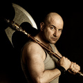
| 05/29/2006 05:58:02 AM | Barbarian by kiwinessComment: Well, you didn't get that 8+ I predicted, but you came damn close. Where the hell do you get all these props? | | Photographer found comment helpful. |
| 05/29/2006 05:17:53 AM | | | Photographer found comment helpful. |
|
Showing 161 - 170 of ~1843 |
Home -
Challenges -
Community -
League -
Photos -
Cameras -
Lenses -
Learn -
Help -
Terms of Use -
Privacy -
Top ^
DPChallenge, and website content and design, Copyright © 2001-2025 Challenging Technologies, LLC.
All digital photo copyrights belong to the photographers and may not be used without permission.
Current Server Time: 04/21/2025 05:59:58 AM EDT.
|