|
|
|
Showing 171 - 180 of ~1843 |
| Image |
Comment |
| 05/29/2006 05:10:09 AM | Boringby tonyvComment: Greetings from the Critique Club. My critiques are generally geared towards trying to help you improve your score within DPC, and not on any true "artistic" merit of the photograph itself, unless it relates to DPC voters and scoring. Please keep that in mind as you read this.
Initial Thoughts
Nice arrangement, and B&W works for this shot, although I'm unsure about the wall.
Composition/Content
The assymetrical composition is something I'm not entirely sure of, personally. I'd like to see what happens to this shot with the plates and bowl lined up more centrally. From what I can picture, it'd ground the photo a little more. I also think it might have benefitted from a little more of a portrait orientation instead of square, but that's just me. As it stands, to my mind, it just doesn't feel right.
Background
As you stated, the lighting is harsh on the wall, and tends to take away from your subjects and arrangement. A softer mood would definitely have helped.
Camera Work/Technical
You did a pretty good job exposing for the light you did apparently have, with only the wall in the upper right really being the only bit slightly out of exposure. I'm glad you put in your comments that it was accidentally shot at 1600, or that would have really confused me. hehe. Nice work with the neat image though, I never would have been able to tell.
Digital Processing
As I said, good work on the neat image. Everything else looks really good as well, and the B&W conversion is quite nice, disregarding the over-exposure on the wall.
Fits the Challenge
A good fit for this challenge, as it contains all the elements necessary.
My Opinion of the Photo
As your title says, it really doesn't contain much of what DPC needs to score hugely high, but as you seem to have known this going in, I won't dwell on it. Some tweaking with your set-up though, and it could have had quite a bit more impact. Still, a 6 is never a bad score, so nicely done.
|  Photographer found comment helpful. Photographer found comment helpful. |
| 05/29/2006 04:59:57 AM | Appleby sodastreamerComment: Greetings from the Critique Club. My critiques are generally geared towards trying to help you improve your score within DPC, and not on any true "artistic" merit of the photograph itself, unless it relates to DPC voters and scoring. Please keep that in mind as you read this.
Initial Thoughts
A little flat, but striking nonetheless. Simple but effective in its own way.
Composition/Content
Compositionally, this is pretty sound. Nice use of negative space to give the apple a sense of presence. Unfortunately, as some people noted, your use of a *single* object probably hurt your score more than anything.
Background
Wonderful background with a really pleasing texture to it. The mottled green sets your subject off beautifully.
Camera Work/Technical
Exposure is a little off for your highlights, but unfortunately, no information was provided for that. I was under the impression that a critique couldn't be asked for without providing that information, so this challenge might be the last you can do that with. Please be sure to provide information in the future, as it helps greatly.
As it is, all I can suggest is that you try and meter for the brightest parts of your photo to help with blow-outs.
Digital Processing
I think you could use a little more contrast here to *really* set the apple apart from your background. It also seems that there was a little too much smoothing used, which hurt the sharpness, which some people commented on. Darker and more intense reds in the apple could have boosted your score more.
Fits the Challenge
Because of the use of a single object, you didn't really meet the challenge as seen by a lot of voters. Technically, this is an ok still life in my books, but still not exactly what people were looking for. As the classic definition of a still life is a "group of objects", it is something to keep in mind for next time.
My Opinion of the Photo
A pleasing photograph that, with a proper exposure and some work with your colors and contrast, could have really been improved immensely. The tenuous connection to the challenge notwithstanding, it's a step in the right direction.
Good luck on future challenges. |
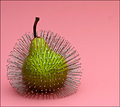
| 05/29/2006 04:51:06 AM | Prickly Pear by aimeethetooComment: Hello, and greetings from the Critique Club.
As this photo finished with the blue ribbon, I am going to leave this temporary note on your photo so that I can go on to more entries that may need my help a little more.
Congratulations on your blue, and if the powers that be decide that I should leave a little more of a critique anyway, I shall do so and contact you when it is done. If not, then know that you've done the job you needed to do and that's as much a critique as anyone can give.
Enjoy your ribbon. | | Photographer found comment helpful. |
| 05/29/2006 04:35:06 AM | always thereby sigrun_thComment: Greetings from the Critique Club. My critiques are generally geared towards trying to help you improve your score within DPC, and not on any true "artistic" merit of the photograph itself, unless it relates to DPC voters and scoring. Please keep that in mind as you read this.
Initial Thoughts
About as "out-of-the-box" as you can get for this challenge, but a pretty cool photo on its own.
Composition/Content
The composition is very good with one minor flaw. A little more rotation to get the statue more vertically aligned would have, in my opinion, really solidified this shot. I love the play of the shadows, and the gradient of the sky is a nice touch. (for my tastes, I wouldn't have gone so green.)
Background
A little cluttered and distracting, but pretty much unavoidable.
Camera Work/Technical
Nice exposure, and there doesn't seem to be any noticeable effects from having a slower shutter speed. (On a tripod?)
Digital Processing
Your list of steps shows good work with all of them, with the possible exception of the color work in the sky. It's just a little too unnatural. The muted tones with the rest of the photo work very well though, I think.
Fits the Challenge
As many have commented, this is the part where you were really hit in voting. As you said, I figured that you were going for the statue as your "still life", but the photo betrays you as it isn't the perceived focus of your shot. It's more a background element than the subject, and that is why people voted you down. However, even if it *were* the main subject, I suspect it still would have gotten lower votes because of the definition of "still life" as most voters saw it. Many were looking more for a grouping of inanimate objects arranged compositionally, and your photo contains nothing of the sort.
My Opinion of the Photo
An interesting and striking photo that, with a couple of tweaks, could be a very good photograph. However, it was simply in the wrong challenge, and because of that, your score suffered mightily. | | Photographer found comment helpful. |
| 05/29/2006 04:24:29 AM | Orange Daisyby kbrownvcComment: Greetings from the Critique Club. My critiques are generally geared towards trying to help you improve your score within DPC, and not on any true "artistic" merit of the photograph itself, unless it relates to DPC voters and scoring. Please keep that in mind as you read this.
Initial Thoughts
Well shot, great lighting, but not really "still life" in the classic sense.
Composition/Content
You've got a nice, simple composition here with just enough off-set to lend the photo a good presence. The subject itself is good, if a little static. However, as it is, it doesn't really convey the classic still life model that I believe voters were looking for, which is an "arranged group of objects", preferrably on a noticeable surface.
Background
I love the mild bokeh. Just enough to be interesting, not enough to distract. Unfortunately, for this challenge, it is too open.
Camera Work/Technical
Great work on your technicals here, and I really don't have anything I can suggest for improvement.
Digital Processing
No information given for this area, so anything I say is conjecture, but I don't see anything out of place or any noticeable signs of processing. That generally means nice job :)
Fits the Challenge
For me, this is where you've gone a little wrong in the DPC sense. I believe that voters were looking for something *entirely* different, and it's only the strength of your technicals and the photo itself that really saved your score. As nice a photo it is by itself, for this challenge, you'd have been better off arranging a group of flowers in, say, a vase or other object, on a surface, keeping with the more classical definition.
My Opinion of the Photo
A lovely flower photograph, but probably just in the wrong challenge. Could have been mid-6s in a challenge more suited for it.
Good luck on future challenges. | | Photographer found comment helpful. |
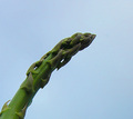
| 05/29/2006 04:11:16 AM | "Aw geez, give us a kiss, will ya?" (If still life could speak...)by Joy MooreComment: Greetings from the Critique Club. My critiques are generally geared towards trying to help you improve your score within DPC, and not on any true "artistic" merit of the photograph itself, unless it relates to DPC voters and scoring. Please keep that in mind as you read this.
Initial Thoughts
Not very striking, and not really "still life" in the classic sense.
Composition/Content
Compositionally, you've probably done the best job with your chosen subject matter that I can personally think of. However, the best composition in the world won't make up for content that doesn't resonate with the viewer. Especially for DPC, your subject doesn't present any of the qualities that makes for a well-scored photo. No great colors, no strong impact, nothing to really make the viewer stand up and take notice. The pale colors and the fact that it's "just a strand of asparagus" will guarantee that the voters just passed this one by pretty quickly.
Background
For me, the pale blue is simply *too* pale. A nice gradient would have done wonders, to darken and give more presence.
Camera Work/Technical
Lighting is good, but you lack tonal range. Contrast could be better, as the image is pretty flat. Your focus looks good, although the quality of your camera starts to become a little noticeable when shooting this close.
Digital Processing
You didn't enter any information about your processing, so whatever I say is conjecture. However, it seems that you've over-sharpened slightly, and the lack of any processing to give this photo a little more punch has hurt you. Working with colors and contrast more might give you a little more interest, but there's only so much one can do with a plain stick of asparagus I think.
Fits the Challenge
This is where I believe you got hit the most. A still life, as one commenter put it, is generally "an arranged group of objects" I think many people were looking for studio arrangements of multiple objects, and those photos that didn't meet that criteria weren't recieved very well. I myself don't really have a lot of experience doing or studying still life, but I agree that this photo isn't really "still life" as classically defined. A little more research on the challenge subject before entering can sometimes really help. Especially if you're looking for a higher score.
My Opinion of the Photo
A flat, uninteresting photo with no appeal within the challenge it was entered. I appreciate out-of-the-box thinking, but this probably was just a little *too* out there.
Good luck with future challenges. Message edited by author 2006-05-29 04:13:56. |
| 05/23/2006 06:50:40 PM | Victoria Herbal Doctor by whiteroomComment: Originally posted by BradP:
Never seems to end around these parts when some want to attack and nit-pick great image - sheesh.
The credibility of the photographer comes under scrutiny as to what the environment was/wasn't here, and if it was titled as a Victoria Herbal Doctor, then so be it.
None of us were there and if this is the environment the subject was represented, then so be it.
I applaud Lesley for retaining her composure once again under fire and shame on some in the community for the public derogatory comments concerning this truly outstanding portrait. |
This is also one of the reasons more and more people *aren't* commenting. Because if they have a different opinion, they are jumped on.
Is this a great environmental portrait? Perhaps. Majority thinks so, but it is still art, and in that context, cutter has as much right to think the way he does as the 100 people that think otherwise. It seems to me that more energy is spent putting commenters down sometimes than it is spent commenting.. which is a vicious cycle.
Cutter had an opinion and concern, he voiced it. Either agree or don't agree, but there really isn't anything *derogatory* in the comment, and "truly outstanding portrait" is subjective.
We need to embrace the diversity of the people on DPC and how they view our works.. not only for the people that finish low or middle-ground, but also for the people that finish high. Even the highest scoring image in the world is going to have people that dislike it, and for perfectly valid reasons. It's time to stop hating commentors that don't fit into the "wow, great shot" mold on every ribbon winner. |
| 05/19/2006 07:40:24 PM | My ~Wicked~ Sideby espy2Comment: Time to get the monitor calibrated.
There are so many badly visible marks from processing here, (whether it was burning/dodging/painting/cloning, whatever), that I suspect that you couldn't see them on your end.
Unfortunately, I can, and I suspect most other people will be able to as well.
Nice concept.. but marred badly by visible processing. | | Photographer found comment helpful. |
| 05/19/2006 07:29:18 PM | Drama Queenby KitaComment: Well, someone has quite the career ahead of them. Nice job. | | Photographer found comment helpful. |
| 05/19/2006 07:26:04 PM | | | Photographer found comment helpful. |
|
Showing 171 - 180 of ~1843 |
Home -
Challenges -
Community -
League -
Photos -
Cameras -
Lenses -
Learn -
Help -
Terms of Use -
Privacy -
Top ^
DPChallenge, and website content and design, Copyright © 2001-2025 Challenging Technologies, LLC.
All digital photo copyrights belong to the photographers and may not be used without permission.
Current Server Time: 04/21/2025 10:05:45 PM EDT.
|