|
|
|
Showing 191 - 200 of ~1843 |
| Image |
Comment |
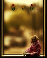
| 05/01/2006 02:02:11 PM | As Life Passes by ArtysteComment: Originally posted by colyla:
w00h00!!!! Congratulations! I didn't see this! I always go through all the photos even though I haven't voted in awhile and I didn't see this.
This turned out beautiful.....this is how I picture her once you move.....she'll be looking out the window waiting for you to come back home.... |
Oh.. great.. thanks. I had a little bit of a meltdown last night because it finally hit me that I was leaving her/them.. and then a comment like this :)
Now where's my tissues again.. there's.. a .. dust storm. yah. |
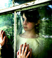
| 05/01/2006 04:19:00 AM | As Life Passesby ArtysteComment: Originally posted by Pug-H:
Congratulations, Glen. I thought it was yours - but I hadn't seen a picture of megan for awhile. (She still has a dummy?) |
Yah. I almost had her cured of it until her mom quit her job and I stopped being the primary caregiver in March.. oh well, what can ya do. |
| 05/01/2006 12:37:09 AM | daydream by CalliopeKelComment: Ok, now I *know* she's not old enough to be getting married. lol
Great shot, has a real raw element to it that really sticks. |  Photographer found comment helpful. Photographer found comment helpful. |
| 05/01/2006 12:36:35 AM | Silencio by kiwinessComment: For something not planned, you sure showed well. Great job. | | Photographer found comment helpful. |
| 04/29/2006 04:50:26 PM | Eyes of Innocenceby Mr_BondComment: Hello, and greetings from the Critique Club. What follows is my best attempt to Critique this photo from a DPC voter's point of view. I'll do my best, but please excuse any comments that may be unintentionally rude or insulting.
Initial Thoughts
Something a little too artificial about this..
Composition/Content
Compositionally, there's not much I can comment on, It's got a nice feel. However, the model, to me, lacks a comfortability factor which makes this shot seem a little artificial and too .. fabricated.
Background
A nice neutral background, no complaints
Camera Work/Technical
Lacks a touch of the sharpness that most DPC voters tend to love, and doesn't have that "intentionally soft" feel. This is also contributed by the lack of contrast, giving the model a very flat look without much depth.
Digital Processing
No information, but I would suggest working on contrast and trying to bring some depth into your model. Darken the shadows, bring out the highlights in the skin tones more, etc.. also, some work with USM to sharpen the photo up a little more will help too.
Fits the Challenge
No arguements here, it does that well.
My Opinion of the Photo
A nice attempt, but a little more natural emotion from the model and less discomfort would give a more natural feel. | | Photographer found comment helpful. |
| 04/29/2006 04:44:31 PM | Best Friendby PhotonurdComment: Hello, and greetings from the Critique Club. What follows is my best attempt to Critique this photo from a DPC voter's point of view. I'll do my best, but please excuse any comments that may be unintentionally rude or insulting.
Initial Thoughts
Certainly a different take on the challenge, very bold.
Composition/Content
The composition is quite strong in my view, and the leading look of the dog makes you wonder just what has his attention. The model is very nice, complementing the black background and is almost.. sad, in a way. Like he's getting old, knows it, but fights on.
Background
Simple black background works, but the tight crop might have voters voting you a bit lower for the lack of any real studio environment.
Camera Work/Technical
Good use of DOF, really brings out the eyes, which are an amazing color. I don't know if they are artificially colored or not, but they really add strength to the black tones. I've certainly not seen color like this in a dog's eyes before, but that doesn't mean they don't exist. However it is, they're lovely.
Digital Processing
From the processing you mention, it seems everything was done pretty well. Maybe some slight over-sharpening in the eyebrow region, but nothing too distracting. The border is nice, but I, (and most voters from what I've noticed), tend to prefer even sides on a border all-around.
Fits the Challenge
It fits the challenge technically, but as in other photos I've seen and commented on, the close-up takes away from the "studio" feel, and some voters probably knocked you for that.
My Opinion of the Photo
A wonderful close up, showing great emotion in the animal and has a strong feel to it. Still lacks that elusive DPC "punch" that is often so important, but an image to be proud of nonetheless. | | Photographer found comment helpful. |
| 04/29/2006 04:22:43 PM | Dawn Breaks on a New Lifeby Baron152Comment: Hello, and greetings from the Critique Club. What follows is my best attempt to Critique this photo from a DPC voter's point of view. I'll do my best, but please excuse any comments that may be unintentionally rude or insulting.
Initial Thoughts
Outdoors doesn't equal studio, sorry (more on this later)
Composition/Content
Compositionally, it's ok. Not entirely inspiring, but not awful either. The models themselves, however, look uncomfortable and unnatural. Even on DPC, voters will notice this and score accordingly.
Background
Your background suggests that this was shot outside. Whether or not it *was*.. the fact remains that it entirely looks like it was. This challenge called for photos that were made in the studio, and voters are looking for this. If you shoot in a studio, but use a background that looks more like a natural environment than a "faked" backdrop, you're going to get hit.. hard. And you were. This isn't about "opening minds", it's about meeting the expectations of the masses. That's the photographer's job, not the voters'
Camera Work/Technical
Some nice work, and good lighting. The problem is, you've done such a good job making it *look* like it was outdoors, that.. well, it looks like it was outdoors. Ironically, your good work here is what ultimately caused some poorer scores.
Digital Processing
From what you've listed, I see no problems. Some nice work, no spot editing marks that I can see.
Fits the Challenge
Despite your call for voters to be more open-minded, ultimately it falls on the photographer to appeal to the voters and make sure they are connected with the challenge. You failed here in that this photo looks too much like it was taken outdoors. As such, you don't meet the challenge to a voter's viewpoint, and that's pretty much the key.
My Opinion of the Photo
It's a nicely shot, if rather uninspired, photo of "the happy couple". I wish for more emotion and natural feel from the couple, and more emphasis on making it look more studio and less natural outdoors was needed. | | Photographer found comment helpful. |
| 04/29/2006 04:11:48 PM | Togetherby sigrun_thComment: Hello, and greetings from the Critique Club. What follows is my best attempt to Critique this photo from a DPC voter's point of view. I'll do my best, but please excuse any comments that may be unintentionally rude or insulting.
Initial Thoughts
What a comfortable and intimate moment that is very well expressed.
Composition/Content
I like the composition, only I think it would have been slightly stronger had you put more emphasis on the adult model's head and moved the shot slightly more in an upper-right angle, or even just more up, putting the child's chin more towards the bottom of the frame. Of course, that's just a thought, but it seems there is too much centering with the child, making the "mother" figure less important. The models, however, are very relaxed and exude their love for each other, while giving us an intensity in their looks.
Background
A nice, neutral background, helping put the emphasis on the models
Camera Work/Technical
My only concern is in the rather flat lighting. There's not enough depth to this image I feel. The shadows are too light, and some hot-spots distract.
Digital Processing
No information given here, but some work with contrast and deeping the color and skin tones would have helped immensely.
Fits the Challenge
No problems here.
My Opinion of the Photo
A strong emotional photo with a few issues that I mentioned. It's a lovely family moment, but for DPC, it lacks that punch. | | Photographer found comment helpful. |
| 04/29/2006 02:40:19 PM | Air Guitarby magnusComment: Hello, and greetings from the Critique Club. What follows is my best attempt to Critique this photo from a DPC voter's point of view. I'll do my best, but please excuse any comments that may be unintentionally rude or insulting.
Initial Thoughts
Great humor and candid feel.
Composition/Content
Composition is ok, but lacking a little something. The angle of the shot may have something to do with that, as it seems to have been shot from slightly below, giving a strange feel. Your model, however, has great personality and presence.
Background
Normally, I'd say the salmon color would be a negative, and I still think many voters may have the same feeling, but personally, I think it works. It's a nice contrast with the male model and suits the "act" nicely. Plays well with the tie and star on the pocket as well, which I suspect was the intention.
Camera Work/Technical
Nice work here, although the lighting seems a little flat. The flashes working against the daylight might be the cause of that. Processing could fix it... which leads to...
Digital Processing
With a little work on contrast and trying to bring out a more dynamic look, this could jump from a really good photo to a great one. The problem here is the color of the wall. While it works, it contributes to flatness of the feel. the model doesn't really "jump out" if you know what I mean. Some work with curves, or selective color, could have really helped here.
Fits the Challenge
Fits it nicely, although you took it outside, a voter would never be able to tell.
My Opinion of the Photo
An amusing candid portrait, which is only hurt by the lack of any real contrast and 'pop'. Also, the angle just doesn't work as much for me as another could have. | | Photographer found comment helpful. |
| 04/29/2006 02:31:11 PM | .by moviemanComment: Hello, and greetings from the Critique Club. What follows is my best attempt to Critique this photo from a DPC voter's point of view. I'll do my best, but please excuse any comments that may be unintentionally rude or insulting.
Initial Thoughts
A little too close in. For studio portraits, I expect people are looking to see more studio, and less "person", if you know what I mean
Composition/Content
Nice composition, although suffers from being neither close enough in, or far enough out, IMO. The head covering is a neat idea, but for some reason doesn't really add anything in this instance. Eyes are great, but lack that extra something.
Background
N/A
Camera Work/Technical
Decent camera work, but your lighting is a little too flat. Not enough shadows, texture, or dynamics there to really set anything apart or bring it out.
Digital Processing
Some good work, but I think more attention payed to bringing out the eyes, and darkening the areas around them might have pushed your score up. Voters love that "dragan" look, and getting a shot like this closer to that look would have helped dramatically.
Fits the Challenge
Iffy on this one. As I said, I think voters were expecting to see more of a studio environment as well as the model, so you might have been hit for that. So it fits the challenge *technically*, but misses the mark because of the lack of showing the environment.
My Opinion of the Photo
A nicely done close-up that just lacks the punch to make me really care about the photo. | | Photographer found comment helpful. |
|
Showing 191 - 200 of ~1843 |
Home -
Challenges -
Community -
League -
Photos -
Cameras -
Lenses -
Learn -
Help -
Terms of Use -
Privacy -
Top ^
DPChallenge, and website content and design, Copyright © 2001-2025 Challenging Technologies, LLC.
All digital photo copyrights belong to the photographers and may not be used without permission.
Current Server Time: 04/21/2025 10:03:05 PM EDT.
|