|
|
|
Showing 201 - 210 of ~1843 |
| Image |
Comment |
| 04/29/2006 02:18:38 PM | Coming of ageby LevTComment: Hello, and greetings from the Critique Club. What follows is my best attempt to Critique this photo from a DPC voter's point of view. I'll do my best, but please excuse any comments that may be unintentionally rude or insulting.
Initial Thoughts
Wonderful look, really spot on.
Composition/Content
Quite a nice composition using rule of thirds, and a very good looking young man fills the photo out nicely. He's got an intense, questing look that really grabs the viewer
Background
Perhaps a little plain, but the vignetting helps frame the model. Voters might have hit you a bit for that though
Camera Work/Technical
Great control of the camera. Good focus, nice lighting (a touch hot on the cheekbones), settings all seem really nicely done.
Digital Processing
You didn't provide much information here, but everything looks good. You've nailed contrast and color very will. Although there's a hint of over-yellowing in the skin tones
Fits the Challenge
Easiest one I have to comment on. To a tee.
My Opinion of a the Photo
A really nice portrait that you should be proud of. I love the look in the young man's eyes. They show a confidence and a feeling that he's ready to take on the world. Good show. |  Photographer found comment helpful. Photographer found comment helpful. |
| 04/29/2006 02:11:22 PM | Keeper of the Flameby crazedfost78Comment: Hello, and greetings from the Critique Club. What follows is my best attempt to Critique this photo from a DPC voter's point of view. I'll do my best, but please excuse any comments that may be unintentionally rude or insulting.
Initial Thoughts
Dang.. nice body, and I love the look here
Composition/Content
I'm a little wary about the amount at the top here. Not sure that it's something voters liked, but can't really know. No comments to that regard anyway, but it seems just a little "off" to me. Your model is great, and it's a very emotive pose.
Background
Great coloring, really plays off with the model
Camera Work/Technical
Everything seems pretty good here for the feel of the photo, but without that sharpness that voters expect, you lose a few points there. It's unfortunate, but sometimes we have to take that hit to be brave with our vision.
Digital Processing
The Grain. Oh, the grain. The voters, obviously, really hit you hard because of this. On DPC.. grain is, usually, death. I know that you probably knew this and went against the grain (pun intended), and this isn't a knock on you.. but for DPC submissions, if you care about scoring, avoid it! For me, it's what *makes* the photo. It's perfect, and the darkness and mood are really cemented by it.
Fits the Challenge
No problems here. Fits to a tee.
My Opinion of the Photo
Possibly one of the better color portraits I've seen that isn't the "DPC Flavor of the Month". Congratulations on being brave enough to submit something different. I love it, and although I'm a little off on the amount of upper negative space.. it's a job well done. |
| 04/29/2006 02:01:00 PM | My first Easter!by nemesise1977Comment: Hello, and greetings from the Critique Club. What follows is my best attempt to Critique this photo from a DPC voter's point of view. I'll do my best, but please excuse any comments that may be unintentionally rude or insulting.
Initial Thoughts
Looks like an outdoors shot made to look like a studio.. a little dark.
Composition/Content
This is ok compositionally, although it could be stronger with a tighter shot on the child and less space around him. This would also help with the "illusion" that this was taken in a studio. Content wise, you've got a great model. Lively expression, and nice, if classic/cliche, posing.
Background
As I've mentioned, the background looks as if you've intentionally tried to make it look like a backdrop instead of the outdoors. Which, is a fine idea, but the wide crop sort of ruins that illusion. Also, the background is too bright compared to your model, which also ruins the illusion to an extent.
Camera Work/Technical
No real problems with your camera work. You've done a nice job with the DOF and sharpness on your model. Lighting is where the problem falls. You needed to get more light on your model. Whether with a fill flash or reflectors, it was imperative that he be better lit. He's far too much in the shadows, and as such, the background takes over.
Digital Processing
On the issue of your model, if you have Photoshop, you might try using the shadows/highlight tool to bring out your model. Done right, I think it could really help in this instance. You processing looks good, but again.. the foreground is simply too dark.
Fits the Challenge
This is where it gets complicated. As cropped, I think that you may have gotten hit by too many "this isn't in a studio" votes, even though you've done a nice job with the illusion. Cropped tighter, and with more lighting on your model, I think you'd have pulled off the illusion much nicer and made more people go in favor of it being "studio" and not "outdoors".
So, it kind of fits the challenge, but not really.
My Opinion of the Photo
Very cute, but the darkness of the foreground throws me off. I'd have really loved it with better lighting. |
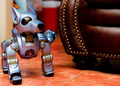
| 04/29/2006 01:46:08 PM | New Dog , Old Trick -- Bad Sparkie!by fotomann_foreverComment: Hello, and greetings from the Critique Club. What follows is my best attempt to Critique this photo from a DPC voter's point of view. I'll do my best, but please excuse any comments that may be unintentionally rude or insulting.
Initial Thoughts
Robot Dog, ok.. but.. what.. he's.. hahahahahah..
Composition/Content
Pretty nice composition, you get all your elements in without complicating the photo, and the leg position of the dog, while a little hidden, is a nice surprise for those that look long enough. Content wise, very nice. An expensive sofa about to be ruined by robot dog pee is sure to get a laugh.
Background
Nicely out-of-focus, good use of DOF. No complaints here.
Camera Work/Technical
There are areas of softness here I can't really explain, perhaps the lens at this focal-length has corner/edge softeness? Otherwise, the focus seems spot on. Good use of aperature for the DOF.
Digital Processing
From your processing comments, it looks like everything was done pretty well. There seems to be a bit of that.. DPC "wow" factor lacking in the look of the photo, but I honestly can't think of anything off hand that would help that.
Fits the Challenge
I'm not sure it *entirely* fits the challenge, but robot dogs certainly aren't old. The title seems to carry the connection more than the photo though.. at least for me. Although I guess the sofa looks quite new too.
My Opinion of the Photo
A keeper because of the humor for sure, good to see that some people still value that over DPCness, which, unfortunately, this lacks a little bit of. But not much. I'd have scored it higher. | | Photographer found comment helpful. |
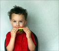
| 04/29/2006 01:34:43 PM | Sticky Boy & His Watermelonby aimeethetooComment: Hello, and greetings from the Critique Club. What follows is my best attempt to Critique this photo from a DPC voter's point of view. I'll do my best, but please excuse any comments that may be unintentionally rude or insulting.
Initial Thoughts
Cute, but a little flat.
Composition/Content
Compositionally, this is pretty good, although I think a tighter crop would have helped quite a bit. Just a *tiny* bit too much negative space for me. The child is a cutie, and eating watermelon is always good for an "aww" factor.
Background
Background is pretty good, but has a few hotspots. Moving him out from the wall a bit might have helped some.
Camera Work/Technical
Focus is great, the eyes really stand out. You've used a good aperature for this type of photo, giving you just the right amount of DOF. I see no real problems here.
Digital Processing
While you offer no details on your processing, let me touch on a couple of points:
1. The wall. A little work with a background layer and some burning might have helped with the hot-spots. I'd have also tried to maybe hue-shift it a little to get either a more vibrant color, or get it whiter across the board.
2. His shirt. The red is a little *too* red. It's to the point of being clipped (sort of like being blown out, losing shade detail), and might have worked better either muted, or with a deeper shade.
Other than that, I have no suggestions
Fits the Challenge
Definitely fits the challenge, it's a nice capture of a good "aww" moment, and fits "studio" rather nicely
My Opinion of the Photo
As I mentioned, I think the crop could have been tighter, but I like the overall feel. I'm a sucker for child shots anyway, and this is a nice moment to cherish. | | Photographer found comment helpful. |
| 04/29/2006 01:25:54 PM | Blowfingerby russiComment: Hello, and greetings from the Critique Club. What follows is my best attempt to Critique this photo from a DPC voter's point of view. I'll do my best, but please excuse any comments that may be unintentionally rude or insulting.
Initial Thoughts
I laughed. What a great candid moment, especially for a studio photo.
Composition/Content
The composition is wonderful, giving us a full view of the boy's antics and body language. The choice of model is a good one, very expressive, open to the camera, and has a great presence.
Background
Perfect studio background, very well lit.
Camera Work/Technical
This is where I have a little problem. The lighting on the boy is fighting with the lighting on the background. His face and hands are just on this side of being blown-out, and while the effect is certainly not bad.. I find it to be just a little too much given where the lighting on the background is. However, it also brings out the eyes a *lot*, so it's kind of catch 22. For me though, it's a little too harsh. On the other technical aspects, you've pretty much nailed things.
Digital Processing
Your layers work seems very good, I don't detect a hint of any artifacts from any of that. I don't know what softlogt is, but the sharpening is fantastic.
Fits the Challenge
Almost to a tee. The one issue that voters may have had is the candid aspect of it. Many were probably looking more for poses and setups, so that *may* have hurt.. but 13th place shows that you appealed more than you didn't, so good job.
My Opinion of the Photo
A little less harshness on the facial lighting would have made this a true classic for me. One of the funniest expressions I've seen on a child, and a great capture for him, his family, and for future memories. | | Photographer found comment helpful. |
| 04/29/2006 01:12:36 PM | Emptyby TuckersmomComment: *I am only commenting, and not voting on this challenge*
Yet another glass against background shot. Against the monitor here? Some crazy psychedelic things going on here, but I'm just not feeling the photo as a whole. The glasses get lost in the chaos, and seem very gratuitous and not very useful as an element. | | Photographer found comment helpful. |
| 04/29/2006 01:11:21 PM | Tetanusby ZigomarComment: *I am only commenting, and not voting on this challenge*
Yikes.. that looks painful. While you chose to focus on the spider (I think that's what it is), I think you'd have been better to focus on one of the barbs instead. The spider is almost lost, and the "2 second to look at a photo" voters are going to entirely miss it. The color play is great though. | | Photographer found comment helpful. |
| 04/29/2006 01:09:57 PM | Nature's colorsby scrum8Comment: *I am only commenting, and not voting on this challenge*
Pretty good colors, but there's just that punch that is lacking here. It's a flower, and it meets challenge criteria, but there's no emotive connection, no "oo, now this I like" factor.. anything like that. |
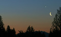
| 04/29/2006 01:08:56 PM | just before dawnby margiemuComment: *I am only commenting, and not voting on this challenge*
Photo is a little too small, colors are a little too muted.. but cool play between the moon and Venus/Jupiter/Whatever. (I'm no astronomer) | | Photographer found comment helpful. |
|
Showing 201 - 210 of ~1843 |
Home -
Challenges -
Community -
League -
Photos -
Cameras -
Lenses -
Learn -
Help -
Terms of Use -
Privacy -
Top ^
DPChallenge, and website content and design, Copyright © 2001-2025 Challenging Technologies, LLC.
All digital photo copyrights belong to the photographers and may not be used without permission.
Current Server Time: 04/21/2025 11:52:22 PM EDT.
|