| Author | Thread |
|
|
05/14/2006 11:18:24 PM |
From the CTP MkII
Sorry, couldn't help but look at other people's comments to see what's been said and what's not.
Whatever I have to say has already been said. And I'd have to agree with Gunnsi as his crits echo mine, word for word (minus the "I love sunsets" thing ;p).
All I could add, I guess, is that try using levels or brightness contrast to cut through that muddy look. |
|
 Photographer found comment helpful. Photographer found comment helpful. |
|
|
05/05/2006 07:51:12 PM |
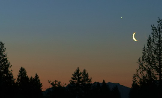
Margie, Greetings from your own Critique Club.
Here is what I like about the image.
- Nice sunset picture.
- Nice composition, nice moon, nice colors
Here is what I think would have improved the image IMO
- Was the picture taken hand held? I can see the trees are not in focus, so I believe you did not use tripod. If you use tripod, you can even go 2 stops down on the shutter speed to make this perfect.
- Little more contrast / saturation in colors would be good. More saturation will bring Blue and Orange complementary colors to meet the challenge.
Best of luck for the future entires.
Message edited by author 2006-05-07 23:53:45. |
|
| Photographer found comment helpful. |
|
|
05/04/2006 07:16:49 PM |
Comment from a member of your own commenting club :-)
I also love sunrises and sunsets. Specially the sunrise when there are still bright stars like Venus or Mercury.
There are some good things in this picture and there are some things that could easily been done better without much trouble.
1. Your picture is only 540x329 in size. You should use the maximum on at least one side of it. In this case it would have been 640x390.
2. The picture is only 23680 Bytes. Believe me I know the trouble saving pictures in Windows (don't have PS now) and loosing information. Maybe your picture was sharper before saving. It is best to use all the 150KB when you can.
3. Using rule of thirds, The moon and the star, wich are the main topic in the picture should be a little bit more to the left. The hight of the moon and star are fine.
4. Lovely colours but I would like to either see a bit more of the mountains (brighter) or make them as dark as the trees.
5. Focus, It is hard to see if the focus is bad or if it is because of the jpeg compression. I know it can be hard to focus near things, like a tree, trying to focus the moon at the same time. Doing this you have to have the trees in a distance, as much as you can. If you want to have full focus on the moon and see its landscapes you have to have about 200 in shutter speed but then everything else turns black in the night.
Message edited by author 2006-05-10 20:23:17. |
|
| Photographer found comment helpful. |
Comments Made During the Challenge  |
|
|
05/02/2006 08:39:17 PM |
| A contrast and saturation adjustment is holding this one back. |
|
| Photographer found comment helpful. |
|
|
05/01/2006 07:45:04 PM |
| Really peaceful. You did a great composition. Makes me want tot go out early to try such a shot. And your moon is well exposed. Just a really nice shot. 9 |
|
| Photographer found comment helpful. |
|
|
04/30/2006 09:57:45 PM |
| Wow, you must have a long lens...Venus shows a disk. |
|
|
|
04/30/2006 09:43:09 PM |
|
| Photographer found comment helpful. |
|
|
04/30/2006 11:17:31 AM |
| Very nice but the color are a bit muddy. |
|
| Photographer found comment helpful. |
|
|
04/30/2006 09:28:41 AM |
|
|
|
04/29/2006 02:28:21 PM |
| nice framing on the edges |
|
| Photographer found comment helpful. |
|
|
04/29/2006 01:08:56 PM |
*I am only commenting, and not voting on this challenge*
Photo is a little too small, colors are a little too muted.. but cool play between the moon and Venus/Jupiter/Whatever. (I'm no astronomer) |
|
| Photographer found comment helpful. |
|
|
04/28/2006 06:27:49 PM |
| How is this complementary colors? |
|
|
|
04/28/2006 03:38:01 AM |
| This photo is a bit bland. I need to see more contrast. Also, had you put the moon closer to a thirds line intersection, then you would have added a little more to the photo without really taking away from the point of the challenge. 4 |
|
| Photographer found comment helpful. |
|
|
04/27/2006 11:32:20 AM |
| what are the complementary colours |
|
|
|
04/27/2006 04:49:03 AM |
| excellent! why not submitting a bigger sized photo though ? |
|
| Photographer found comment helpful. |
|
|
04/26/2006 06:38:55 PM |
| 3 - Too subtle for me - colors. Fairly good shot of the moon and star, but does have somewhat of a 'snapshottish' type of feel to it. Composition is good. Tweaking of the colors (although realize likely blow out the moon/star), for this Challenge, may have helped. 640 width too. |
|
| Photographer found comment helpful. |
|
|
04/26/2006 03:14:09 PM |
| Not obvious "complementary" enough. |
|
|
|
04/26/2006 08:41:48 AM |
|
|
|
04/26/2006 06:59:24 AM |
|
| Photographer found comment helpful. |
|
|
04/26/2006 02:38:34 AM |
| Nice shot, but the colours are not bold enough to meet the challenge fully. Shame. |
|
| Photographer found comment helpful. |
Home -
Challenges -
Community -
League -
Photos -
Cameras -
Lenses -
Learn -
Help -
Terms of Use -
Privacy -
Top ^
DPChallenge, and website content and design, Copyright © 2001-2025 Challenging Technologies, LLC.
All digital photo copyrights belong to the photographers and may not be used without permission.
Current Server Time: 03/12/2025 08:04:50 AM EDT.