| Author | Thread |
|
|
05/05/2006 02:28:29 PM |
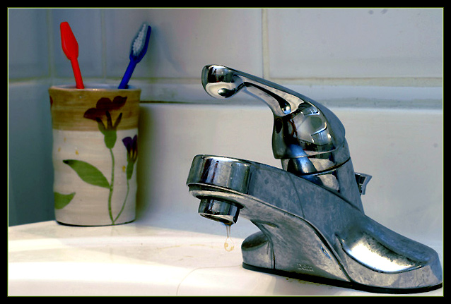
| hmmmm...my overprocessing must have turned my toothbrush a bit too red...it started off orange. |
|
Comments Made During the Challenge  |
|
|
05/02/2006 09:31:07 PM |
| Good focus, but the subject doesn't hold my interest. |
|
|
|
05/02/2006 08:18:06 PM |
| Are the red toothbrush & the green in its holder the complimentary colours? The techs for this shot is right on: good lighting with eact sharpness. The content seems a bit off & a tad boring IMHO as the drip is hardly visibile. REgradless, good luck in the challenge! |
|
|
|
05/02/2006 03:33:38 AM |
| I really like this shot, the only thing is that the drip of water seems to be out of focus a little bit. Everything else is top dollar :) |
|
|
|
04/30/2006 09:50:01 PM |
|
|
|
04/30/2006 08:12:41 AM |
focus on the drip makes it look like the toothbrushes are jsut there so the photo can fit the challenge. they should be the object of the photo since that is the challenge theme.
lighting needs work though congrats on a nice focus on the drop and sink head.
im still jsut giving you a low score for not fitting the challenge enough. |
|
|
|
04/30/2006 01:08:54 AM |
| Great sharpness and creative presentation of the challenge. 10. ( I might have tried the shot without the drip.) |
|
|
|
04/29/2006 10:50:26 PM |
| Sorry, but the complementary colors are very minor in this shot -- and that's if the left-hand toothbrish is orange. It looks red to me, which is not complementary to blue at all. |
|
|
|
04/29/2006 09:17:26 PM |
| The complementary colors are a very small part of this shot. |
|
|
|
04/29/2006 08:05:10 PM |
| I like the texture in the faucet. The drip seems secondary - but this is about the brushes right :) ? |
|
|
|
04/29/2006 12:22:14 PM |
| your sink needs cleaning :) ... that being said I actually like this although the concept of complementary color did not jump out at me at first. what saved it was the line of the tile (leading lines are good) the more I look at this the better the composition 7 |
|
|
|
04/29/2006 09:21:32 AM |
|
|
|
04/29/2006 06:14:16 AM |
| Ugh. Not very nice. Not even complementary. Sorry. |
|
|
|
04/29/2006 02:22:16 AM |
| This doesn't really meet the challenge. Nice catch on the drop though... |
|
|
|
04/28/2006 09:34:54 AM |
| and the complementary colours? |
|
|
|
04/27/2006 09:07:46 AM |
| I think if the toothbrush on the right were green, it would be more effective, as blue/red aren't complementary, but green/red or blue/yellow are. I do like the stop action and the perspective. |
|
|
|
04/27/2006 08:05:22 AM |
| its a nice overall photo but where are the complementary colors? |
|
|
|
04/26/2006 11:05:23 PM |
|
|
|
04/26/2006 09:05:11 PM |
| 1 - Hard stretch to see a color scheme here. Not holding my attention otherwise. |
|
|
|
04/26/2006 04:21:46 PM |
| I'm don't see the connection to the theme. |
|
|
|
04/26/2006 03:59:22 PM |
| Where's Waldo? :) I think I see you ! |
|
|
|
04/26/2006 05:33:16 AM |
| so, are you sure you entered the right challenge??? |
|
Home -
Challenges -
Community -
League -
Photos -
Cameras -
Lenses -
Learn -
Help -
Terms of Use -
Privacy -
Top ^
DPChallenge, and website content and design, Copyright © 2001-2025 Challenging Technologies, LLC.
All digital photo copyrights belong to the photographers and may not be used without permission.
Current Server Time: 03/12/2025 02:20:07 PM EDT.