|
|
|
Showing 221 - 230 of ~1843 |
| Image |
Comment |
| 04/29/2006 12:48:44 PM | Yellow / Purple Springby Goldwing_edComment: *I am only commenting, and not voting on this challenge*
Pretty flowers, and nice color play, but lacking that fine detail touch (especially with sharpness and compositional play), that a good DPC photo needs. Try playing with your angles and DOF some more, and get more creative, while having fun. |  Photographer found comment helpful. Photographer found comment helpful. |
| 04/29/2006 12:47:26 PM | applesby bcraines1Comment: *I am only commenting, and not voting on this challenge*
yup, those sure are apples. A rather bland photo lacking contrast and focus. The composition is hurried, and the glare from your lighting is going to really hurt you in voting. You've got the colors right, but not much else I'm afraid. |
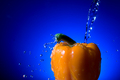
| 04/29/2006 12:46:01 PM | Pepperby danderson107Comment: *I am only commenting, and not voting on this challenge*
Water. Check.
Pepper. Check.
Radial Gradient Background. Check.
Sharp, smooth and compositionally sound? Check.
Hmm, seems like a nice DPC photo. Only thing I can think of that'll hit you is, other than having everything else a ribbon winner needs, it just completely lacks any real punch of interest, and *some* may see it as a blatant attempt to "play the game". (which there is nothing wrong with, but boy, if you overplay certain elements, look out ;))
| | Photographer found comment helpful. |
| 04/29/2006 12:43:40 PM | Newsby BlueZamiaComment: *I am only commenting, and not voting on this challenge*
Well, all I can say is that while you have your red and green, adding the orange was probably a mistake for most voters. | | Photographer found comment helpful. |
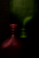
| 04/29/2006 12:42:54 PM | SYMMETRYby imagesloyolaComment: *I am only commenting, and not voting on this challenge*
Dark and moody lighting which works well for me. Red/Green is my least favorite of the CC, but this one really works.. it has a shade of green that doesn't knock you over the head, and the red is almost calming. Unfortunately, your crop leaves the symmetry a *little* bit off, which will probably cause people to hit you a bit. Nice photo otherwise. |
| 04/29/2006 12:41:17 PM | Orange and Blue! Bronco's Rule!by mbakerComment: *I am only commenting, and not voting on this challenge*
A little too small here. Be sure to submit a photo that uses the full 640pixel limit to get the most out of your photo, and from the voters.
Having said that, this is an ok "portrait" of a teddy bear, but I don't believe the "orange" will be strong enough for most. You might also get hit for the visible folds in your background material, although some people also like to see that. It's a cute teddy bear. | | Photographer found comment helpful. |
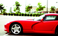
| 04/29/2006 12:39:42 PM | Someday..by RyencoolComment: *I am only commenting, and not voting on this challenge*
Nice car. Dodge Vipers always have been one of my favorites. The over-saturation works for this method of photo. It's very.. industrial, I'd say. However, I think the high contrast will be a turn-off for many, and the slight tilt of the horizon will work against you as well. But boy.. that red is great. |
| 04/29/2006 12:36:38 PM | Hot and Cool Complementary Peppersby chaliceComment: A nice array of vegetables.. nicely shot, well lit, but lacking punch.
On the pages of Home & Garden? Sure, but lacks what it needs for DPC's fickle voters. | | Photographer found comment helpful. |
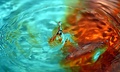
| 04/29/2006 12:35:27 PM | Blue 'n Orangeby sangeethComment: Please take this comment as it is intended, to annoy you. Just Kidding.
Ahh, the water drop shot. Some notes:
Focus is a little soft here. If you used a noise reduction program, that could have led to that. Nice centered focal point, but maybe too centered. Colors are good, but you probably would have appealed to more people by working on the cyan color more and made it a bit deeper. Just a *little* flat over-all.
Nice attempt, keep on shootin'. | | Photographer found comment helpful. |
| 04/26/2006 02:13:10 AM | Still a Fire Withinby ArtysteComment: Dang.. I under-predicted this one.. 6.182.. nice.. I was only 6.11 at turn-over, and it's always great to get another Top 20 under my belt.
Thanks for all the comments everyone.. and yah, I did go a little hard on the eyes.. but hey, whatever.
Just nice to know I can still get above 6 now and again. |
|
Showing 221 - 230 of ~1843 |
Home -
Challenges -
Community -
League -
Photos -
Cameras -
Lenses -
Learn -
Help -
Terms of Use -
Privacy -
Top ^
DPChallenge, and website content and design, Copyright © 2001-2025 Challenging Technologies, LLC.
All digital photo copyrights belong to the photographers and may not be used without permission.
Current Server Time: 04/21/2025 11:55:33 PM EDT.
|