| Image |
Comment |
| 05/02/2007 05:15:39 PM |
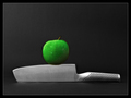
On The Edge by DUCATISTAComment: Might want to go in at 200 - 300% and clean up your edge editing in the future. (Not that it'd be noticeable on *most* monitors I think, but it's clearly visible on mine.) Some strange effects around the edges of the apple and top of the knife (and some on the handle).
Just for future reference anyway. Just pointing out what I see. |
 Photographer found comment helpful. Photographer found comment helpful. |
| 05/02/2007 03:23:23 AM |
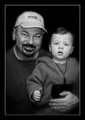
Day One: F & Sby Art RoflmaoComment: Why, I say, must you ruin a great cute kid portrait, by posing him with a gorilla toy? ;D
Nice conversion, great tonage.. but I can't say I really like the strong blurring of the edges. It kind of ends too abruptly in places, and is out of place around your hand. |
| Photographer found comment helpful. |
| 05/02/2007 03:19:50 AM |
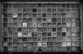
chainby doc_gonzoComment: All I can do here is echo a few of the comments here that this would be much better with the whole chain in focus.
When you photograph something straight on, it can be very disorienting for part of it to be OOF, especially when you don't have any kind of "3D" or perspective to give the viewer a reason *why* it's OOF.
|
| Photographer found comment helpful. |
| 05/02/2007 03:13:41 AM |
Guitar Stringby MarioAngelComment: Very nice conversion here. You've captured a broad range of tones, and done well to highlight a stark, industrial feel.
I'll also echo the sentiments of the diagonal crop (or reshoot). It's not something I'd have thought of by myself, but it's a wonderful suggestion. |
| Photographer found comment helpful. |
| 05/02/2007 03:11:33 AM |
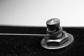
one/thirtyby UNCLEBROComment: The thumbnail made me very curious. This is a fascinating study in light reflection and refraction. I'd also love to see this a little sharper, with more of a contrast boost. Lovely as is though.
Also, keep coming back to this location at different times of day and year, if you can. I bet you could capture some stunning play. |
| Photographer found comment helpful. |
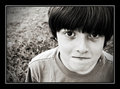
| 05/02/2007 03:09:02 AM |
Day 1by walrus451Comment: I'm surprised that there haven't been more portraits yet. This is one of the better ones so far. A nice conversion, the starkness playing off his expression quite well. I think you could have given a little more life into the eyes though, by solidifying the pupils a touch more, and enhancing the natural catch lights. They (the eyes) remain just a touch muddy I think.
Also, you might be just a touch too far into the cyan channel with your toning. I'm seeing "green" here, which is off-setting. If you are able, try playing with Selective Color in "Neutrals", and dropping the cyan slider by -1 or -2. |
| Photographer found comment helpful. |
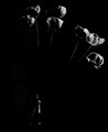
| 05/02/2007 03:05:08 AM |
2 - Seeking the Lightby JutildaComment: Why am I not surprised that you would be one of the first to go with a really classic super-high contrast B&W :)
My only suggestion here would be to "shift" the frame over to the right by about 50 pixels. There's just a little too much negative space on the left hand side, throwing the balance off for me. |
| Photographer found comment helpful. |
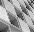
| 05/02/2007 03:02:49 AM |
Geometric Pattern (2)by TonyTComment: I'd try this again with a deeper depth of field, and a stronger contrast. I'd leave the lighter areas pretty much where they are, (maybe a TINY boost), but I'd certainly try and darken the shadows/black areas to add a little more feel and solidity. The over-all feel for me is that it's just too soft and light.
The angles have been captured beautifully though. |
| Photographer found comment helpful. |
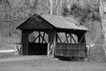
| 05/02/2007 02:58:26 AM |
Bridge in the Park.jpgby dsternerComment: Some suggestions:
When photographing a subject, pay very close attention to what is, and isn't, in your view. The OOF foreground elements here (the branches), are very distracting, and easily avoidable. Take some time to wander around and find an area that provides a good, clear, unobstructed view of your subject.
MK has some very good points regarding B&W conversion. I second them.
Also, compositionally, I'll have to disagree with sherpet, partly due to the fact that you've chosen a spot with distractions in the way, but also partly because this subject doesn't really work well in a centered composition. I'll explain why IMO:
The path leading into the bridge disappears on the other side. You have brush and bramble there that abruptly cuts off your line. Because of this, I'd have tried to find a way to get more of the leading path into the shot, giving you negative space to lead into the bridge, in an off-centered composition. This way, you don't worry about having uninteresting brush, you give more dynamics to the shot, and you give a reason for the eye to follow the scene.
Lastly, sharpness is a small issue as well. A light pass with USM at or around 0.3 radius, and 150 or so amount (tweak as needed), would help that.
(EDIT: Ooops, mk beat me to the composition idea already, missed that. But I hope I've expanded on it well enough.) Message edited by author 2007-05-02 02:59:12. |
| Photographer found comment helpful. |
| 05/02/2007 02:29:52 AM |
The Big Bang by DUCATISTAComment: People have to stop using this lens.. I don't want to get bumped off the top 5 ;D |
| Photographer found comment helpful. |
Home -
Challenges -
Community -
League -
Photos -
Cameras -
Lenses -
Learn -
Help -
Terms of Use -
Privacy -
Top ^
DPChallenge, and website content and design, Copyright © 2001-2025 Challenging Technologies, LLC.
All digital photo copyrights belong to the photographers and may not be used without permission.
Current Server Time: 04/16/2025 01:14:06 AM EDT.