Greetings from the Critique Club!
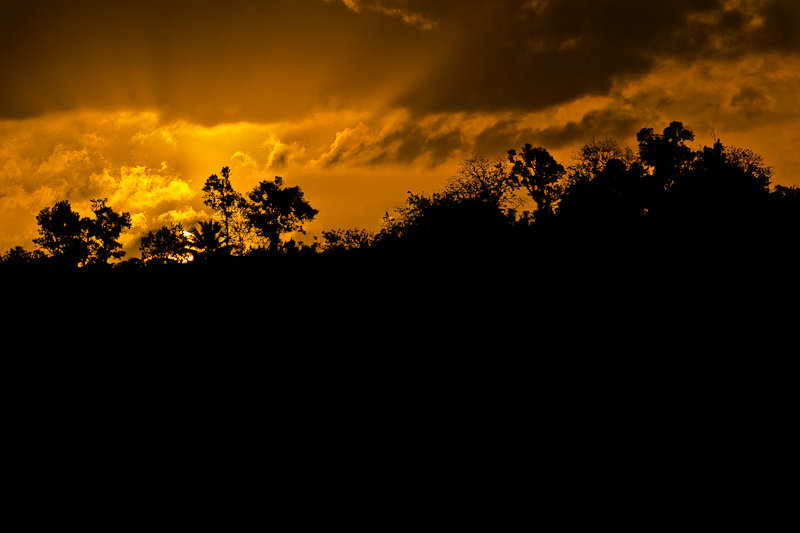
Pity that this image didn't do better, as you have lovely golden tones in the sky and great silhouettes to work with. Problem is, from my point of view, is the vast expanse of black at the bottom of the page. For an entire third, there is nothing to look at. Now on the one hand it does help draw the eye to the punch of colour, but then...that's it. This is a highly competitive site, and Free Studies in particular are difficult to do well in. There needs to be something more here.
I see that you're a new member, so you may want to try this simple but effective exercise to help you get a better sense of what I mean. Choose a challenge (or several) and go through all the images...in reverse order. So start at the very end, with the DQs and bottom images, and work your way up to the ribbon winners.
Hope this helps, please keep on shooting and entering!
Feel free to PM me,
Susan |