| Author | Thread |
|
|
05/01/2012 11:27:25 AM |
Greetings from the Critique Club!
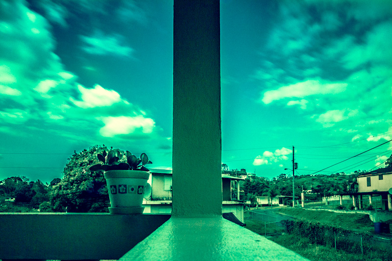
Nice use of long exposure and an interesting use of colour, for sure. Compositionally it's only an OK shot, I've seen much better in your portfolio. The actual scene itself is a bit humdrum, perhaps that's why you chose to go with the underwater colour filter? This to me is a too common problem, relying on PS or similar programs to rescue a shot. Sorry, but when the pp overwhelms the actual image, your vote will as a general rule, suffer. Tactful use of pp can enhance a good image, but too much will ruin any shot, good or bad.
Feel free to PM me
Susan |
|
Comments Made During the Challenge  |
|
|
04/24/2012 10:18:18 PM |
dreamy
I'm hanging this in my fantasy art gallery
 |
|
 Photographer found comment helpful. Photographer found comment helpful. |
|
|
04/23/2012 08:37:34 PM |
| Wow, that is so interesting how different the two sides look. |
|
| Photographer found comment helpful. |
|
|
04/23/2012 07:45:25 PM |
|
| Photographer found comment helpful. |
|
|
04/22/2012 09:08:30 AM |
| The colors don't really do it for me... |
|
|
|
04/21/2012 04:00:50 PM |
| I love the color tone. It has such a retro feel. |
|
| Photographer found comment helpful. |
|
|
04/21/2012 12:56:40 PM |
| Odd. Compelling. Repulsive. Balanced. Very blue. |
|
|
|
04/19/2012 04:13:20 PM |
| Think I would have liked it better in B&W .love the feel of it though . |
|
| Photographer found comment helpful. |
|
|
04/19/2012 01:29:27 PM |
| nope, don't like the color |
|
Home -
Challenges -
Community -
League -
Photos -
Cameras -
Lenses -
Learn -
Help -
Terms of Use -
Privacy -
Top ^
DPChallenge, and website content and design, Copyright © 2001-2025 Challenging Technologies, LLC.
All digital photo copyrights belong to the photographers and may not be used without permission.
Current Server Time: 03/10/2025 08:58:51 PM EDT.