| Author | Thread |
|
|
06/15/2012 11:06:19 AM |
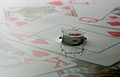
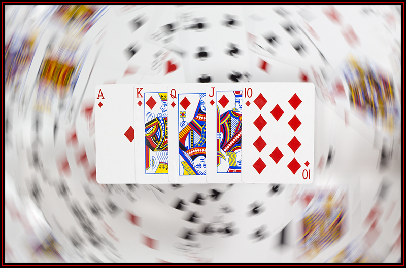
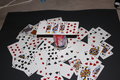
Great idea and nicely executed. I think what really makes this work is the balance of light between the cards in the foreground and the cards in the background. It helps the front cards really stand out.
Excellent. |
|
 Photographer found comment helpful. Photographer found comment helpful. |
Comments Made During the Challenge  |
|
|
04/28/2012 10:18:55 AM |
|
| Photographer found comment helpful. |
|
|
04/26/2012 10:18:29 PM |
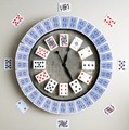
| Cool shot, love to know how you achieved this. |
|
| Photographer found comment helpful. |
|
|
04/25/2012 10:45:42 AM |
| Very cool effect you created. |
|
| Photographer found comment helpful. |
|
|
04/23/2012 04:43:49 PM |
| One earlier entry had a similar concept - both are very clever takes on flush suit of cards. Well done. |
|
| Photographer found comment helpful. |
|
|
04/23/2012 12:57:14 AM |
| Awesome picture, would be curious to learn how you did it! |
|
| Photographer found comment helpful. |
Home -
Challenges -
Community -
League -
Photos -
Cameras -
Lenses -
Learn -
Help -
Terms of Use -
Privacy -
Top ^
DPChallenge, and website content and design, Copyright © 2001-2025 Challenging Technologies, LLC.
All digital photo copyrights belong to the photographers and may not be used without permission.
Current Server Time: 04/26/2025 12:34:25 AM EDT.