Greetings from the critique club.
First, I'm no expert on street photos... but I imagine you intended this photo as a different approach to a street style photo. Quickly, I'll touch on why this photo might not have scored so well, then I'll let you know why I like it.
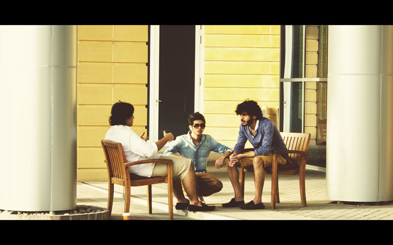
It seems people were really looking for an image that told a story. I think street photos are really about the interaction of people between each other and/or with their environment. While there is some interpersonal interaction going on here, it's meaning is not well understood by the viewer. The man on the left is explaining something, the man on the right is leaning in, while the middle man appears to be watching the photographer. The columns offer an interesting framing that I like, but I think it was voted down because there wasn't an intimacy here due to including the columns.
It has a really interesting and unique feel. It's very balanced, very mirrored. The colors are great. I personally love blues and yellows. They seem to complement each other so well. I also like the gradient of the shirt colors. White to blue.
I think it comes down to perception. As a few people said, the image looks like a screengrab from a 70s film. Not so much a standard street photo. But it has a very pleasant artistry to it. For that reason, and it's strong composition, I find it very interesting. Sorry that the majority of voters didn't agree - it seems the "DNMC" vote (1s and 2s) is what might have got you here, score wise. Don't focus on that though, take a look at the numerous good comments. That's what means the most.
Food for thought.
James Downing |