| Author | Thread |
|
|
03/06/2013 09:19:41 PM |
| Fascinating subjects and once again beautifully shot and processed. |
|
|
|
02/03/2013 11:06:57 PM |
I love your subject matter and the way it models so nicely.
Unfortunately (IMO, of course) that background detracts slightly. |
|
|
|
02/01/2013 02:15:49 PM |
| Better than the first one, quite a bit. However, to me, the background is still catching too much attention because of the interesting light being on it rather than on the subject. |
|
|
|
01/31/2013 10:15:02 PM |
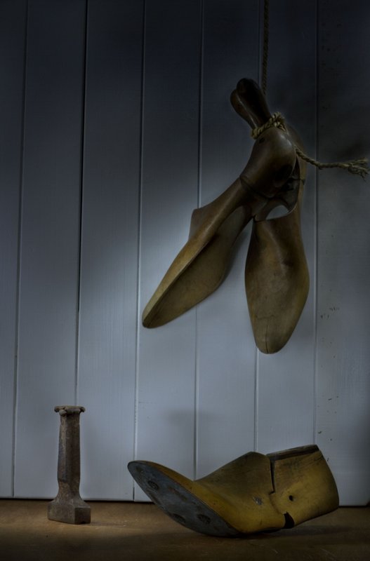
| The problem with still lifes is that we expect everything to be perfect or planned with a purpose. Quite a challenge especially for us with attention deficit issues. That's why I don't try. So I find both interesting but so different in lighting and composition that it is difficult to choose a preference. I find myself more interested in the two as a set - a study in process of how we can see the same subject and alter our perceptions over time. |
|
|
|
01/31/2013 02:20:57 PM |
I am with Ann on this one. The brightest part is where the eye goes first, yet that does not define the subject. Ann on this one. The brightest part is where the eye goes first, yet that does not define the subject.
On a personal note I struggle most in a still life with the transition of a three dimensional setup into a two dimensional photograph. Placing your objects in real life to get them where you want them in the photograph is an art in itself. |
|
|
|
01/31/2013 08:22:55 AM |
Definitely cooler. 3 objects and thus simpler than before. I also prefer straighter lines. |
|
|
|
01/29/2013 06:23:24 PM |
| I wish you had of included your first shot in your comment box as it would make it easier to compare .. You know, this set-up is simpler but it's missing the feel of being as authentic as the first one. I am hopeless at these kind of setups so I am not sure how much value I would place on my comments. |
|
 Photographer found comment helpful. Photographer found comment helpful. |
|
|
01/29/2013 12:37:46 PM |
| I think you're making progress. Learning to shoot still lifes is a process, not just some ability that people are born with. I think the white balance on last week's image looked more natural. The white wall this week looks a little too freshly painted. What I'd aim for on this one would be to get more light on the shoes and tools to try to focus the attention on them. On this image, the brightest, most contrasty thing is the white wall around the hanging shoe things, so that's where my eye goes. |
|
|
|
01/29/2013 12:16:08 PM |
| Unlike mariuca, I prefer the slightly simpler set-up you have here - but I do agree about the tones. I also think this background needs to be perfectly straight to be most effective. |
|
| Photographer found comment helpful. |
|
|
01/29/2013 05:51:53 AM |
| Everytime I see your shots it inspires me to try it out myself. I am liking what you are achieving. |
|
| Photographer found comment helpful. |
|
|
01/28/2013 10:00:09 PM |
| I prefer the first shot, composition and all. You lost some of the freshness of the look and even if the blue is a beauty, the palette for the subject was nicer before. |
|
Home -
Challenges -
Community -
League -
Photos -
Cameras -
Lenses -
Learn -
Help -
Terms of Use -
Privacy -
Top ^
DPChallenge, and website content and design, Copyright © 2001-2025 Challenging Technologies, LLC.
All digital photo copyrights belong to the photographers and may not be used without permission.
Current Server Time: 04/11/2025 07:35:34 AM EDT.