| Author | Thread |
|
|
01/15/2003 07:07:04 PM |
CRITIQUE CLUB REVIEW
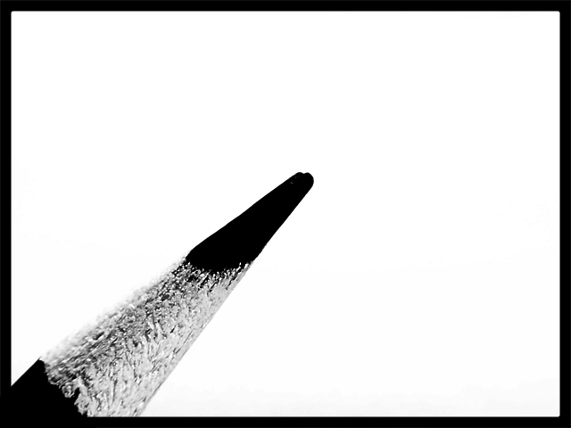
Question. Did you shoot this in 'whiteboard' mode? Just wondering how it came out the camera looking like that :). Was it a conversion post shoot to black and white?
Graphic design wise, this is excellent. Stark , reduced to essential elements. My eye wants the pencil to project farther into the frame tho, and maybe not QUITE at such a steep angle.
I think it could have been improved a bit if you had moved your lighting in such a way that you got a bit more of a high light off the pencil point. Would have given it more 3 dimensionality.
Your DOF is narrow, and I also wonder what it would have looked like with a smaller aperature (more of the pencil in focus). If you are using a tripod, then you shouldnt have a prob with a slower shutter speed.
Great pic! |
|
 Photographer found comment helpful. Photographer found comment helpful. |
Comments Made During the Challenge  |
|
|
01/10/2003 10:44:45 PM |
So I'm a sucker for the simple and good use of -dare I say...negative space. Very clean-technically. I believe that the choice of boarder adds to this image. Excellent! 10
Ruthann |
|
| Photographer found comment helpful. |
|
|
01/09/2003 10:03:15 PM |
| doesnt seem to meet the challenege... feel free to email me and explain, as otherwise it's a good photo.. thanks |
|
| Photographer found comment helpful. |
|
|
01/09/2003 03:08:12 PM |
| I cant see how this fits the subject of strange. Great shot though. |
|
| Photographer found comment helpful. |
|
|
01/09/2003 12:39:56 AM |
|
| Photographer found comment helpful. |
|
|
01/08/2003 09:04:27 PM |
|
| Photographer found comment helpful. |
|
|
01/08/2003 01:53:33 AM |
| I can't see the strangeness in your image. However, it is a great macro shot and the contrast has been really well done. |
|
| Photographer found comment helpful. |
|
|
01/07/2003 07:38:51 PM |
| Good detail of the pencil. The use of thirds applies to the focal point. |
|
| Photographer found comment helpful. |
|
|
01/07/2003 12:42:08 PM |
| Nice photo but I don't think this meets the challenge. |
|
| Photographer found comment helpful. |
|
|
01/07/2003 11:44:51 AM |
| This is a neat shot and an interesting use of high key contrast, but i don't understand the theme as pertains to the challenge... - setzler |
|
| Photographer found comment helpful. |
|
|
01/06/2003 07:02:14 PM |
| I finally figured out what this is! (An incredibly close up of a pencil tip!!) O.K. now that's out of the way, what has this to do with the challenge? Nice use of negative space. 6 Swash |
|
| Photographer found comment helpful. |
|
|
01/06/2003 10:21:38 AM |
|
| Photographer found comment helpful. |
|
|
01/06/2003 03:49:28 AM |
| The contrast is a bit too bold for me. |
|
| Photographer found comment helpful. |
Home -
Challenges -
Community -
League -
Photos -
Cameras -
Lenses -
Learn -
Help -
Terms of Use -
Privacy -
Top ^
DPChallenge, and website content and design, Copyright © 2001-2025 Challenging Technologies, LLC.
All digital photo copyrights belong to the photographers and may not be used without permission.
Current Server Time: 03/12/2025 08:39:03 PM EDT.