| Author | Thread |
|
|
09/27/2004 06:55:53 AM |
| Some very cheeky comments here about this camera... I'll have you know my next DSLR purchase will be Minolta! |
|
Comments Made During the Challenge  |
|
|
09/26/2004 11:53:18 PM |
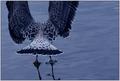
| good lighting, nice composition, the gradient effect works well, I like borders, but this one I just don't really care for too much. A very good shot overall! |
|
 Photographer found comment helpful. Photographer found comment helpful. |
|
|
09/26/2004 04:36:23 PM |
| A good shot, the background is a little too unreal |
|
| Photographer found comment helpful. |
|
|
09/26/2004 04:01:57 PM |
| This has a lovely graphic quality; nice use of negative space. |
|
| Photographer found comment helpful. |
|
|
09/22/2004 04:59:24 PM |
| I like the way you used a minolta just incase you dropped it, nothing to lose :) 8 |
|
| Photographer found comment helpful. |
|
|
09/22/2004 02:12:38 PM |
Backgrpound looks very processed. On the other hand so does mine.
Love the composition and sharpness of the image |
|
| Photographer found comment helpful. |
|
|
09/21/2004 11:56:36 PM |
| Doesn't look "real" to me. Looks heavily minipulated. I like it otherwise. :) |
|
| Photographer found comment helpful. |
|
|
09/21/2004 09:01:55 PM |
|
| Photographer found comment helpful. |
|
|
09/21/2004 11:52:48 AM |
|
|
|
09/21/2004 11:28:30 AM |
I like the nice Photoshop work however it is way to obvious and I think it breaks the rules for this challenge. Someone might try to disqualify you.
Personally I like it and if you can do extra Photoshop work on a photo without anyone picking up on then all the power to you. This has got disqualification written all over it but ill give you a 6 because I like it. Good luck
|
|
|
|
09/21/2004 11:09:48 AM |
| I don�t like the border, but over all a good image. I would have gone with an all white background, and even maybe made the image black and white. |
|
| Photographer found comment helpful. |
|
|
09/20/2004 11:43:37 PM |
| Interesting photo, great lighting. I'm interested in how it was processed. It has a very "digital art" kind of feel. |
|
| Photographer found comment helpful. |
|
|
09/20/2004 08:10:31 PM |
| I don't know why but this looks very phony to me. |
|
| Photographer found comment helpful. |
|
|
09/20/2004 02:06:47 PM |
| Original, but background too artificial. |
|
| Photographer found comment helpful. |
|
|
09/20/2004 01:42:38 PM |
| Sorry, but don't like it. Looks like digital art and the colors of the background hurt my eyes, very sharp, but just not for me (hey, I'm honnest) (6) |
|
| Photographer found comment helpful. |
|
|
09/20/2004 10:17:02 AM |
| I think that having replaced the background puts this image outside of the limits of the challenge rules... but it's a great shot |
|
| Photographer found comment helpful. |
|
|
09/20/2004 08:25:52 AM |
| The picture is good - the border is very distracting |
|
| Photographer found comment helpful. |
|
|
09/20/2004 06:01:54 AM |
| Did you use neatimage (or something like that)? The pic looks plastic. Too much of the effect to me |
|
| Photographer found comment helpful. |
|
|
09/20/2004 02:34:59 AM |
| Boy, are you crazy throwing your camera like that? ;-) This is a very dramatic shot with an interesting composition that I like a lot. The only thing that's jarring is that bright blue with horizontal striping through it, which usually indicates a simple gradient fill. Still, the shot came out very nice. |
|
| Photographer found comment helpful. |
|
|
09/20/2004 01:47:35 AM |
| Beautiful colors and good use of negative space. Fit for a Minolta ad. Good job! |
|
| Photographer found comment helpful. |
|
|
09/20/2004 12:35:56 AM |
| Thank goodness it wasn't a Canon!!! Great image! 10. |
|
| Photographer found comment helpful. |
Home -
Challenges -
Community -
League -
Photos -
Cameras -
Lenses -
Learn -
Help -
Terms of Use -
Privacy -
Top ^
DPChallenge, and website content and design, Copyright © 2001-2025 Challenging Technologies, LLC.
All digital photo copyrights belong to the photographers and may not be used without permission.
Current Server Time: 03/14/2025 06:39:46 PM EDT.