| Author | Thread |
|
|
01/21/2003 09:59:21 PM |
Critique Club
Composition-Content
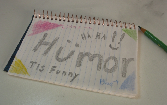
The composition is good, nice and simple with no distracting information, I like the tilt of the notebook. However, I think that you lost most people with your brand of humour! This was such a difficult challenge, everybodys sense of humour is so different. I have seen entries before with something written on a notebook and for some reason they never seem to do especially well, maybe it's just not visually exciting enough.
Background
Background seems fine, looks a little dirty on the top right corner, or maybe that's just my computer screen!
Technical
Focus is nice and sharp, lighting seems OK, if a little flat, but I do like the shadows cast.What really would have helped this a lot would have been more contrast, easily boosted. Maybe if you had used colour pens, instead of pencils, then boosted the contrast it would have been better, lots of bright colours against a white background would have really stood out.
My Opinion
At least you tried, which is better than me, I totally copped out of this one! Good Luck in the next challenge
|
|
 Photographer found comment helpful. Photographer found comment helpful. |
|
|
01/21/2003 08:11:09 PM |
I would like to thank all of you for your comments on this photo. I found most of them helpful. As for the contrast I'm not sure what exactly happened, I'm sure it was brighter then this, but my original is dark too (d'oh!). I will try to be more careful in the future. This was a difficult challenge, I hope to have better luck next time.
Cheers!
|
|
Comments Made During the Challenge  |
|
|
01/16/2003 09:38:45 AM |
| Are you also the "Too Dumb" person? Just looks familiar. Took longer to do this than to really shot a photo. Too funny. |
|
| Photographer found comment helpful. |
|
|
01/15/2003 09:39:54 PM |
| Hmm... this is a tough cahllenge because so many are good. The first thing that comes to mind is that I don't think this is funny. Which is ok, of course, it's just that reading is boring to me. hehe Not too sure why the colors are drawn in the corners there. hehe Technically, it seems dull... like there's not enough light I think. I don't really have any suggestions. |
|
| Photographer found comment helpful. |
|
|
01/15/2003 05:40:17 PM |
|
|
|
01/15/2003 12:26:27 AM |
|
| Photographer found comment helpful. |
|
|
01/14/2003 07:53:57 PM |
| Looks like you could have boosted the White by adjusting levels. Not sure this picture has made me laugh. |
|
| Photographer found comment helpful. |
|
|
01/14/2003 10:35:33 AM |
| Humor is funny, but this isn't real funny. The lighting isn't real great. I would think that the paper would be white, rather than a shadowy dull color. Nice art work. Focus is really good, I'll give you that. I think a white level adjustment is in order though. Good luck in the challenge. |
|
| Photographer found comment helpful. |
|
|
01/14/2003 02:35:00 AM |
| damn you made me giggle... guess I have to raise the score. the shot needs focus though |
|
| Photographer found comment helpful. |
|
|
01/13/2003 07:34:14 AM |
| Not only did you mis-spell "humour", you got "colours" wrong too! ;-) Unfortunately, your photo doesn't make me want to laugh out loud which was the aim of the challenge. |
|
| Photographer found comment helpful. |
Home -
Challenges -
Community -
League -
Photos -
Cameras -
Lenses -
Learn -
Help -
Terms of Use -
Privacy -
Top ^
DPChallenge, and website content and design, Copyright © 2001-2025 Challenging Technologies, LLC.
All digital photo copyrights belong to the photographers and may not be used without permission.
Current Server Time: 03/14/2025 06:01:30 AM EDT.