| Author | Thread |
|
|
01/22/2003 11:35:22 AM |
Greetings from the Critique Club :)
Hi Carsten :)
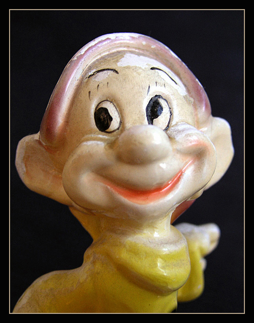
You did a great job with this macro shot. The composition here is as good as it can be. This looks to be an antique figurine maybe? The 'age' showing on this piece adds quite a bit of interest for me. I think it may be hand painted and possibly part of a set :) I personally like 'old' stuff.. especially when it comes to making photographs like you have here. I recently worked on a project for another site that had to be a series of 10 photos from somewhere I have never been before. The results of that set are here if you are interested in viewing:
//www.pbase.com/jmsetzler/spruce_pine
When I work with something old, or when i'm attempting an 'old' theme, I usually go with black and white or some sepia tint like shown in the photos above. I think you made the correct choice of going for color for use in the humor challenge though. However, if this piece is indeed an antique and you want to do something with this photo other than use it for the challenge, you may want to try some b/w or sepia tinting yourself. If you are unaware how to do this, feel free to send me a message and I will be happy to share my method with you. I may even write a tutorial for dpc on this subject someday.
On a tecnhical note, I think this photo could be a lot stronger with more depth of field. Your aperture setting of F2.0 has created a very narrow depth of field for this image. The right ear and extended hand are out of focus because of the shallow depth of field and, as far as I can see, that shallow focus is not enhancing the image in any way. I believe that shooting this image at about F5.6 in aperture priority would bring the whole figure into nice sharp focus.
I believe that you also chose an interesting directional lighting for this piece, which is working ver well here :)
The only possible explanation that I have for this photo not scoring much higher is the overall 'humor' factor presented in the photo. Technically, I believe the photo is worth much more than a 4.5 score. Regardless of the score you achieved here, you have a great photo to add to your portfolio :)
Keep up the great work :)
John Setzler
|
|
 Photographer found comment helpful. Photographer found comment helpful. |
Comments Made During the Challenge  |
|
|
01/17/2003 08:57:17 PM |
| Cute, but the lighting is harsh, creating some glare. |
|
| Photographer found comment helpful. |
|
|
01/17/2003 01:36:45 PM |
| IMHO the quality of the figurine, texture and color, are absolute impediments for you to obtain an atractive image, no matter how good your photographic technique. |
|
|
|
01/15/2003 09:28:06 PM |
| Nice photo although I don't think it's a humorous pic. The character is, so it qualifies. It just seems to lack emotion... being ceramic I guess. Technically, the lighting is cool, just a little hot on his forehead. But that's nitpicking. I've been liking the pictures with people in them. Still a nice shot though. (7) |
|
| Photographer found comment helpful. |
|
|
01/15/2003 10:40:45 AM |
| Nice close up, a little fuzzy on the nose. You might try to increase your DOF to fix. He makes me feel warm but not break out in laughter. 5 |
|
| Photographer found comment helpful. |
|
|
01/14/2003 08:02:28 PM |
| Cute shot. The overall picture looks a bit fuzzy, I'd like to see the whole figurine in focus. Nice border. Jacko. |
|
| Photographer found comment helpful. |
|
|
01/14/2003 05:48:21 PM |
| Great macro work here. I would have prefered a more colourfull back ground. though. |
|
|
|
01/14/2003 12:48:03 AM |
| He's funny, but the photo its self isn't really funny. Oh well. I like dopey anyway. The color is very nice, and I like to DOF as well. Nice focus and clarity. Technically, this is nicely done. Only a slight glare on his forehead. I like the background, nothing distracting there. Lighting appears to have been good for the shot. Good luck in the challenge. |
|
| Photographer found comment helpful. |
|
|
01/13/2003 10:34:30 AM |
Looks like a good photo to me. I will say the texture, or age of this figure makes the shot look like it has grain. I see it does not. I like the background and the colors.
The top is a little over exposed. Good luck to you. |
|
| Photographer found comment helpful. |
Home -
Challenges -
Community -
League -
Photos -
Cameras -
Lenses -
Learn -
Help -
Terms of Use -
Privacy -
Top ^
DPChallenge, and website content and design, Copyright © 2001-2025 Challenging Technologies, LLC.
All digital photo copyrights belong to the photographers and may not be used without permission.
Current Server Time: 03/14/2025 06:00:08 AM EDT.