| Author | Thread |
Comments Made During the Challenge  |
|
|
10/08/2004 06:36:20 PM |
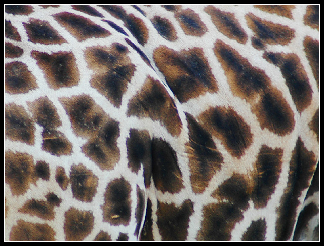
| Nice color and interesting, but for me, has a "wallpapery" feel to it. Would love to have seen more of the giraffe's "personality"! |
|
 Photographer found comment helpful. Photographer found comment helpful. |
|
|
10/07/2004 08:22:37 PM |
| A bit more of the giraffe and some context/background would have made this a considerably stronger challenge entry. |
|
| Photographer found comment helpful. |
|
|
10/06/2004 11:31:21 PM |
| this would probably be more interesting to me if the focus was a little sharper. i also don't think the border does anything for the presentation. |
|
| Photographer found comment helpful. |
|
|
10/06/2004 07:34:49 AM |
| Focuse and colors could wish better but idea is nice of showing texture. |
|
| Photographer found comment helpful. |
|
|
10/05/2004 03:32:07 PM |
| Great abstract idea but I don't think the colours are rich enough to do it full justice. |
|
| Photographer found comment helpful. |
|
|
10/04/2004 08:55:28 PM |
| Unusual perspective of a Giraffe, well done. The frame compliments it. |
|
| Photographer found comment helpful. |
|
|
10/04/2004 04:30:13 PM |
I being with a haiku:
Oh mighty tower
Melting with the burning grass
And bespotted paths
and now a faiku:
the shifting chroma
from the lens or the wobbles
begs for black and white
and now a paiku:
the dancing pattern
moves like sun-dappled water
hiding in shadow
|
|
| Photographer found comment helpful. |
|
|
10/04/2004 03:42:43 PM |
| Very cool! I like this a lot, a nice design with great composition! The only thing is its a tad bright on my monitor, and maybe a bit blurry. 8 |
|
| Photographer found comment helpful. |
|
|
10/04/2004 02:08:20 PM |
Interesting texture but it says nothing about its environment to me.
Interesting take on the challenge.
Good luck. |
|
| Photographer found comment helpful. |
|
|
10/04/2004 01:25:01 PM |
| Interesting perspective. The image seems flat. I'm trying to think of how you could have given it more oomph but I have a brain cramp right now. Stay tuned ... Jacko. |
|
| Photographer found comment helpful. |
|
|
10/04/2004 12:47:20 PM |
| Nicely composed and producted shot. The border holds the shot together well, and good choice of just b&w for the border not colours. The black parts of the spots look a little pale. I think I'd increase the contrast or levels a ltitle. The shot looks a little soft - I think I'd try using a little (more) sharpening. With the texture as it is I'd imagine it would be hard to see any negative effect of the sharpening. Overall interesting idea and pretty well produced. |
|
| Photographer found comment helpful. |
Home -
Challenges -
Community -
League -
Photos -
Cameras -
Lenses -
Learn -
Help -
Terms of Use -
Privacy -
Top ^
DPChallenge, and website content and design, Copyright © 2001-2025 Challenging Technologies, LLC.
All digital photo copyrights belong to the photographers and may not be used without permission.
Current Server Time: 03/14/2025 03:53:43 AM EDT.