| Author | Thread |
|
|
01/23/2003 07:17:11 PM |
Critique Club Critique
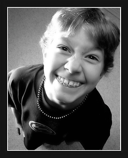
(1) COMPOSITION (CONTENT) The composition of the photograph is one of the best things about it. The diagonal placement of the young man is very interesting compositionally. The fact that you are looking down at him makes his face much larger than any other part of him and thus take on a prominence that it normally would not.
(2) BACKGROUND The background is rather plain, and because of this the photo has an uncluttered look to it. Nice selection for this partcular photo. I do not know what that little thing in the corner over his head is, but it is a little bit distracting. Maybe you could have cropped the photo just a little tighter and gotten rid of it.
(3) CAMERA WORK ,TECHNICAL Exposure seems a little bright on the left side of his face and hair. It looks as though this was taken in natural light. Some wonderful details are lost in the highlight areas. I am wondering if that light could have been muted a little with some tissue paper or muslin cloth.
(4) DIGITAL PROCESSING ,TECHNICAL Black and white was a good choice for this photograph. You have very good tonal range here, all the way from whitest white to blackest black.
(5)MEETING THE CHALLENGE This photo does a very good job of meeting the challenge. I love the look on his face, the way he is wrinkling up his nose and even the sparkle in his eye.
(6) MY OPINION ON THE PHOTO This is one of those photos that you will treasure when he is older. It does have a little "snapshot" feel to it, but that does not seem to take anything away from the photograph. |
|
 Photographer found comment helpful. Photographer found comment helpful. |
Comments Made During the Challenge  |
|
|
01/18/2003 01:32:51 AM |
| This is definitely a humorous photo... the angle you took it at and the look on his face, not to mention the addition of his braces really makes this funny to look at. Like one of those birthday cards that are blank inside or something. Good choice of using black and white as well. There are a few things that to me drop the score a tad. The lighting on the left side of the picture especially on his face and neck is much too harsh. His face seems to blend in with his neck, and its a shame some of the hair is blown out at the top because that would have very nicely framed his face... I like your choice of cropping part of the head, because it makes it look like he's lifting is face to fill the frame. It looks like there is wood or something in the upper right hand corner which is slightly bothersome... I would have had him move a little so you didn't get that in the frame and would be able to keep a purely solid background. -7- Good luck! |
|
| Photographer found comment helpful. |
|
|
01/17/2003 09:15:46 AM |
| He looks so happy in this shot, a great portrayal of humor. The lighting on the left side makes this shot more interesting. A smilar light source on the right side might have improved this already well done shot. |
|
| Photographer found comment helpful. |
|
|
01/15/2003 05:39:07 PM |
| You know what, I didn't like it at first, but I now find it has character. I assume he just got the braces? Nice picture to hang on your wall; assuming it's your kid. I like the angle of the shot. A bit too much cropping (or too close to the camera). I'd like to see all of the kid in the frame. Jacko. 8 |
|
| Photographer found comment helpful. |
|
|
01/15/2003 05:00:43 PM |
| I really like this photo. I would have liked to have seen it in colour. But mabey you tried that. In any case good shot. |
|
| Photographer found comment helpful. |
|
|
01/14/2003 07:24:30 PM |
| Nicely silly :-)6. Lionel |
|
| Photographer found comment helpful. |
|
|
01/14/2003 02:36:56 PM |
| This is a really nice photo! Silly, but well executed. I like the framing... kinda shoves the boy's face in my face... or something like that. Maybe coulda been a little tighter still. I love these unique perspectives. (8) |
|
| Photographer found comment helpful. |
|
|
01/14/2003 02:20:05 AM |
| great expression and I really like the angle you took the shot at... I think a little less exposure would tone down the glare a bit and make it even better |
|
| Photographer found comment helpful. |
|
|
01/13/2003 10:37:53 PM |
| heheheheh. Great shot... love the angle! Great lighting, too. |
|
| Photographer found comment helpful. |
|
|
01/13/2003 05:22:51 PM |
| Lighting on the side of the face is too harsh -- washes out the hairline. I like the wrinkles on his nose, though. |
|
| Photographer found comment helpful. |
|
|
01/13/2003 10:53:56 AM |
|
| Photographer found comment helpful. |
|
|
01/13/2003 02:44:37 AM |
| L O L. Great capture & quite funny too. Only a small petty thing is that there seems to be too much light on the right side of his face. However, a great humourous capture. |
|
| Photographer found comment helpful. |
|
|
01/13/2003 01:23:11 AM |
| Nice dramatic angle, I like that a lot. I think that the lighting is good. I even like the bright spot on his hair. Your focus and clarity are great. Definatley a silly face. I like the use of black and white for this shot, and the border also works very nicely. Nice shot. Good luck in the challenge. |
|
| Photographer found comment helpful. |
Home -
Challenges -
Community -
League -
Photos -
Cameras -
Lenses -
Learn -
Help -
Terms of Use -
Privacy -
Top ^
DPChallenge, and website content and design, Copyright © 2001-2025 Challenging Technologies, LLC.
All digital photo copyrights belong to the photographers and may not be used without permission.
Current Server Time: 03/12/2025 03:16:22 PM EDT.