Critique Club:
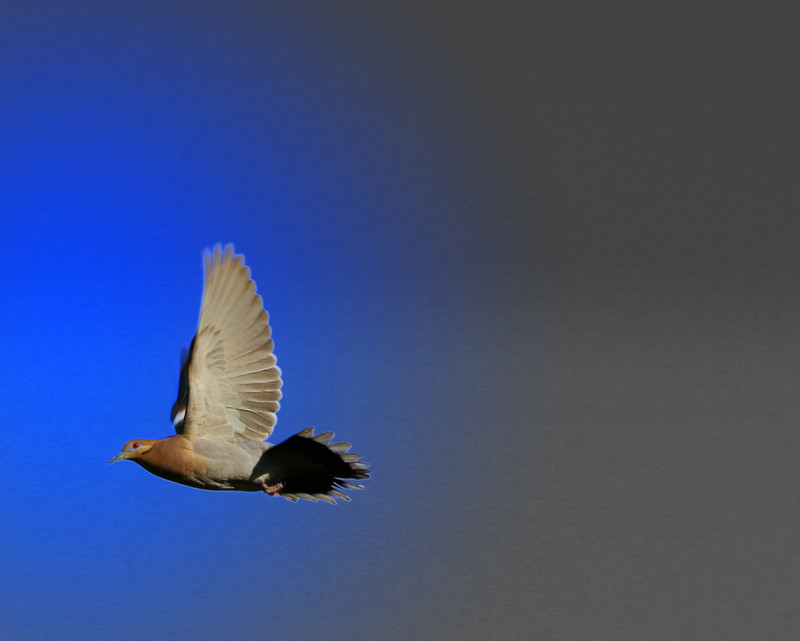
Hi Rebekah! A lovely shot of a bird in flight. Really tough to capture them in motion and manage to get the detail you've managed to do! Congrats! Obviously you checked the box for feedback, so here's my take: With a score of 5, you're pretty much middle of the voting scale. The biggest drawbacks to the image are the following.
1. The transition from grey sky to blue sky is very disorienting. Appears as though you processed one half of the frame as B&W and the other as color, and it's quite a jarring transition. If you choose to do selective coloring, you need to be a little more precise and selective with it.
2. The blue are oversaturated. The sky seems unnaturally blue and also gives rise to processing artifacts (halo) around the tail feathers.
3. Compositionally, the bird looks cramped for space. It needed more room on the left hand side of the frame to fly into. A better framing of the image would be the bird on the right hand side of the frame and having a bunch of open sky to fly into. When you have a static object, you can place your object anywhere in the frame, but when an object is on motion, or looking somewhere, it's a good rule of thumb to have the object moving (or looking) into space.
Anyway, hope this has helped! PM me if you have any further questions! And BTW...welcome to DPC :)
Kind regards,
Garry |