| Author | Thread |
|
|
01/30/2003 08:30:58 PM |
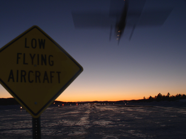
| I am intrigued by the use of your aperture setting, ISO, and shutter speed. This combination tells me you meant to have the plane blurred, and keep the good depth of field.This would have worked very well if the sign had not been so dark...Depending on the situation you were in...you might have tried setting the head lights of your car on the sign. If you meant to have the sign dark, to add to the illusion of night, the idea was good but the outcome just didn't work. The composition of your pic was very good and the sunset really works well. It would be interesting to see what would the picture might have looked like if the sign was better lit. JG |
|
Comments Made During the Challenge  |
|
|
01/26/2003 01:43:33 PM |
| nice job, should offer a nice print to the airport. |
|
 Photographer found comment helpful. Photographer found comment helpful. |
|
|
01/24/2003 01:55:23 PM |
| I think the sign should be more in focus, and less movement blur on the plane, but its a nice idea. Maybe shooting in a higher ISO will help this. |
|
|
|
01/24/2003 12:44:08 AM |
|
| Photographer found comment helpful. |
|
|
01/23/2003 04:19:13 PM |
| Might have been better is the sign was lit up a bit more. It's hard to read because it's so dark. |
|
|
|
01/23/2003 09:06:51 AM |
| The idea is good. The composition is also good. I find the sign is a little too dark and out of focus. Maybe you should have illuminated the sign with a light or torch. That way you would still get that wonderful sun setting sky out the back there. There is also too much motion blur on that plane coming in. I am not sure if you wanted to create that effect on purpose, but I would have used a faster shutter speed and taken the photo a little earlier while it was still lighter. |
|
|
|
01/21/2003 10:24:14 PM |
| nice shot. with a slow-sync flash, this might really have popped - I'm assuming that the sign is reflective. don't know if you tried it and if so, how it came out, but it sure would be interesting to try. |
|
| Photographer found comment helpful. |
|
|
01/21/2003 05:06:31 PM |
| Wow... excellent catch here! I would have liked a little more lighting on thee sign, but it's understandable why you couldn't get that. The horizon also isn't quite level, but that is a minor problem. Even though there are a couple of problems here, I give you a -9- great job! Good luck. |
|
| Photographer found comment helpful. |
|
|
01/21/2003 11:19:32 AM |
| I love the color of the sun at the horizon blending into the blue of the sky. Overall though, on my monitor, the photo is much too dark for my taste. I can barely make out what the sign says, and the photo doesn't have a great deal of impact. |
|
|
|
01/20/2003 10:49:59 PM |
| Should have been taken in daylight. |
|
|
|
01/20/2003 07:42:30 PM |
| I realise the difficulty in getting this shot, but the sign is too dark. Perhaps you could have lit it slightly to make it the highlight of the photo and then the plane flying over would have been a lovely complement. It's still a pretty good photo though. |
|
|
|
01/20/2003 07:21:08 PM |
| Pity the sign is so dark. |
|
|
|
01/20/2003 07:03:41 PM |
| Can't see the sign. Maybe use a flash next time?? :) |
|
|
|
01/20/2003 03:04:33 PM |
| Too bad the sign is so dark... it's a pretty cool shot. I know it would have been a pain in the butt, but even a small light of some sort would have brightened the lettering of the sign without affecting the exposure of the plane and sunset. |
|
| Photographer found comment helpful. |
|
|
01/20/2003 02:52:12 PM |
|
| Photographer found comment helpful. |
|
|
01/20/2003 02:27:17 PM |
| i think if you had used your flash to light the sign the photo would have come out a little better - or used a tripod to take a longer exposure and had the plane lights streaming through the picture while at the same time being able to get some more exposure on the sign, again, lightening it up. |
|
|
|
01/20/2003 06:40:29 AM |
| The sign is a bit too dark. I think it would have been better in daylight, rather than at sunset, or use a bit of fill-in flash. |
|
| Photographer found comment helpful. |
|
|
01/20/2003 02:57:46 AM |
| Nice concept! If only that sign were not so dark I could rate it higher. |
|
| Photographer found comment helpful. |
|
|
01/20/2003 02:09:03 AM |
| Had to really strain but could read the "Low Flying Aircraft" sign. Nice one. Have to sit there long to catch this? My only complaint is I wish the sign showed up better and were easier to read. But I'll still give it a 7. |
|
| Photographer found comment helpful. |
|
|
01/20/2003 01:23:14 AM |
| Interesting photograph! I like the blur of the motion of the plane. The sign is a bit dark, but it doesn't take too much away from the photograph. I also like the colour of your horizon. -Annida |
|
| Photographer found comment helpful. |
|
|
01/20/2003 12:40:36 AM |
| very nice. I wish the sign was brighter butI realize there isnt anything you can do but use a flash really and then it would be too reflective. |
|
| Photographer found comment helpful. |
Home -
Challenges -
Community -
League -
Photos -
Cameras -
Lenses -
Learn -
Help -
Terms of Use -
Privacy -
Top ^
DPChallenge, and website content and design, Copyright © 2001-2025 Challenging Technologies, LLC.
All digital photo copyrights belong to the photographers and may not be used without permission.
Current Server Time: 03/12/2025 07:09:07 PM EDT.