| Author | Thread |
|
|
01/28/2003 02:48:33 PM |
Well, phooey on all of them. I gave this a 10 'cause I really liked the soft focus and ethereal feel.
You got robbed. :)
Rob |
|
Comments Made During the Challenge  |
|
|
01/26/2003 11:52:51 AM |
|
|
|
01/24/2003 09:22:30 PM |
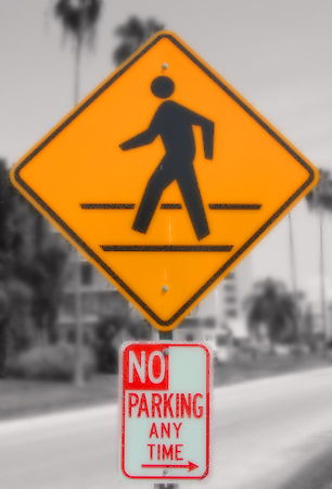
| I like how the signs are coloured and the background appears black and white. Really should be more focused. |
|
|
|
01/23/2003 04:00:31 PM |
| Not even people; just keep on walking. Could use a sharper focus. Even the signs are a little too soft on focus. Good composition, but needs better execution. |
|
|
|
01/23/2003 12:07:50 PM |
| I'm afraid it seems to lack originality and isn't a very crisp image. |
|
|
|
01/21/2003 11:34:59 PM |
|
|
|
01/21/2003 11:27:00 AM |
How did you get the background to be desaturated?
|
|
|
|
01/21/2003 08:00:52 AM |
| fuzzy, title it "DOI perspective and it would have worked. |
|
|
|
01/21/2003 04:50:51 AM |
| A little out of focus. The background seems to be in black and white which gives the photo a nice effect also bringing out the colors in the signs more. |
|
|
|
01/21/2003 01:07:32 AM |
| I like the background blurred it would have been to busy otherwise, but the sign seems to be a bit too blurry also. Did you try to sharpen it using PS or PSP? You may want to try a few different angles also. I personally don't care for things perfectly centered (well every once in a while) usually they are not as appealing to my eyes. The sign was OK, it is very hard to find any interesting signs around, but then again a different angle may have helped give the sign a bit more pizzazz. 4. |
|
|
|
01/20/2003 06:47:03 PM |
| The technique of desaturating all but yellows and red in this is GREAT! But you should have not cropped it this tightly and shown a little more of the right, left, and to a lesser degree the top. But the sign itself is boring. Nice pic tho. |
|
|
|
01/20/2003 05:13:48 PM |
| i like the selective focus on this one...maybe a bit soft on the foreground though. |
|
|
|
01/20/2003 01:38:25 PM |
| Hmmm. Why is the focus so soft. Did you use a Soft filter? |
|
|
|
01/20/2003 10:28:58 AM |
| focus seems soft. like to color contrast. |
|
|
|
01/20/2003 03:04:42 AM |
|
Home -
Challenges -
Community -
League -
Photos -
Cameras -
Lenses -
Learn -
Help -
Terms of Use -
Privacy -
Top ^
DPChallenge, and website content and design, Copyright © 2001-2025 Challenging Technologies, LLC.
All digital photo copyrights belong to the photographers and may not be used without permission.
Current Server Time: 12/14/2025 02:02:02 PM EST.