| Author | Thread |
|
|
02/02/2003 03:09:19 AM |
*Critique Club*
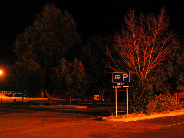
FIRST IMPRESSION: Eerie lighting, seems like something out of a horror movie. I'm not sure if that adds to the photo or not.
CHALLENGE: Meets the challenge.
COMPOSITION: The light on the left side is a distraction. If you crop just to the right of that, the image is much stronger. The light pulls the viewer's attention, but once it is removed, everything in the image works together to bring the viewer's eye to the sign.
TECHNICAL: Other than the red cast, the technical aspects of this sht are excellent. I'm not sure what you were trying to do with the red cast, but I think I like it.
CONCLUSION: A strong image that probably could have scored a little better with a very minor change.
Thanks for sharing and good luck in future challenges! |
|
Comments Made During the Challenge  |
|
|
01/26/2003 10:00:27 PM |
| A little too red. jgillard3 |
|
|
|
01/25/2003 10:43:02 PM |
| The light on the left is distracting, cropping this out may give a different look. |
|
|
|
01/25/2003 10:11:46 AM |
| Great mood in this pic. Real peaceful, restful, like vacation should be. The colors are very nice and warm. Good pic - Inspzil |
|
|
|
01/25/2003 01:23:08 AM |
| nice colour at night. you got that trailer just right in the background. Is it yours? |
|
|
|
01/24/2003 12:49:50 AM |
|
|
|
01/23/2003 10:04:03 PM |
| Meets the challenge well. The redish tone is personally not appealing to me. Decent photo otherwise. |
|
|
|
01/23/2003 08:50:52 AM |
| Wow red! I personally would have cropped that light on the left out of this photo and I would also have focused on the sign. Other than that the idea is good. |
|
|
|
01/23/2003 03:17:41 AM |
| Boy is that Bug Lighting anoying. |
|
|
|
01/21/2003 04:31:47 PM |
| Well taken shot. Was the lighting that orange/red? Very clear night shot, how many second exposure? I tried a "hand crop" on my screen, suggestion: take off the bottom (about 1/2 way up the sign's posts) and the light on the left edge. It might help. I like the trees. 6 Swash |
|
|
|
01/20/2003 07:37:20 PM |
| The red trees and road look really nice - really moody. I hope you took a shot of just that tree (without the sign) - it looks like a real good candidate for a photo. |
|
|
|
01/20/2003 06:20:21 PM |
| Why is the picture so Red? |
|
|
|
01/20/2003 03:10:30 PM |
| I quite like the lighting in this one |
|
|
|
01/20/2003 09:03:15 AM |
| pretty dark. the sign almost gets lost. |
|
|
|
01/20/2003 06:07:35 AM |
nice attempt under difficult circumstances (street lights).
p.s. It's spelt quiet, but I haven't scored you lower for your spelling. |
|
Home -
Challenges -
Community -
League -
Photos -
Cameras -
Lenses -
Learn -
Help -
Terms of Use -
Privacy -
Top ^
DPChallenge, and website content and design, Copyright © 2001-2025 Challenging Technologies, LLC.
All digital photo copyrights belong to the photographers and may not be used without permission.
Current Server Time: 03/12/2025 02:44:46 PM EDT.