| Author | Thread |
|
|
01/27/2003 09:44:21 PM |
CRITIQUE CLUB REVIEW
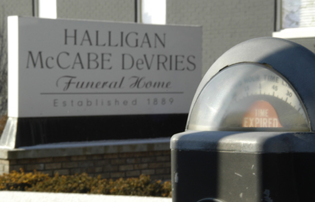
Conceptually this shot is very strong. It tells a story, which is more than many do.
However, with this good of a camera system, there was no excuse for any of the important elements of the image to be out of focus. This really hurts the shot.
I'm especially troubled by the lack of foreground sharpness. At the very least the meter should have been razor sharp. Looks to me from your aperture setting that you tried to put your focus somewhere between the meter and the sign in hopes of including both. I think you would have been better off with a really sharp foreground.
Post processing also could have been employed to boost sharpness and perhaps color saturation. There's an orangey cast to the pic which isnt bad, but I wonder how this would have looked on an overcast day?
Good idea that I think deserves another attempt :). |
|
Comments Made During the Challenge  |
|
|
01/26/2003 07:11:50 AM |
| Clever shot, I would have prefered it all in focus. |
|
|
|
01/26/2003 02:13:28 AM |
| This is a great composition. I think the shadow on the meter is slightly distracting but not bad enough to impact your score. |
|
|
|
01/25/2003 09:24:24 PM |
| Clever. Another one I wish I'd thought of. Great juxtaposition. (8) |
|
|
|
01/25/2003 08:44:08 PM |
| Good idea, but it's a bit blurry. |
|
|
|
01/25/2003 02:34:06 PM |
| Nice point of view, good eye. I wish it was a bit sharper in focus though. I noticed that you only used 55k of the 150kb file size allowed. That would certainly have added some sharpness. |
|
|
|
01/25/2003 01:28:01 PM |
| Funny. It`s a shame that the focus is slighty off. |
|
|
|
01/25/2003 11:44:43 AM |
| Would have scored higher if BOTH signs were in focus. |
|
|
|
01/25/2003 10:28:44 AM |
|
|
|
01/24/2003 11:56:29 PM |
| Excellent picture. You really get the message across. You have a good sense of humor. |
|
|
|
01/24/2003 08:05:34 PM |
| Nice idea, pity it's not a bit sharper. |
|
|
|
01/24/2003 01:57:27 PM |
| Good eye! Very good shot. It's too bad camera's don't have dual focal ranges, this would have been a good shot for it. Color seems a little muted (just a tiny bit) 8 Swash |
|
|
|
01/24/2003 07:45:42 AM |
| I really like the idea of this shot and you may have done this on purpose, but I would have liked this even better if you would have used depth-of-field to make both the meter and the sign in focus. Very creative. |
|
|
|
01/24/2003 12:35:18 AM |
| off topic for me, but cute idea |
|
|
|
01/23/2003 02:05:40 PM |
| This is cute. Needs to be tweaked a bit and you have a winning photo. |
|
|
|
01/23/2003 10:55:26 AM |
| Good idea on this photo. The composition is good. I would have tried to get The sign a little more into focus though. |
|
|
|
01/23/2003 08:11:23 AM |
| Yeah that's life. I imagine this photo as B&W |
|
|
|
01/22/2003 11:31:22 PM |
|
|
|
01/22/2003 10:54:18 PM |
| lighting is too harsh on the meter, sign in the background isn't in focus, which would make this photo much better. also i'm not sure if a meter is a sign but whatever, this is well composed |
|
|
|
01/22/2003 10:10:59 PM |
| An interesting photo, but it feels like nothing is in focus. |
|
|
|
01/22/2003 08:35:58 PM |
| What a priceless shot...Composition is good and the colors drab enough to add to the theme. Only suggestion would be a better job of focusing. |
|
|
|
01/22/2003 03:54:56 PM |
| Clever. Some more depth of field would have helped this, IMO, the funeral home sign would be better in focus. |
|
|
|
01/22/2003 07:16:54 AM |
| Haha, very ironic indeed, clever manipulation of the challenge topic. Excellent use of location and composition. It's also very refreshing after looking through the myriad of 'regular' road signs. |
|
|
|
01/21/2003 11:20:23 PM |
Good subject. Unfortunately out of focus
|
|
|
|
01/21/2003 07:39:23 PM |
| Yes, very ironic. Everything is a little bit soft, although I suspect that's a result of struggling to get enough depth of field to include both objects. |
|
|
|
01/21/2003 02:28:22 PM |
| Technically not perfect (only the front of the meter is in focus) but very original! |
|
|
|
01/21/2003 08:21:02 AM |
| focus is way off, but great idea, crop out the white stripe on the bottom.6 |
|
 Photographer found comment helpful. Photographer found comment helpful. |
|
|
01/20/2003 11:35:31 PM |
|
| Photographer found comment helpful. |
|
|
01/20/2003 07:59:09 PM |
| Excellent. However :) you should have focused on the funeral home sign... It's the main subject and the "Time Expired" is really secondary. 8. |
|
|
|
01/20/2003 07:24:48 PM |
|
|
|
01/20/2003 04:10:41 PM |
| This is so almost a ten, Great idea, if the meter were in focus or at least clear or cleaner to make more of a pleasent item, and if the sign were in focus this would be a ten for sure.,..,,..,,..8 |
|
|
|
01/20/2003 03:26:48 PM |
|
|
|
01/20/2003 03:00:51 PM |
|
|
|
01/20/2003 02:45:20 PM |
Nice choice of theme.
The picture in general lacks light in the right places though... too many shadowy/grey areas. 6 |
|
|
|
01/20/2003 11:04:00 AM |
| very original. too bad the focus on the funeral home is a little soft (although i don't know if it could have been done better given the DOF challenge inherent with the shot). |
|
| Photographer found comment helpful. |
|
|
01/20/2003 10:54:02 AM |
| Soft focus, but I like the idea and composition. |
|
|
|
01/20/2003 04:48:03 AM |
| Great idea a bit too blurry though |
|
|
|
01/20/2003 04:18:02 AM |
| Shame the light obscures the meter a bit. Good idea though. |
|
|
|
01/20/2003 03:08:09 AM |
|
|
|
01/20/2003 02:10:58 AM |
| Need just a tad bit more focus. But good shot. Worth a 6. |
|
|
|
01/20/2003 01:38:03 AM |
| Very clever! I\'m partial to photos that put the sign in a situation where it compliments its surroundings, and this is one of the best ones. It could be just a BIT sharper, but great job! 9 |
|
|
|
01/20/2003 01:13:15 AM |
| A really funny concept, but something ought to have been in focus for it to be carried out effectively. |
|
Home -
Challenges -
Community -
League -
Photos -
Cameras -
Lenses -
Learn -
Help -
Terms of Use -
Privacy -
Top ^
DPChallenge, and website content and design, Copyright © 2001-2025 Challenging Technologies, LLC.
All digital photo copyrights belong to the photographers and may not be used without permission.
Current Server Time: 12/14/2025 07:20:11 PM EST.