| Author | Thread |
|
|
01/30/2003 05:49:45 PM |
Greetings from the Critique Club.
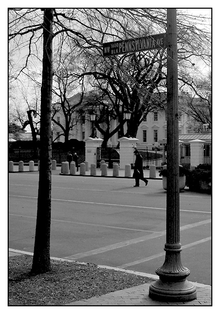
I agree. It is too bad about the tree. I'm not sure what time you shot this but the sky looks overexposed to me.
Despite the the trees and sky. I like the framing of this shot. I probably would have waited for the gentleman in the middle to move out of the frame. I'm not sure how much time you had to take the picture as I'm sure you the secret service guys may have been eyeing you down.
I think I am the minority by saying this but I'm not sure I would have gone with the B&W. I know its winter and there's not much color around but because of that I don't see a lot of contrast. An example is the tree on the left. It has nearly the same shade as the bushes and lawn behind it. I think the use of certain filters can bring certain colors out more even in B&W. You can also play around with that stuff in Photoshop as well.
I think the subject is cool. Not everybody can say the share the same address as the president. I hope this helps a little feel free to e-mail me if you have any questions. |
|
|
|
01/27/2003 08:17:20 AM |
this is great. i should have gotten back to you earlier that i preferred the other one. the backlighting on this one renders the whole scene rather dark. the sign might have benefited from some fill flash to bring it out. you should have chopped down the tree, also.
Message edited by author 2003-01-27 08:17:38. |
|
Comments Made During the Challenge  |
|
|
01/25/2003 05:11:54 PM |
| That looks like a nice place to live, if a bit cold. Is it for sale? |
|
|
|
01/24/2003 01:50:48 PM |
| Very good! Strong contrasts. Focus seems very strong. It's a tad cluttered, but I'm not going to ask you to cut down a tree or two (or would you?). 8 Swash |
|
 Photographer found comment helpful. Photographer found comment helpful. |
|
|
01/24/2003 10:29:14 AM |
| Very strong shot and equally strong use of black and white.. = 10 - setzler |
|
|
|
01/24/2003 01:28:40 AM |
|
|
|
01/23/2003 09:55:31 PM |
| It's a lovely building in the background, but the tree and sign fight with each other too much. |
|
| Photographer found comment helpful. |
|
|
01/23/2003 07:09:31 PM |
| Nice B&W Shot. Makes me thinks it's a cold morning that you were out there taking this shot. Nice crisp photo. Nice job. |
|
| Photographer found comment helpful. |
|
|
01/23/2003 04:03:09 PM |
| It's a wonder you didn't get the camera yanked out of your hands. Nice job of framing with the tree and sign post. Good job. Nice B & W. |
|
|
|
01/23/2003 01:40:45 PM |
| Nice black and white. Great clarity and DOF. |
|
| Photographer found comment helpful. |
|
|
01/22/2003 11:23:16 PM |
| I like the black and white, but not a fan of the border |
|
|
|
01/22/2003 10:19:46 PM |
| that's a pretty good idea. the trees really do hurt your score i think, as good as this picture is technically |
|
| Photographer found comment helpful. |
|
|
01/22/2003 09:05:47 PM |
| This is a great street scene and great in B/W. Not sure that the road sign element is strong enough, but I still like it! |
|
|
|
01/21/2003 08:46:36 PM |
| Very nice the way you framed the White House using the tree and sign post, would love now to see it in color too. Hope you aren't to offended by a 9 =o) |
|
|
|
01/21/2003 11:14:40 AM |
Amazing that you can take a photograph on that street and not be arrested.
Of course, they're probably taking your picture too.
|
|
|
|
01/21/2003 10:52:29 AM |
| Wow! A wonderfully evocative photo. You made a good choice making this a B&W photo! |
|
| Photographer found comment helpful. |
|
|
01/21/2003 05:19:04 AM |
| Somebody musta' cut down the Bushes... |
|
|
|
01/21/2003 04:56:17 AM |
|
|
|
01/20/2003 11:05:04 PM |
| looks good. i wish i had gotten back to you, as i preferred the other entry .. |
|
| Photographer found comment helpful. |
|
|
01/20/2003 05:20:47 PM |
| Picture seems a little too crowded on the top, and open in the bottom. Would shooting this picture from lower balance it out a little more? Looks very sharp though. Good luck! 7 |
|
| Photographer found comment helpful. |
|
|
01/20/2003 11:11:50 AM |
| I like how the tree and sign post frame the white house. I think black and white also works well here, but I've been partial to black and white lately ;) Good shot. 8 |
|
| Photographer found comment helpful. |
|
|
01/20/2003 05:53:00 AM |
| Sign seems a bit lost in the branches. |
|
| Photographer found comment helpful. |
|
|
01/20/2003 02:59:16 AM |
| A little too dark for me. Why not color? Cub |
|
|
|
01/20/2003 01:30:04 AM |
| Looks awfully dismal, not at all like TV, anyhow. I think this might have been better if you had been standing a bit further to the left, so the pole didn't cut right through the building. How did this look in color? |
|
Home -
Challenges -
Community -
League -
Photos -
Cameras -
Lenses -
Learn -
Help -
Terms of Use -
Privacy -
Top ^
DPChallenge, and website content and design, Copyright © 2001-2025 Challenging Technologies, LLC.
All digital photo copyrights belong to the photographers and may not be used without permission.
Current Server Time: 03/12/2025 09:25:57 AM EDT.