I'm here as a new Critique Club member... Your image popped up as my first opportunity to do a critique. Here goes:
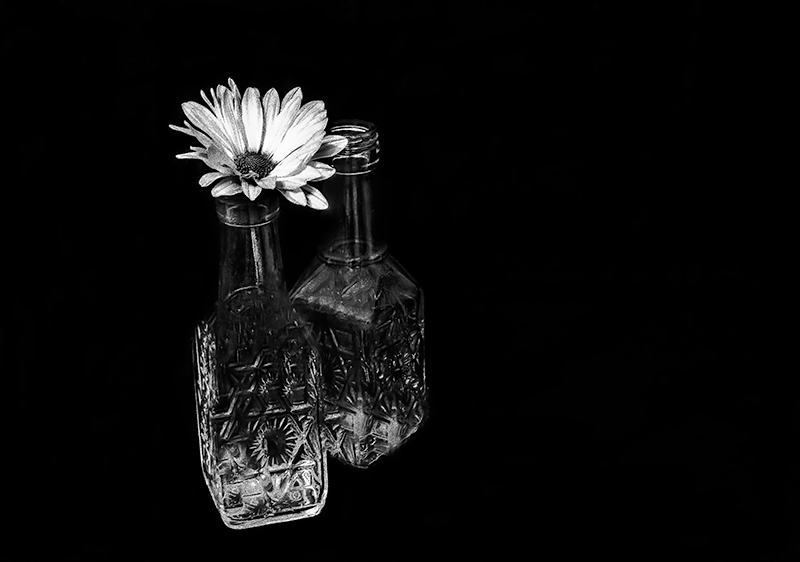
First off, I'm always drawn to B&W images of flowers, as they can, at times surprisingly, depict the inherent beauty of a subject that typically uses color as a primary component of attraction, as this photo does. It presents a strong first impression. The dramatic contrast and abundant use of negative space really draws me in as a viewer. The off-center composition is effective as well and creates a powerful isolation of the subject - which is amplified by your choice of title. The patterns and contrast of the cut glass create a combined balance and tension for me. I like the mirroring of the flower with the radial pattern on the bottle directly below it, although, I'm struggling a bit with splitting my attention between the two - not really sure where to focus.
The amount of grain/noise is interesting, too. While it adds an interesting dimension to the texture of the flower, it also draws my attention to the portions of the petals that are blown out to pure white. This texture in the flowers, and to a lesser degree in the glass, also contrasts with the smooth noiseless background black in a way that separates the subject from the background.
Let me finish by going back to that all important first impression. My voting typically starts with a separation of entries that immediately catch my attention and those that don't (6's vs 5's). I then revisit the 6's for a closer look and boost the score when a more detailed observation draws me in further to the image. I did vote in this challenge and gave your photo a 6. It caught my eye as a strong entry and I remain impressed with the overall dramatic impact.
Not voting on this one, but wanted you to know how exquisitely lovely I think it is. The lighting is perfect. I love the simplicity of the daisy complimented by the intricacy of the cut glass. Good job!!