Critque Club:
Meeting the challenge: This couldn't have been achieved any better!! Great job of keeping the focus on an otherwise boring road sign and yet coming up with a very lovely photo.
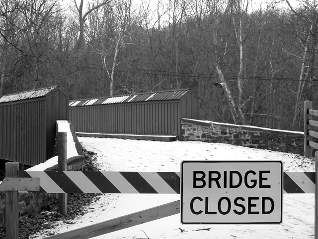
First of all, this photo impresses me with the lines in the composition as well as the nice [b]contrast[\b] between the snow and the darkness of the lettering, buildings, fence and stone wall. Also, there is good contrast within objects, until you get to the trees. I don't know if there was any other interesting angle you could have shot this without the powerlines visible, but if possible, I would have changed that in the composition, or cropped out the top of the photo as I don't think the trees and sky really add anything to it. The lack of coloring helps make this photo resonate with a cold feeling, well done in that area, too.
Technical Quality: Focus and dof are very good. I like the soft lighting that leaves no harsh shadows and helps to improve the contrast of the darker objects against the always bright snowy road.
Creativity: As noted above, a very nice shot of what would have been a boring sign. This was a tough challenge for many, and you did very well discovering and submitting this shot.
Overall: A very nice shot in general, the only thing I would have changed is the powerline, although it is still a minor flaw given the challenge this week. I would have given this photo at least a seven, too bad others didn't see it the same way. |