On the morning of the last day, I suddenly had this idea. It was very simple, so I worried about the "expert" aspect... but based on past input from some very wise friends, I decided to KISS it, rather than chase some more complex interpretation.
Of course, I only had a few hours to find the model, shoot, edit, and submit. But since it was a simple concept, I was confident I would have plenty of time.
So I contacted Sam - he of the bulging biceps - but he was unavailable. I then turned to Model Mayhem (where I'd found Sam), sent a handful of emails, and David - who was my first choice - was also the first to respond.
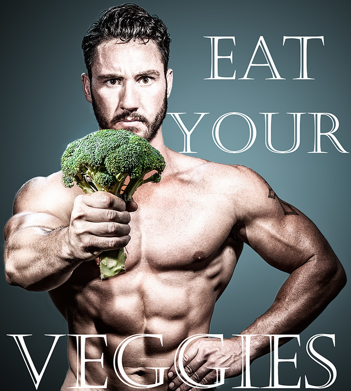
A couple of hours later I'd bought a bunch of organic broccoli, and David was in my studio doing pushups. An hour after that, I was at my computer, tweaking the image.
This could easily have been advanced editing, but by taking advantage of the expert rule set, I was able to choose the best take for the body, the best take for the face, and a separate shot for the broccoli. I wanted everything in focus, and because of the dof of the pose, it was just not possible.
What most people don't realize is that posing in bodybuilding is exhausting, and that each time you flex, you also pump up your muscles. This can work in your favor for biceps, pecs, shoulders... but for abs, it's the opposite. You loose definition.
Also, in this particular pose, I was having him flare his lats, bring his elbow forward a bit, tighten abs, have the broccoli at a specific height, AND give me an expression. This body best showed his definition, but the expression was kinda meh. The body in the one with the great expression was no where near as defined or symmetrical as this. And in neither was the broccoli in focus.
I started out with a 2-light setup - a c-stand with a blue gel and a white umbrella behind him, giving me both a nice bg color AND rim light, and one with a 7" reflector to camera front right. But I had to add a 3rd special with a snoot just for the broccoli 'cause I just couldn't get it lit, and there was a horrible shadow on that arm, no matter where I placed the key light.
Finally, I wanted a "postery" look and added way more contrast than I would for a shot like this. I desaturated everything but the broccoli, and increased the green saturation.
I did play with making the letters in a different color, and then just the VEGGIES in green. They all drew focus from the image, and just looked weird. In placing them, I wanted the "Eat Your" behind him, and the "VEGGIES" in front of him in larger font size, echoing the and supporting the "in your face" veggie.
I was surprised amazed at how 3-D this turned out, as I wasn't aiming for that! It truly looks like the broccoli is sticking out of the screen :)
[Sep. 12th, 2014 03:47:49 PM]
As a cute aside, David told me he loved the concept, and laughed when he read it because his friends always tease him about how much he looooooves broccoli.
----
Thanks so much for the comments and generous voting. Was 7+ until the last day.
Christophe, looks like you HAVE been eating your veggies :)
Statistics
Place: 4 out of 35 Avg (all users): 6.8718 Avg (commenters): 8.0000 Avg (participants): 6.3500 Avg (non-participants): 7.0517 Views since voting: 1745 Views during voting: 285 Votes: 78 Comments: 15 Favorites: 0
Very well done, congrats on 4th. One 'but if' - the distance between his arm on the left side of the photograph and the image edge nabbed my eye before I looked over the rest of the photo. I revisited it and find that to be something that immediately steals your eye from the overall image, could just be me - probably why I still gave this a 9 in voting, and definatley expected it to be in the top 5.
I really should eat much, much more vegetables it seems! I really loved this one Johanna, it made me laugh, and I was convinced it would win a ribbon. Well, better luck next time. It is a fantastic poster whatsoever!
Well-lit for sure, but maybe some bolder, green colored letters for the word "VEGGIES" would have looked better instead of using the same font as the top.